The architecture of information:
A few days ago, a glass shower door in my home broke. (Fortunately, nobody was hurt.) After my wife and I had finished cleaning up, I started considering how to replace the door. My first thought was to visit Home Depot since there’s a store near our house. But before getting in the car, I went to the company’s website to see what options exist, price ranges, etc.
I’d never bought a shower door before and didn’t know anything about them. As with many other things, “shower door” is a general category. It turns out there are several types. Which did I need? I didn’t know. What’s worse, I didn’t even know there were different types. All I knew was that I wanted a glass door with particular dimensions. It’s a common situation: we need to look for something but lack the language to describe it. We may not know the relevant distinctions beyond the general category.
So that was my starting point. I went to homedepot.com and typed “shower door” into the search box. Usually, doing this on an e-commerce site leads to a search results screen. Depending on our level of familiarity with the subject, we may find the results meaningful (or not.) Often, such sites provide faceted filters that allow us to narrow results by attributes common to items in the set. (E.g., door materials, sizes, etc.) By looking at the search results interface — and the results themselves — we begin to understand the distinctions that will help us become more effective searchers.
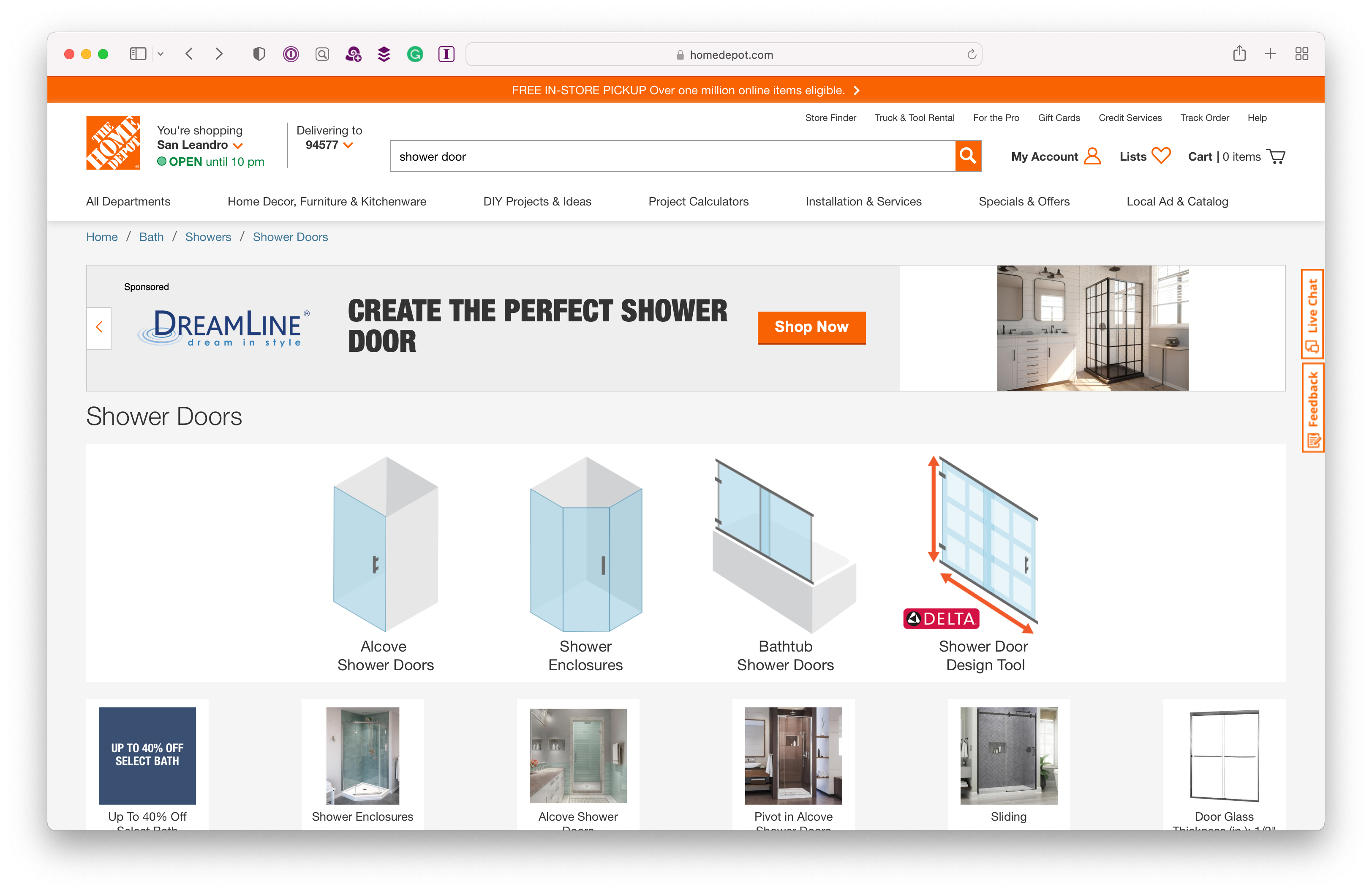
That’s how it usually works. But I was pleased to see Home Depot go one step further. Their search interface acknowledges that users might not be an expert on the product they’re searching for and shows additional elements to help them become more educated. This is what I saw when I typed “shower door” into the search field:

The first thing we see below the search box is an ad. Whatever — that didn’t seem relevant, so I ignored it. But look at the row immediately below the ad. It starts with a title that repeats the search phrase, so users know they’re in the right place. Then, the screen shows four diagrams that begin to clarify distinctions rather than showing the expected set of results. The distinctions are labeled:
- Alcove Shower Doors
- Shower Enclosures
- Bathtub Shower Doors
- DELTA Shower Door Design Tool (is this an ad?)
Below that, there’s another row of distinctions, this time with photos:
- Up To 40% Off Select Bath (bleh, another ad)
- Shower Enclosures
- Alcove Shower Doors
- Pivot in Alcove Shower Doors
- Sliding
- Brass
Except for the ads, these are all subcategories. (The actual set of results and the faceted filters start below the second row of subcategories.)
The key here is that these subcategories play two roles. On the one hand, they are navigational elements: I can click on any of them and see another (more narrowly focused) screen of results. But they also play an essential educational role. Those subcategories — especially the ones with the diagrams — teach me about the distinctions I need to know to shop for a shower door.
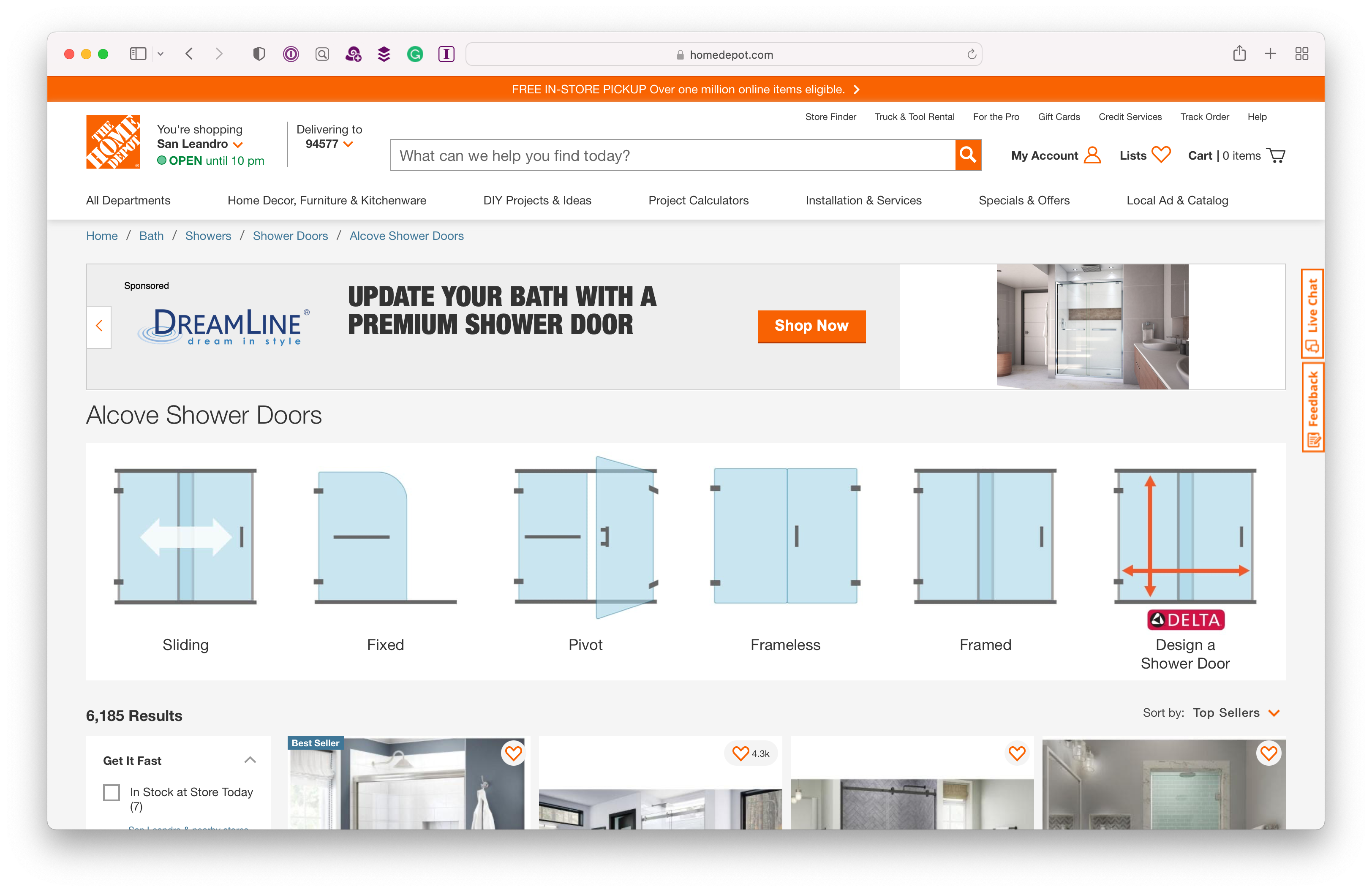
I knew going into this experience what my shower looked like, but I didn’t know it was called an alcove. Note that this doesn’t necessarily need to be a term in everyday use; it could be a distinction relevant only for interacting with this particular data set. What matters is that I find the exact type of item I need. So I clicked on Alcove Shower Doors and saw the following page:

Another set of diagrams! And these, too, are very clear. It seems there are further distinctions I needed to be aware of. While the first set of distinctions was about the type of shower in my home, this second set seems to be about how the door is affixed to the house:
- Sliding
- Fixed
- Pivot
- Frameless
- Framed
- DELTA Design a Shower Door
(By this point, it had dawned on me that the last item on this list probably wasn’t an ad but some kind of customization tool. Anyway, back to the distinctions…)
These distinctions made sense to me — again, I could quickly tell which one best described the door in my house. I clicked on “Pivot,” which took me to a filtered results page, this time with no further clarifications. (I.e., I could see the available options for the type of door I needed.)
Note the efficacy of the diagrams in this case. I understand the words alcove, enclosure, bath, sliding, fixed, pivot, etc. I may even have a sense of what they mean in this context. But when they’re coupled with the diagrams, I’m relieved of having to imagine how those distinctions might apply to the shower door in my house. It made for a great search experience: I quickly found what I was looking for and left a more educated buyer.
Principle: assume users won’t know all the relevant distinctions when searching for things in a large, heterogeneous data set. How can you help users become more educated while giving them the means to find what they’re looking for? Words might not be enough; well-considered diagrams can amplify the contrast between options, clarifying distinctions and making for a better experience.
