Tanner Christensen asked a good question on Twitter:
Looking for any resources/tips/processes for identifying and designing a navigation model for a complex product or platform. Anyone have insights or links you could share? (h/t @peterme for the nudge)
— Tanner Christensen (@tannerc) March 4, 2021
Peter tagged me on his reply, leading me to respond with a few thoughts. I’m restating (and expanding) them here to keep them from disappearing in Twitter’s fast-moving stream.
Whenever I work on a new navigation system, I start by establishing its ideal user conceptual model. This model must be informed by research. (So, research is the place to start. But that should be self-evident.)

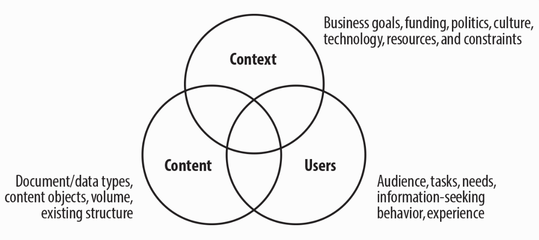
The “infamous three circles of information architecture,” from Information Architecture for the Web and Beyond by Rosenfeld, Morville, and Arango (2015.)
To define a conceptual model, we must understand the system, its subject matter, context, and the users’ mental models about the system’s domain. The model defines a bridge between the system and its users’ expectations; it aims to clarify the conceptual distinctions the system presents to users and how those distinctions relate to each other. The ultimate goal is for users to accomplish their intended tasks with the system.
For example, a person may be looking to pay her credit card. This goal calls for several sub-tasks that require her to visit several parts of the system and interact with different system components. She brings expectations to this experience (i.e., mental models) informed by previous interactions with financial services companies both on- and offline.
Our system may include concepts that may confound her expectations. For example, to pay her bills, she’ll log into her (system) account so she can transfer money from her (bank) account. The conceptual model allows us to identify and clarify such ambiguities. Knowing there’s an issue, we can explore alternative terms or ensure that we include clarifiers such as ‘checking’ in front of the word ‘account.’
When designing complex or novel systems, the goal isn’t to make the system ‘intuitive’ (a word often misused in interaction design) but to make it learnable. That is, when interacting with the system, the user will likely encounter unfamiliar concepts or familiar concepts used in unexpected ways. As designers, our job is to help users leverage concepts they already know to come up to speed in the new domain. We do this through the use of metaphors and careful selection of language.
We can’t effectively sort these issues out by sketching screen-level artifacts; we must work with models. As I’ve written about before, defining an ideal conceptual model is key to designing understandable systems, and navigation systems are no exception. Some replies to Tanner’s Twitter thread highlight the relative obscurity of this important subject.
Back to his request: An excellent book to learn how to do this is Jeff Johnson and Austin Henderson’s Conceptual Models: Core to Good Design. My Information Architecture Essentials workshop also includes a modeling exercise with the explicit goal of teaching folks to make a conceptual model before laying out nav at the UI level. Get in touch if you’d like to find out more.