Timothy B. Lee reporting for Ars Technica:
A federal judge has ruled that Citibank isn’t entitled to the return of $500 million it sent to various creditors last August. Kludgey software and a poorly designed user interface contributed to the massive screwup.
Citibank was acting as an agent for Revlon, which owed hundreds of millions of dollars to various creditors. On August 11, Citibank was supposed to send out interest payments totaling $7.8 million to these creditors.
However, Revlon was in the process of refinancing its debt—paying off a few creditors while rolling the rest of its debt into a new loan. And this, combined with the confusing interface of financial software called Flexcube, led the bank to accidentally pay back the principal on the entire loan—most of which wasn’t due until 2023.
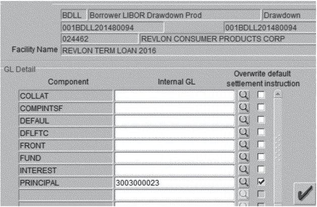
My initial reaction on reading this was: wow, $500m is a lot of money — I wonder how bad the UI is? The article provides a screenshot, which it credits to Judge Jesse Furman:
You can’t do justice to the complexity of much enterprise software by looking at just one screen. Also, such applications are targeted at small groups of highly specialized users. Not knowing the subject domain, it’s hard to evaluate the degree to which the application meets subject matter experts’ needs. Sure, this particular screenshot doesn’t look modern or refined. (It looks like a typical Windows NT-era enterprise application.) But beyond its aesthetics, perhaps the distinctions evident in the UI make sense to its intended users?
Not the case. According to the story, Arokia Raj, the subcontractor responsible for entering the transaction, thought he was doing the right thing:
Raj thought that checking the “principal” checkbox and entering the number of a Citibank wash account would ensure that the principal payment would stay at Citibank. He was wrong. To prevent payment of the principal, Raj actually needed to set the “front” and “fund” fields to the wash account as well as “principal.” Raj didn’t do that.
This wasn’t a problem with one individual user; the official workflow required two other people to sign off on the transaction. One of Raj’s colleagues in India and a senior Citibank official in the U.S. were also confused by the UI.
This is a poor user interface. But the primary issue isn’t aesthetics or usability; it’s the lack of a clear user conceptual model. I’m assuming the people who entered and authorized this transaction understood the distinctions between principal, front, and fund, and the nuances of the task they were trying to accomplish. Clearly, the system didn’t perform the way they expected.
The difference between what users expected and what actually happened speaks to a design failure. And yes, the user interface implementation is poor. But such problems are deeper than UI. This seems more of a failure to properly model the relationships between the concepts required to carry out the task at hand.
Citibank just got a $500 million lesson in the importance of UI design