Twitter recently changed its user interface. Changes include a new custom-made font and a more contrasty color palette. Here’s a thread from Twitter Design about what’s different. Among other things, the change in contrast affects “Follow” buttons, and the result has confused some folks.
I know everyone complains about UI upgrades, but @Twitter swapping the fill/no-fill on the follow/following button is surprisingly confusing.
— haroon meer (@haroonmeer) August 13, 2021
I’m really curious if the designers who did it aren’t heavy users, or if they are playing 4d engagement chess. pic.twitter.com/T679DlLLH4
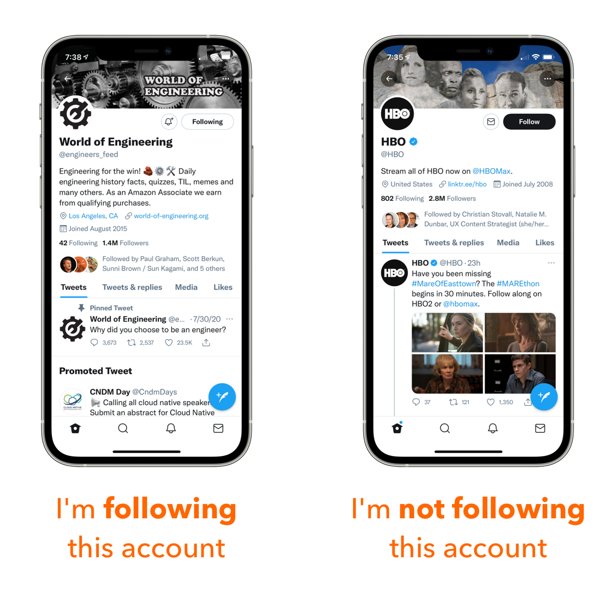
As highlighted by the tweet above, the problem is that the new button treatment is the inverse of what came before. In the previous version, the Follow button was solid blue with white text for accounts you were already following, and white with blue text for accounts you were not following.
This follows a widespread user interface convention: selected or active items usually appear bolder than non-selected/inactive items. You can see an example of this treatment in your phone’s Settings app.
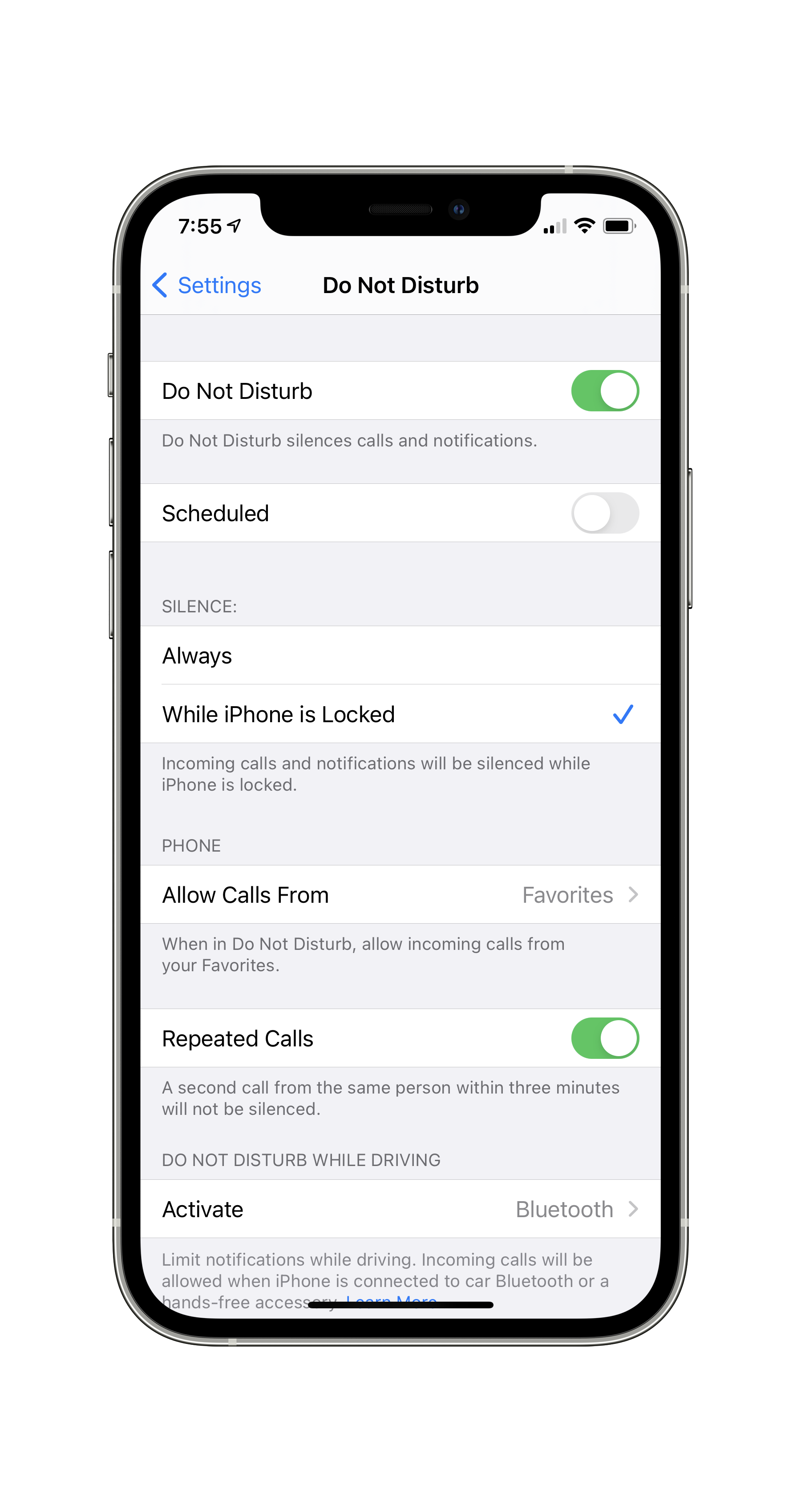
Do Not Disturb options in the iOS Settings app.
In this screen, I have activated “Do Not Disturb” and “Repeated Calls,” so their respective toggle switches are rendered in solid green. “Scheduled” is not activated, so its switch appears in a light shade of gray. Lots of buttons follow this pattern, even in the physical world. (Consider the caps lock key on your keyboard: the LED light comes on when caps lock is active.)
Twitter’s new “Follow” button confounds expectations by inverting this pattern. In the new version, accounts you don’t follow are shown bolder than those you’re not following.
I’ve seen reports of folks confused by the new interface, causing them to think twice about whether they’re currently following an account or not.
The latest redesign of this here bird website has me all turned around. I've nearly unfollowed three people because I thought I wasn't following them and clicked to follow, only to be asked if I wanted to unfollow them. Why is the blue bird trying to confuse me?
— Kate O'Neill (@kateo) August 13, 2021
I think I understand why Twitter’s designers made this choice. Of the button’s two possible states, white text on dark background stands out more in the (mostly white) default Twitter UI. More visible = higher likelihood you’ll find it quickly. It’s a practical consideration: the black buttons are the equivalent of a shiny red berry.
However, optimal findability isn’t the only consideration. Besides allowing the user to perform an action (follow/unfollow), this button also plays an important semiotic function: it indicates whether you’re already following the account or not.
These two functions are in conflict in the Twitter UI. The new version optimizes the experience for cases when you’re not following the account, which are likely the majority. But in doing so, it introduces a semiotic dissonance.
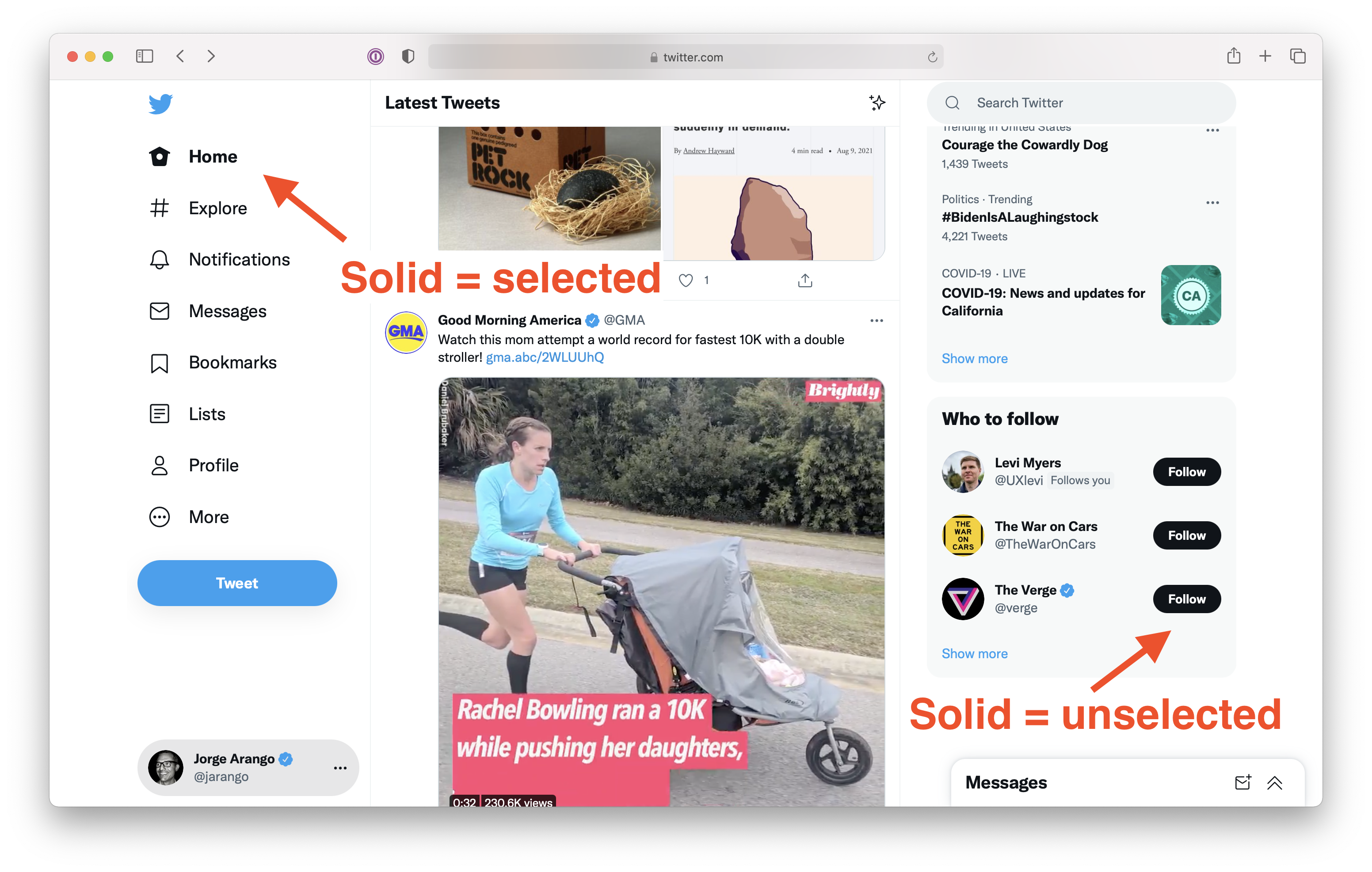
This dissonance isn’t limited to users’ prior experiences; it’s inconsistent within the new Twitter UI itself. As with many other sites, primary site navigation in Twitter indicates state by using solid as selected — the opposite of the Follow button treatment.
Bottom line: the new Follow button treatment makes sense from one perspective, but it flouts a widespread UI pattern. While we may eventually get used to it, the new version requires some thinking on our part. And as Steve Krug reminds us, we should aim to not make users think.