It’s challenging enough for a product’s conceptual models to be internally coherent. But it’s even more challenging to maintain coherence within a family of products. One of my favorite examples is Amazon’s Kindle.
The Kindle product family started with a dedicated e-reader device in 2007. Over the years, the line has grown to include several devices with different capabilities, ranging from relatively simple readers with e-ink screens to fully-featured tablets. Besides dedicated devices, Kindle also encompasses apps that run on other hardware platforms, such as Android phones, iPads, and personal computers running Windows and macOS.
This widespread availability is one of the system’s most attractive features. It means you can read your e-books on your preferred device. Alas, this variety also presents design challenges. These devices don’t have the same features and capabilities. Some have touchscreens, while others use a mouse or trackpad. Some have larger screens than others. Some have color displays, while others are monochromatic. And so on.
Also, even though they’re all labeled “Kindle,” not all Kindle products have the same capabilities. Dedicated Kindle e-ink readers (such as the Kindle Oasis) are optimized for reading books. The Kindle apps on other platforms, such as Windows and iOS, are also optimized for reading books, but run in the context of a third party’s operating system. In some of these platforms you can peruse and buy from the Kindle bookstore, while you can’t do so in others. As a result, Kindle’s user interface is different on each platform.
That said, all of these products must provide a basic set of functions for users to experience them as “Kindles.” That set includes, at a minimum, giving users access to their book library. They must be able to open a book and read it. They must be able to move around in the book, including navigating its table of contents. They must be able to search in the contents of the book. They must be able to highlight key passages and leave notes in the book. Those changes — especially users’ highlights and notes and their reading location in the book — must synch with other instances of Kindle. I don’t think you can call a product — be it software or a dedicated device — “Kindle” if it doesn’t provide these basic features.
It’s not necessary that the UI that provides access to these features be identical in each platform, as mentioned above. However, ideally, the underlying structural relationships would be maintained throughout all instances. For example, I expect the features that allow me to navigate within books — e.g., the table of contents, jumping to a particular page, synching to the furthest location read — to be grouped together. I also expect that these features would only be available in the context of reading a book. (As opposed to the level of the library of books.)
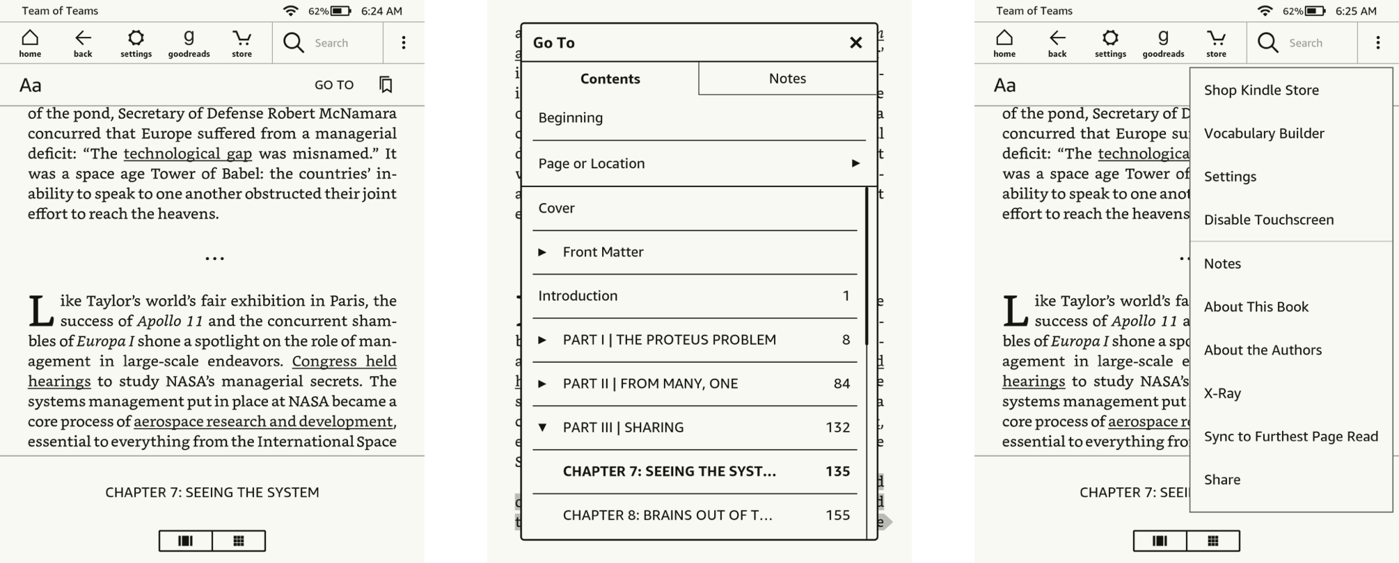
In fact, this is how these features are grouped in the iOS and iPadOS Kindle apps.
Navigation menus within a book in the Kindle for iPadOS app. The screen on the right shows the contents of the “hamburger” menu.
The Windows and macOS versions of the Kindle app (which are very similar from a structural perspective) feature a dedicated “Go To” menu. The “sync to furthest page” feature has a dedicated button, and it’s located next to the “Go to” menu.
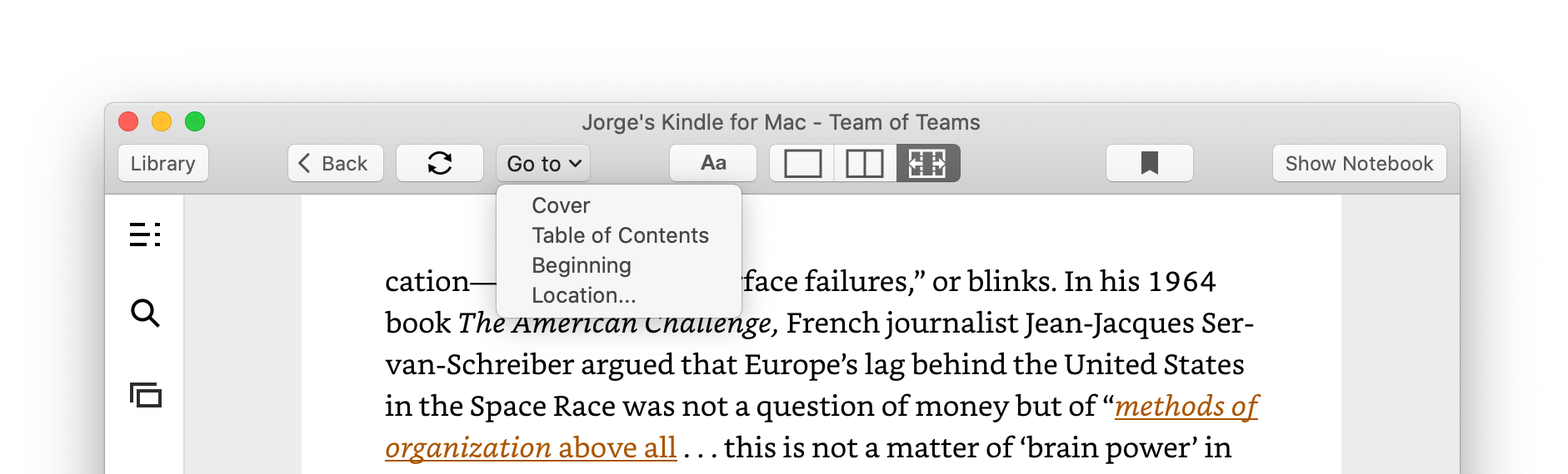
Navigation menus within a book in the Kindle app for macOS. Note the dedicated “Sync to Furthest Page Read” button next to the “Go to” menu.
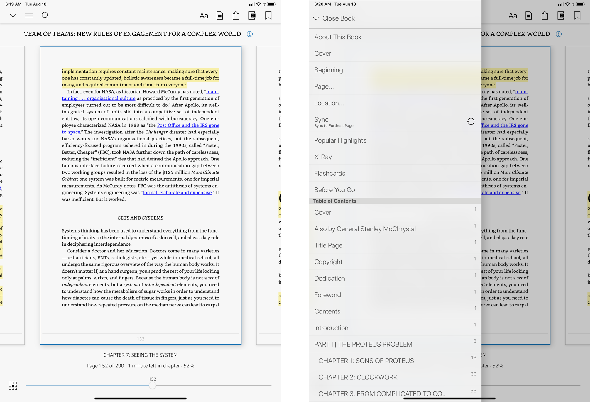
However, the “Sync to Furthest Page Read” feature is in a different location in the dedicated Kindle e-ink readers. Instead of being grouped with the book-content navigation features, in these devices, “Sync to Furthest Page Read” is in a generic menu alongside seemingly unrelated features such as “About the author” and “Share.” This menu — which is signified with a vertical ellipsis — is also present at the library level, where it shows a different set of options. Note that the e-ink Kindle devices also have a dedicated “Go To” menu, which lists the book’s table of contents and user notes, but “Sync to Furthest Page Read” isn’t close to this menu.
Navigation menus within a book in a dedicated Kindle device. The middle screenshot shows the contents of the “Go To” menu. The one on the right shows the generic “vertical ellipsis” menu.
So, three different platforms that share the same feature set but present it within very different structures. I’ve chosen to focus on “Sync to Furthest Page Read” because this feature is especially useful for people such as myself who use Kindle in more than one device. If there is one feature that should be located consistently between platforms, this is it. I’ve used Kindles concurrently in multiple devices for many years, and I still make the frustrating mistake of looking for “Sync to Furthest Page” read in the “Go To” menu on my Kindle Oasis. There’s a lot to be said for maintaining structural coherence across a family of products.