The architecture of information:
Digital experiences are changing our understanding of physical environments. Google Maps gives you the ability to walk around a new city as though you’d known it for a long time. And should you develop a sudden hankering for ice cream, Yelp allows you to locate the nearest gelateria. The most noticeable change comes from layering information on the environment. For example, when trying to decide between two neighboring restaurants you’re no longer constrained to judging them solely by their appearance; you can also peruse their reviews in Yelp. Restaurant A has four-and-a-half stars, whereas restaurant B has three — A it is!
The number of stars is information about the place. You won’t find it in the physical place itself, but in its representation in an information environment which you access through your magical pocket-sized slab of glass. We’ve grown used to these augmented interactions with physical space, and mostly take them for granted. But recently I had one such interaction with an app I hadn’t used before, and which stood out to me for 1) its clarity of purpose and 2) the degree to which that purpose changed the experience of the place. I’m referring to the Disneyland app.
My family and I visited Disneyland a few weeks ago. We hadn’t been in five years, and the Disneyland app was one of the novelties since our last visit. The app presents a map of the Disney theme parks. As such it mostly replaced the parks’ old (and sometimes beautiful) paper-based maps. Thanks to the phone’s sensors, the Disneyland app makes it easy to figure out where you are, where to go next, and how to get there. But the app adds an additional key piece of information to the experience that can’t be had with paper-based maps: attraction wait times. Over every representation of an attraction in the park, you see a little callout that indicates how long you’ll have to wait in line to experience that ride or show:
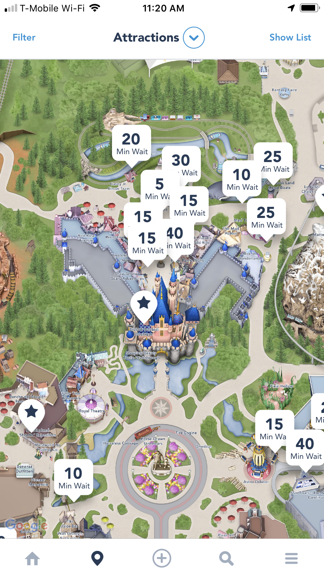
This piece of information is always available at all levels of zoom in the map. It’s the definitive element of the experience: in these maps, attraction wait times have the highest visual priority. As a result, wait times become the defining factor in sequencing the exploration of the park. The apps preferred answer to the question “What should we do next?” is always “Whatever is closest that has the shortest lines.”
This is an interesting choice that recalls the park’s old ticket levels. A long time ago, each Disneyland attraction required a separate ticket. Not all attractions used the same tickets; there were several levels ranging from A to E. “E-tickets,” such as the Haunted Mansion, were the most popular and desirable. These were considered the park’s premium attractions; their tickets were worth more than the others. This economic scheme influenced how visitors experienced the park. Ticket “coupon books” only included a limited number of E-tickets as compared to the lower denominations. Guests could buy more tickets inside the park, but having a limited number of the various level tickets affected choices. (I remember visiting Walt Disney World when it had a similar scheme, and hearing things like, “let’s visit this ride next, we have to use up our C-tickets.”)
The Disneyland app creates a similar economy by making attraction wait times the key informational element of the experience. When you’re trying to decide between two rides, knowing you’ll have to wait 65 minutes in line in one versus 15 minutes in another could be the key factor in your choice. (It was for my wife and me. Children get very cranky after waiting in long lines all day!) Our choosing to go on the ride with the lower wait times would contribute to slightly increasing that ride’s wait times and lowering the wait times for the more popular rides. I don’t have data, but my expectation is that this would help even out wait times throughout the park.
That is, of course, if all other things are equal — which they aren’t. The Haunted Mansion is a much more elaborate and compelling experience than Dumbo the Flying Elephant. Also, some rides have higher throughput than others. So the choice of riding one rather than the other doesn’t come down solely to which has the shortest waits.
That said, for someone like myself, who knows Disneyland very well, having this extra bit of information made the experience of visiting the park much better. In our two days at Disneyland, my family and I experienced more of the park than we’d ever been able to before. We also had more fun, since we spent a lower percentage of our time there in queues. But I wonder about the effect on folks who are less familiar with the parks. Will the emphasis on wait times drive them to prioritize less popular attractions over the park’s highlights? Adding feedback mechanisms to a system influences the way the system works. In what unexpected ways does this app change the experience of visiting Disneyland?