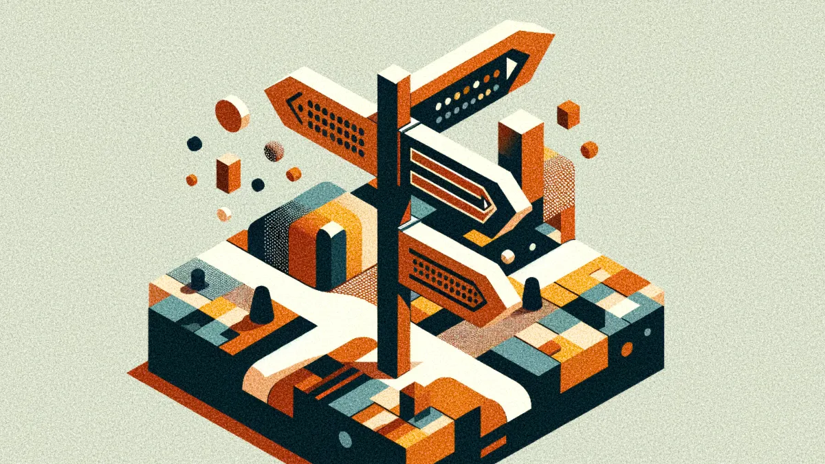
Why are so many large products so hard to use? In part, it comes with the territory: complex products require users to know more. But some products are harder to use than necessary. Many are designed and developed by separate teams working on different parts of the system, each making independent choices. Often, the result is inconsistent terminology.
The problem is exacerbated with multiple products in the mix. As successful organizations grow, they develop new offerings internally or expand through acquisition. In so doing, their portfolio becomes more complex. Suddenly, users must deal with common features and functionality, such as settings screens and login processes, that use different processes and labels.
Taken as a whole, these terms constitute an ontology: a particular set of meanings specific to that product or portfolio. Users know that words mean different things in different contexts. By carefully choosing terms, designers can make even complex UIs can feel natural and cohesive. But when terminology runs amok, trouble ensues.
Consider two complementary products. Product A refers to login details as an “account.” When interacting with that product, you see a label that says, “Login to your account.” This label communicates two conventions:
- In this product, your login details are called an “account.”
- Here, “login” (note the compound term) is something you can do to your account.
This example rests on familiarity: both “account” and “log in” are industry standards for this concept and action. But neither of these terms is inherent in the technology; like most of what we see when interacting with computers, they’re metaphors.
Obviously, your goal is consistency. You’ll confuse users if you refer to login details as an “account” in one part of the system and “user profile” in another. (It’s okay to use both phrases if they mean different things; “user profile” might refer to their profile picture while “account” refers to their username, password, and 2FA details.)
Aligning terminology within one product is challenging enough. But imagine what happens when a second product enters the picture. Product B is complementary to Product A but was developed by a competitor. Instead of “account,” Product B uses the word “profile” to refer to the user’s credentials in the system.
Because they’re complementary, some customers of Product A also use Product B. They cope with the cognitive dissonance because they know both products are developed by different organizations. But what happens if Product A’s organization acquires Product B? Now, the two sit alongside each other in the same portfolio. Since they’re owned by the same organization, users wonder why they operate differently.
Remember, what matters is what’s going on in users’ minds. Under the hood, all these things might be stored in the same database table. But users will perceive them differently if they have different names. The problem isn’t how things work but how they’re presented.
In situations like these, the acquiring company will often modify Product B so it looks more like Product A. But the change is skin-deep: colors, layout, typography, logos, etc. This is an important step, but further work must be done to align the underlying semantic structures and make the experience coherent.
Unfortunately, this is expensive. Redesigning a product’s aesthetics is like Botox: something you can do as an outpatient. Redesigning the system’s semantic structures is like major plastic surgery: it requires general anesthesia and cutting into bone. As a result, organizations delay it. Over time, the system enters an uncanny state where UIs look cohesive — with similar layouts, colors, fonts, logos, etc. — but are rife with semantic misalignments.
These inconsistencies make products harder to use. Users must remember how things are done differently in different parts of the system, adding to their cognitive load. Onboarding and day-to-day usage suffers. Sales processes take longer, support and training costs rise, and customer satisfaction plummets. In short, synergies are squandered to reduce redesign costs.
If the organization waits too long to fix these issues, it accrues what I call ontological debt. An analog to this is technical debt: consistently choosing to add new features rather than fix issues that emerged in previous iterations. This approach leads to problems down the line: a tangled mess to untangle later (hopefully by somebody else.)
Technical debt is demonstrably true for complex codebases. Something similar happens to the system’s semantic environment. If you introduce idiosyncrasies (an inevitable side effect of growth,) over time you’ll have a frustrating system that feels like what it is: a hodgepodge of parts made by different teams that haven’t communicated with each other.
Obviously, you want to avoid this. The first step is recognizing the problem. Design and research teams are often aware of the situation: site and search analytics can offer hints and user interviews provide firsthand reports. Support teams also get feedback from frustrated users.
But sometimes, internal teams aren’t aware of misalignments. I’ve been in projects where different teams use the same terms throughout and eventually realize they mean slightly different things. These realizations often come in redesign workshops where everyone’s in the same “room’ for the first time. (This is one reason why information architecture is a useful MacGuffin.)
So, what can you do about ontological debt? If your organization is buried in it, you must pay it down. This means redesigning (at least) parts of the system. But you can’t start with screen-level design. Instead, you must start with a model — in this case, a conceptual model of the whole system, including functionality shared between products. The idea is to nail down the key concepts users will encounter as they interact with the system.
All products, whether intentionally designed or not, have a such a model. It defines specific names for product features and the relationships between them, which allow users to accomplish tasks. It’s the “source of truth” for portfolio-wide concepts. What do we call a user account? Is it an “account”? If so, what happens if it’s a bank that provides users with bank accounts? Potential confusion arises.
You must address the model. But even though it’s a system-wide artifact, you shouldn’t attempt to redesign the entire portfolio in one go. A better approach is to start with one product while keeping the big picture in mind. This “T-shaped” approach means that you’ll deal with particulars while working on universals. It keeps the model grounded in reality. With a solid initial model, you can redesign other products and features to align them. You’ll tweak the model as you go.
As you may have guessed, this isn’t a project but an ongoing initiative. It’s a complement to design systems: both aim to bring consistency and coherence to the portfolio. The difference is that design systems focus on UI components, aesthetics, tone of voice, etc., whereas conceptual models focus on semantics.
Someone must take on the responsibility of evolving the model long-term. This role sits alongside others responsible for system-wide coherence. (E.g., the design system.) Again, the scope is portfolio-wide, even though particular UI interventions happen at the product or feature level.
Of course, this assumes that the organization is willing to fund such work. It’s a tall order: the benefits of system-wide coherence are harder to quantify than those of new features. UI rollout also happens in slower cycles; it might take a year or two before things start to improve.
In other words, paying down ontological debt is a leadership challenge. It mostly falls on product and design leaders, with support from the C-suite. But one way or another, someone must address this issue. Organizations grappling with ontological debt squander opportunities for alignment — not just in the UX, but internally as well.
Ironically, ontological debt is a good problem to have. Only growing organizations accrue ontological debt. But they must pay it down nonetheless. It’s a symptom of internal misalignment that causes users pain — and it becomes harder to address the longer you wait.