A version of this post first appeared in my newsletter. Subscribe to receive posts like this in your inbox every other Sunday.
Amazon links on this page are affiliate links. I get a small commission if you make a purchase after following these links.
Information architecture deals in abstractions. You’re looking to define semantic structures that allow people to find their way to information that can help them. Heady, intangible stuff! And although screen-level design plays a role, IA spans across the entire UI; no one screen captures the gist. So, IA is conveyed through diagrams.
But not just any diagrams: there are six types I return to over and over. They serve different purposes, but there’s enough overlap to confuse students. Let’s unpack them.
Conceptual models
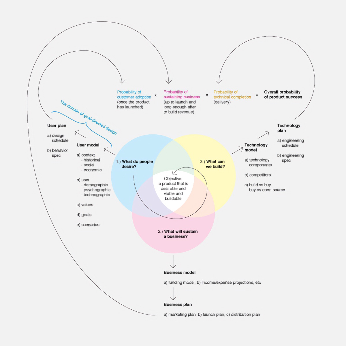
A conceptual model represents how ideas relate to each other. As a simple, abstract representation, it helps designers explore and communicate the system’s structure and explain to themselves and others how things work.
There’s no one “right” way to draw conceptual models. They can be represented as concept maps, flowcharts, bubble diagrams, and more. In IA, the intent is to represent structural relationships between concepts — categories, hierarchies, parts of the system, and so on.
Dan Brown’s Communicating Design includes a chapter on conceptual models; he’s made a PDF available for download. Jeff Johnson and Austin Henderson’s Conceptual Models: Core to Good Design is also a useful guide.
Content models
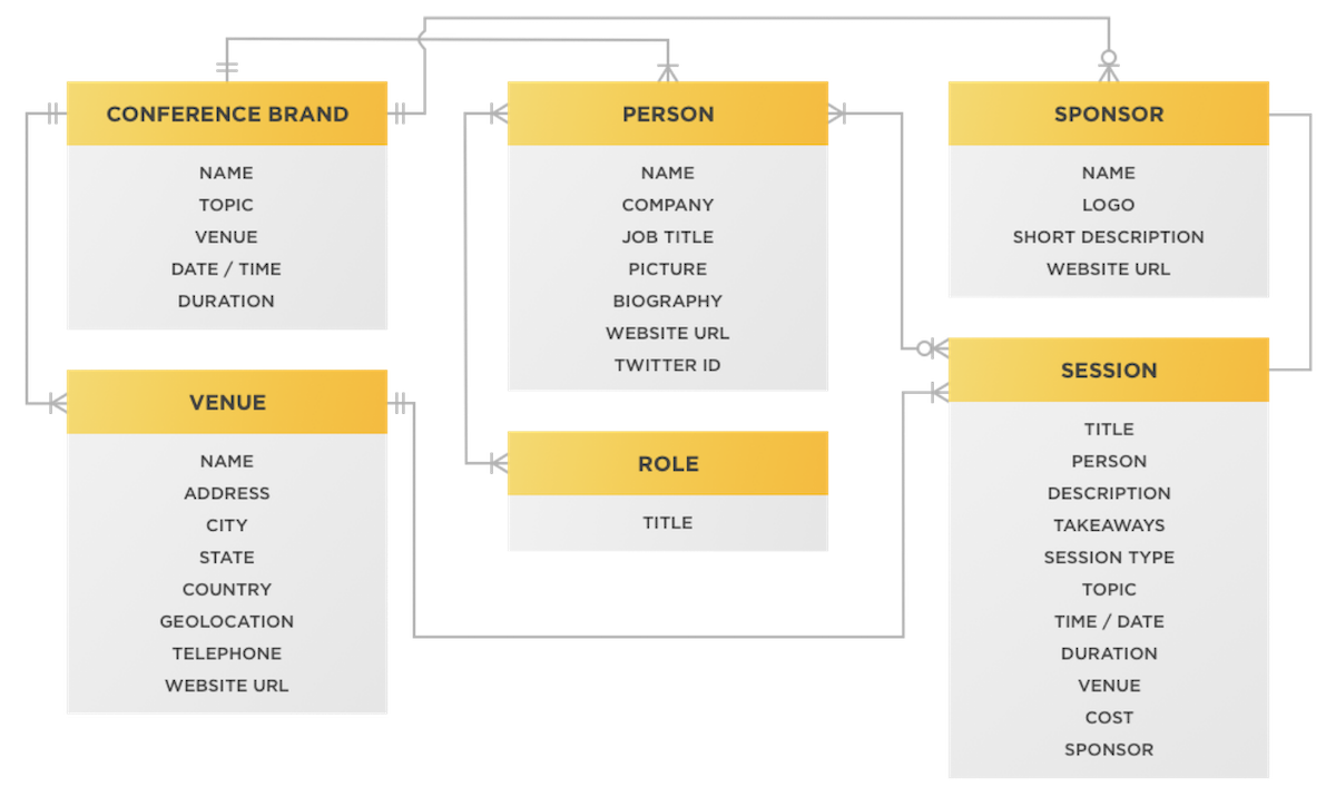
A content model represents the intended organization and structure of the content in the system. It includes the main content types and their attributes, plus relationships between content items. Content models allow you to ensure that information in the system is structured logically and supports user goals.
These content types can eventually inform content templates. For example, if you’re working on an online store, products in the store might be content types. Their attributes can include the price, the category to which they belong, customer ratings, and more. The final website will likely have a product page template, and it will show these attributes as UI elements.
Carrie Hane and Mike Atherton’s Designing Connected Content has solid examples; here’s a good how-to post.
Experience maps
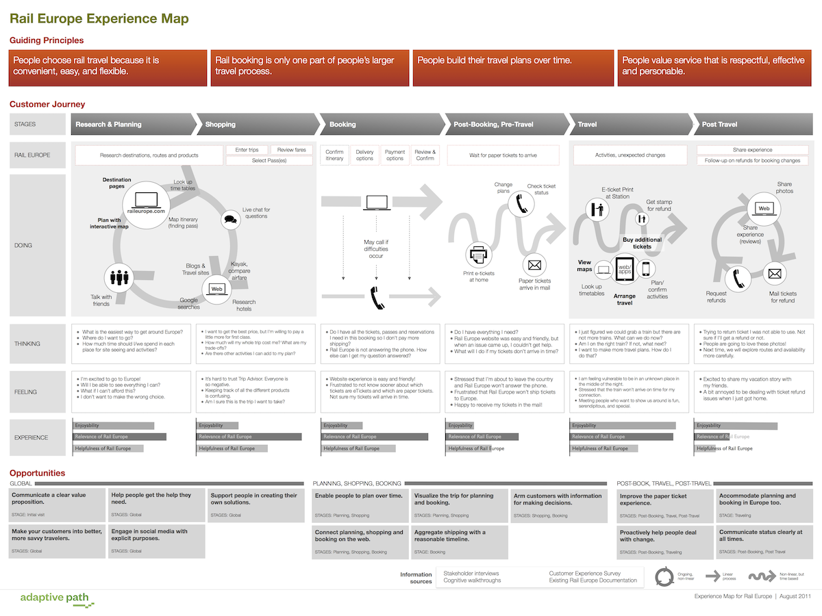
Experience maps depict the user’s experience as they interact with a service or product over time. They showcase touchpoints, emotions, and user actions as they move through various stages of their journey.
These maps give you a holistic understanding of how users engage with the system and identify potential areas for improvement. As such, they’re a powerful tool to inform design decisions.
A good resource to learn about these (and the following three) maps is Jim Kalbach’s Mapping Experiences.
Ecosystem maps
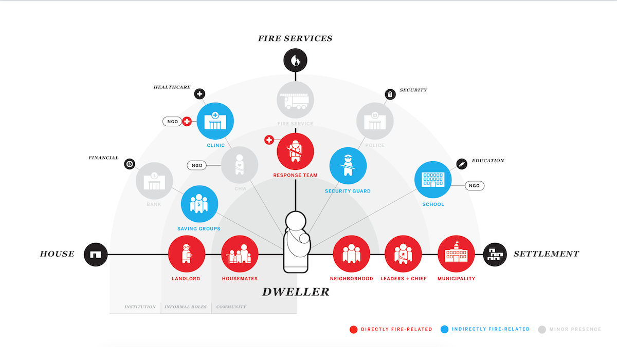
Ecosystem maps aim to represent the entirety of a project’s ecosystem: relationships between various actors, systems, and touchpoints in a broader context. I find them especially useful during the research stage of complex redesign projects, when I’m looking to understand all the parts of the system I’m designing.
For example, a complex website might actually be composed of several sites hosted in different content management systems, and featuring different navigation systems. It’s useful to have a big picture that lays everything out. Ecosystem maps do that.
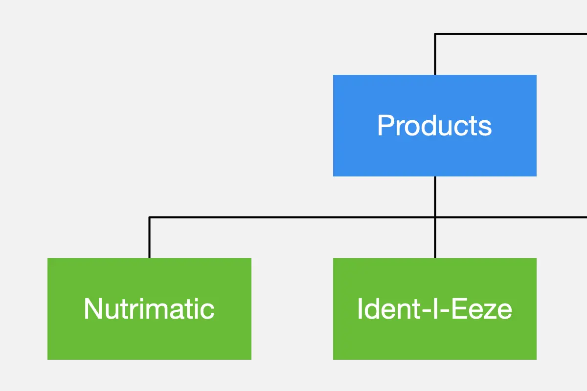
Site maps
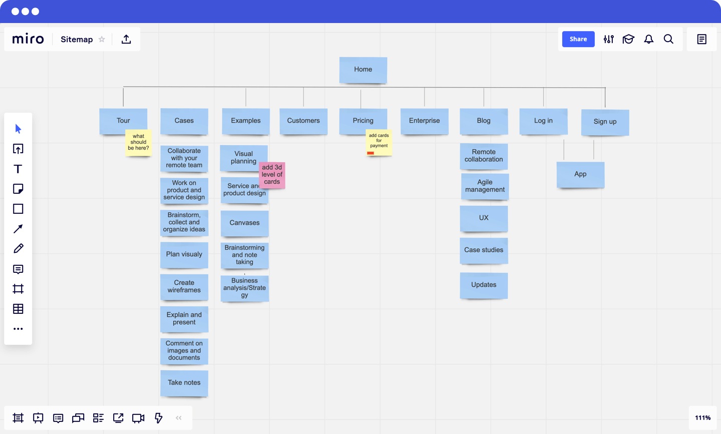
Sitemaps are undoubtedly the type of diagram most closely associated with information architecture. They are hierarchical representations of the intended structure of the system. The top-level items represent the main categories in the website or app. These will usually translate to navigation items in global nav bars.
Site maps are very useful in that they help you understand how things are categorized across the entire system. But remember that most websites and apps aren’t strictly hierarchical. Often, it’s possible to reach a page or screen via more than one path.
Flow maps
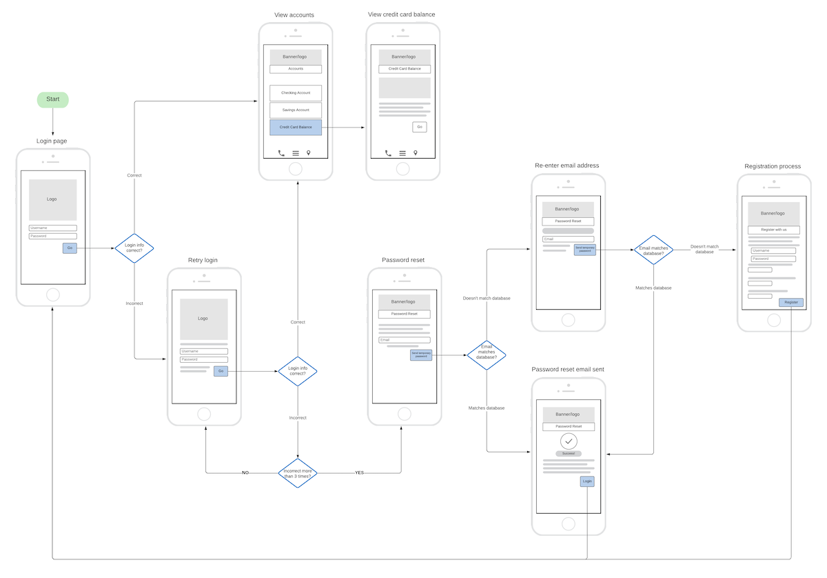
Like site maps, flow maps represent relationships between screens or pages in your app or website. But unlike site maps, the intent here isn’t to represent hierarchies or categories, but steps in a process. This is useful when documenting multistep processes, such as onboarding flows.
As with other IA artifacts, the focus here is on clear labeling and distinctions across all steps of the process. You want to ensure the sequence of steps is clear to end users. Getting a sense of how all the steps in the process work together will give you that high-level perspective.
Where do screens fit in?
Maps, models, and other diagrams are very effective for exploring and explaining abstract ideas. But there comes a point where you must explain how those ideas influence the user experience. You must also validate ideas with actual users. You can’t do any of this effectively using diagrams. That’s when prototypes — including abstract ones, such as wireframes — are helpful.
But most designers are more familiar with screen-level artifacts than with diagrams. And when exploring system-wide structures, diagrams are essential. Learn how to express your intent through maps and models, and you’ll be well positioned to improve your site or app’s user experience.