The architecture of information:
The Accidental Tech Podcast is one of my favorite shows. Every week, the co-hosts — three experienced developers — discuss the latest about Apple’s ecosystem. Episode 506 featured an intriguing segment about macOS Ventura, which debuted on October 24.
The segment highlighted a big change in this release: the new System Settings app. If you’ve used a Mac, you’ve likely interacted with its predecessor, System Preferences: it’s where you tweak various aspects of the operating system, ranging from desktop wallpapers to network connectivity and more.

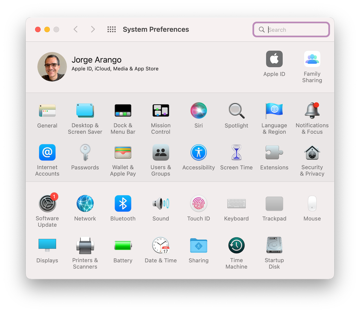
System Preferences as it appears on my Mac — which isn’t yet upgraded to Ventura.
This app is an important OS component, and Apple redesigned it for Ventura. Among other things, the app now features a navigation scheme inspired by iOS and iPadOS. It’s very different from previous versions.
To be clear, I haven’t yet used System Settings. (I’m waiting before upgrading for reasons unrelated to this change.) That said, the ATP segment suggests it has major issues. And this isn’t the first time users have called them out; in August, while testing a beta release, Jason Snell wrote,
The System Preferences app is a strange beast, as you might expect for a relic from the prehistoric era of Mac OS X. At its top level, it’s got a couple dozen icons to choose from – way too many–organized either in alphabetical order or broken into inscrutable categories.
But the two-dozen-ish icons (the exact number varies based on what kind of Mac you’re using and the peripherals attached) aren’t the only organizational problem: Click on one, and you’re frequently led to a preference pane that’s got its own navigational sidebar, tab groups, and buttons that bring up modal preference windows. It’s settings boxes all the way down.
In theory, System Settings should solve this problem. It’s using the iOS/iPadOS approach of a large scrolling list of setting types, which is less intimidating but no less confusing – on my Mac Studio, there are no less than 30 different items at the top level! That’s a lot, and in truth, the best way to approach either app is probably to use the Search box to find what you’re looking for.
There’s more, and you should read the whole piece. The gist: despite the fact that the current app has findability issues, and that many users will likely find the structures in Apple’s mobile operating systems more familiar, System Settings still has information architecture issues.
To my surprise, one of ATP’s co-hosts, John Siracusa, called it out explicitly in the show. He said,
If I’m given the job: we have System Preferences; it’s a mess we need to be redesigned. Give that to any web designer [and] they will design something better than this because they’ll understand the job. They’ll know they have to make it responsive. They’ll make it work well in the allotted space; maybe if you make the window wider, it will expand into that place.
The state of the art of web design could tackle this problem. It is basically an information architecture problem, which is a discipline that may be by a different name, maybe it is under the umbrella of UX these days, but IA used to be a big thing back in the early days of the web.
And the problem was, we’ve got this big company; we got to make a website. How do we organize that and make it tractable and able to serve the user’s needs? Because when someone comes to a website, they probably want to accomplish something. Do they want to find out what the hours of a restaurant [are]? Do they want to download the menu? Do they want to find out where the locations of our stores are? Do they want to shop for something and buy it? Do they want to find out information about our products? Do they want to find a contact address?
That’s just information architecture. And when faced with an entire website for a big company, web designers would come in, and they would figure it out. How do we organize this information? How do we present it to people in a way that they can navigate it, that they understand where they are, that they can find what they want, and accomplish their tasks?…
The web is not the place where all these disciplines came out, but it is the most recent and most closely analogous problem to organizing System Settings. When I look at this, I say any half-decent web designer would have done better at this.1
This is a more lucid explanation of information architecture than what I’ve heard from many UX designers. Siracusa nails it: design isn’t just a cosmetic intervention; it’s about asking deep questions about what users want to do with the app, what information will allow them to accomplish those tasks, and how it should be organized so they can do what they need to do easily and effectively.
He’s also correct in suggesting that people — if they know about it at all — associate information architecture with an earlier stage of digital design. (The nascent web.) But as this case suggests, application designers also benefit from considering the semantic structures that allow people to find and understand stuff.
Although I don’t have inside knowledge of what happened with System Settings, everything I’ve heard and read leads me to think its designers didn’t dedicate much (if any) time to modeling structures before drawing screens.
Apple is often lauded as an exemplar of good design. System Settings sounds like a misfire — and as Siracusa suggests, it may be due to a lack of IA. Steve Jobs said, “Design is not just what it looks like and feels like. Design is how it works.” This seems to be an example of what happens when you ignore this maxim.
ATP 506: Our Only SEO Is You — Accidental Tech Podcast
(The relevant segment starts at 1:14:52.)