The architecture of information:
Apple’s WWDC developer conference is underway. As with the last few years, they’ve posted a video keynote highlighting the latest developments. Among the usual flurry of software and hardware announcements, the company showed off a new information architecture for one of their less prominent apps: Home. (The relevant section of the video starts at 34:30.)
The Home app allows you to control smart home devices like lightbulbs, smart locks, cameras, etc. from your iPhone, Mac, or iPad. The current version shows devices grouped in lists of favorites by type. For example, mine shows three groups: Favorite Scenes, Favorite Accessories, and Favorite Cameras. This doesn’t scale if you have dozens or (Heaven forefend!) hundreds of IoT devices in your home. It’s ok if you’re just getting started but won’t work for more advanced users.
The new version changes this structure. In the video, Cory Wang, Producer, Human Interface at Apple, explained upcoming Home.app performance improvements. Then she said,
We also completely redesigned how you navigate, organize, and view accessories to make it easier to control your smart home. We’ve integrated your rooms and favorites into the main tab of the app so you can see your entire home in a single view. And we made sure it looks great whether you’re just getting started or have built out an advanced connected home.
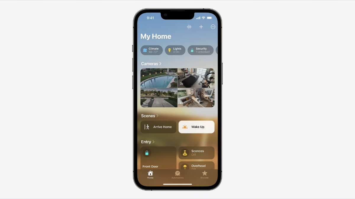
The redesigned Home app in iOS 16. Image: Apple
We’ve added new categories for climate, lights, security, and more, and an overview of what’s happening in each category right at the top of the screen. And categories are a great way to navigate within the app. When you tap on a specific category, you see all the relevant accessories organized by room. And more detailed status information.
A multi-camera view displays up to four cameras at once, front and center, and you can scroll to the right to see any additional cameras. We also redesigned tiles so that different accessories are more visually recognizable through shape and color. And with the new widgets in the home screen, it’s now easier than ever to see how your home is doing.
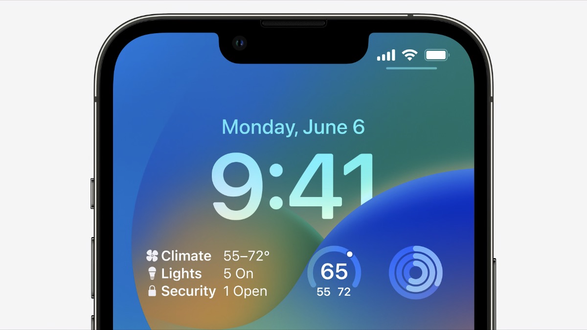
The iPhone’s homescreen in iOS 16, showing the new Home app widgets. Image: Apple
Of course, I haven’t tried any of this yet; public betas of the new OS come later this summer. But it looks like the app has been restructured to reflect the mental model most people have of their homes, with rooms as the basic category. Rooms are an additional level of hierarchy that allows the app to show more devices without overwhelming users.
The distinction between cameras and other accessory types is maintained, which is understandable since their output and controls are very different from other accessories. Accessory types are shown along the top of the screen, where they serve double duty as information widgets and category filters. So you can, for example, show only lights and nothing else in the per-room hierarchy.
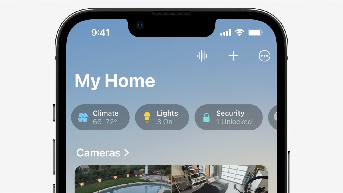
Details of the redesigned Home app, showing the accessory widget/tabs. Image: Apple
Note that Wang doesn’t call out information architecture per se; she talks of a new design for “how you navigate, organize, and view accessories.” But it’s clear she’s not talking about the app’s aesthetics; Home.app uses the same stock visual design as most of Apple’s other apps. The redesign is mostly organizational — i.e., IA.
Home isn’t my most-used app; I’ve gotten used to its quirky structure. (If not its slow performance, another area where Apple promises improvements.) That said, it’s good to see Apple improving its information architecture — and, especially, giving it this much attention in the keynote. I wish they did this for more of their apps.