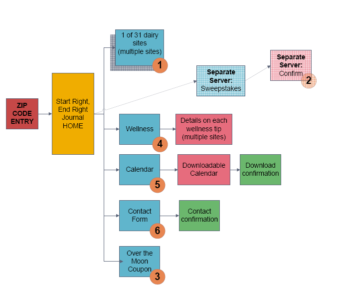
When people think of information architecture, they think of diagrams expressing distinctions and relationships between concepts, such as site maps or concept maps.

They understand that IA primarily explores high-level choices. That is, IA is concerned with these distinctions and relationships in the abstract — i.e., at the level of the system as a whole instead of at the level of individual screens.
UI-level decisions, including screen layouts, hierarchies, and typography — the stuff of visual design — seem too granular to be within IA’s remit. And yet, if you aspire to create findability, understandability, and utility, you must consider how people experience choices when interacting with the system.
A typical site map renders two “peer” items on the same hierarchical level, often appearing as contiguous boxes. The diagram doesn’t suggest which, if either, should have a higher visual priority on the final screen layout.
But often, one item should be more prominent. Perhaps the company wants to emphasize one line of products over the others, or one feature in the utility menu should be more immediately visible than the others. Abstract diagrams such as site maps don’t usually convey these nuanced distinctions. You only get to explore them through screen-level artifacts such as wireframes
There’s an inherent tension in wireframes. On the one hand, you want to suggest what users will see on screens. On the other, you want to avoid over-specifying visual design choices around typography, etc. But visual design choices (especially around things like font sizes and contrast) impact findability and understandability. So, where do you draw the line? (Pardon the pun.)
Personally, I avoid working at the wireframe level if I can. Instead, I’d rather explore these questions with high-fidelity sketches and then work with screen-level designers on screen mock-ups. This won’t work for every situation. But it’s feasible for the types of projects which I focus on, i.e., enterprise products and tools, many of which benefit from using established (or emerging) UI design systems.
Design systems obviate many subjective decisions about visual design, such as color and typography choices, allowing the team to focus instead on questions of layout, hierarchy, and semiotics. These decisions are closer to IA.
Bottom line: IA deals in distinctions and relationships, including hierarchies, between concepts. But these don’t just affect understanding and findability at the level of the system. Screen-level decisions matter a lot.
I’m not saying that people focused on IA should also do visual design. But I am suggesting that people who care about enabling findability and understandability system-wide should also care about where and how people interact with the system — whether that be screens, VUIs, etc.