The architecture of information:
Two recent news items about mainstream products improving the discoverability of their advanced search features. First up, Mahmoud Itani writing in XDA Developers:
We have discovered earlier that a Search @Username’s Tweets button is appearing on the latest (stable) version of the iPhone app.
This new button — located in the top right corner, next to the 3-dot menu — allows iOS users to dig through their own Tweets or any other account’s. When you click it, you get a search field where you can enter the term(s) you’re looking for. Once you hit enter, you will be taken to a screen similar to that of the existent search functionality. There the search term will change to From:Username Term.
The interface is simple. Twitter user profiles now include a search button. Tapping on this button leads to a search field that narrows search scope to that username’s tweets. This functionality already existed; what’s new is the search button in the context of the user’s profile that prepopulates the scope filter in the search field.
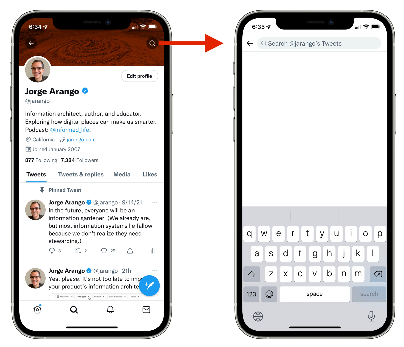
Twitter’s new user-specific search filter
Second news item: Jon Porter writing in The Verge:
Google is preparing to beta test new search filters in Google Drive, which will hopefully make it easier to find the exact file you’re looking for. Dubbed “search chips,” the feature adds a line of filters to the top of the Drive interface, letting you limit your search by things like file type, last modification date, or which other users are associated with a specific file.
As with Twitter’s change, this isn’t about adding new search features. Google Drive already offers the ability to filter search results by file type, owner, date modified, etc. However, the current UI hides these features under an “advanced search” button in the search bar. Many users might miss them because they don’t think to click on this button. (Its icon isn’t obvious.) I’m one of these people; I often have trouble finding documents in Google Drive and never remember to look at the advanced search options.
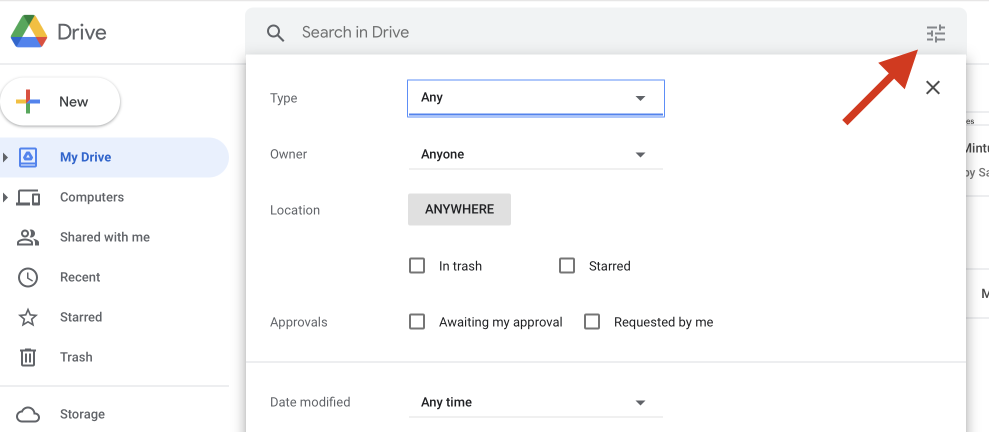
Google Drive’s current ‘advanced search’ UI
Every new element in a web page or app screen — label, button, navigation option — adds clutter. Features such as advanced search and metadata filters improve the findability of information at the cost of a slightly more complex UI. Having a single “advanced search” button on the page results in a less cluttered UI than having a set of dropdown filters. But the single button isn’t as obvious as the dropdowns. So, better findability and a simpler UI can be in tension. One way to address this tension is by exposing the advanced search controls in the context where they make the most sense.
The new Google Drive search interface makes advanced search easier to use by moving search filters to the top of the results page, where we’re more likely to look for them. This is an excellent context to show them since we often resort to advanced search when our first attempt fails. As with the new search button on Twitter profile pages, this is about adding better search and filtering affordances in the context where they make the most sense to users.
See also: Spotify’s “Your Library” Redesign
Twitter is making it easier to dig into others’ Tweet history on iOS
Google is working on a more user-friendly way to find files in Drive - The Verge