The architecture of information:
Facebook, in their newsroom blog:
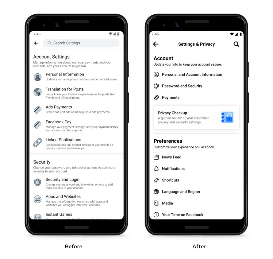
As part of our ongoing efforts to improve people’s experience on Facebook, we’ve redesigned the Facebook Settings page to make our tools easier to find. We’ve streamlined the layout, while keeping all the previous settings.
Whether it’s managing the ads people see, adjusting sharing settings, or curating an audience for posts, people shouldn’t have to think too hard about where to start. That’s why we’ve reduced the number of categories, and renamed them to more closely match people’s mental models. Settings are now grouped into six broad categories, each containing several related settings: Account, Preferences, Audience and Visibility, Permissions, Your Information, and Community Standards and Legal Policies.
We’ve also relocated several standalone settings so that they live alongside related settings. For example, the News Feed setting, which previously lived in a smaller category of its own, now lives under Preferences where it is grouped with similar settings. We’ve also made some improvements to the settings search function, making it easier to find the settings you need if you don’t know the exact name or location of the setting you’re looking for.
 Image: Facebook
This is a great example of how revising a product’s information architecture can make it easier to use. Alas, nowhere in the post does Facebook mention the phrase “information architecture.”
These changes aren’t just (or even mostly) about “[streamlining] the layout” — they’re changes to the structure and labeling of settings options. That’s IA.
How We’re Making it Easier to Navigate Settings - About Facebook (Via The Verge)