The architecture of information:
Apple recently launched a new “Store” page on their website.
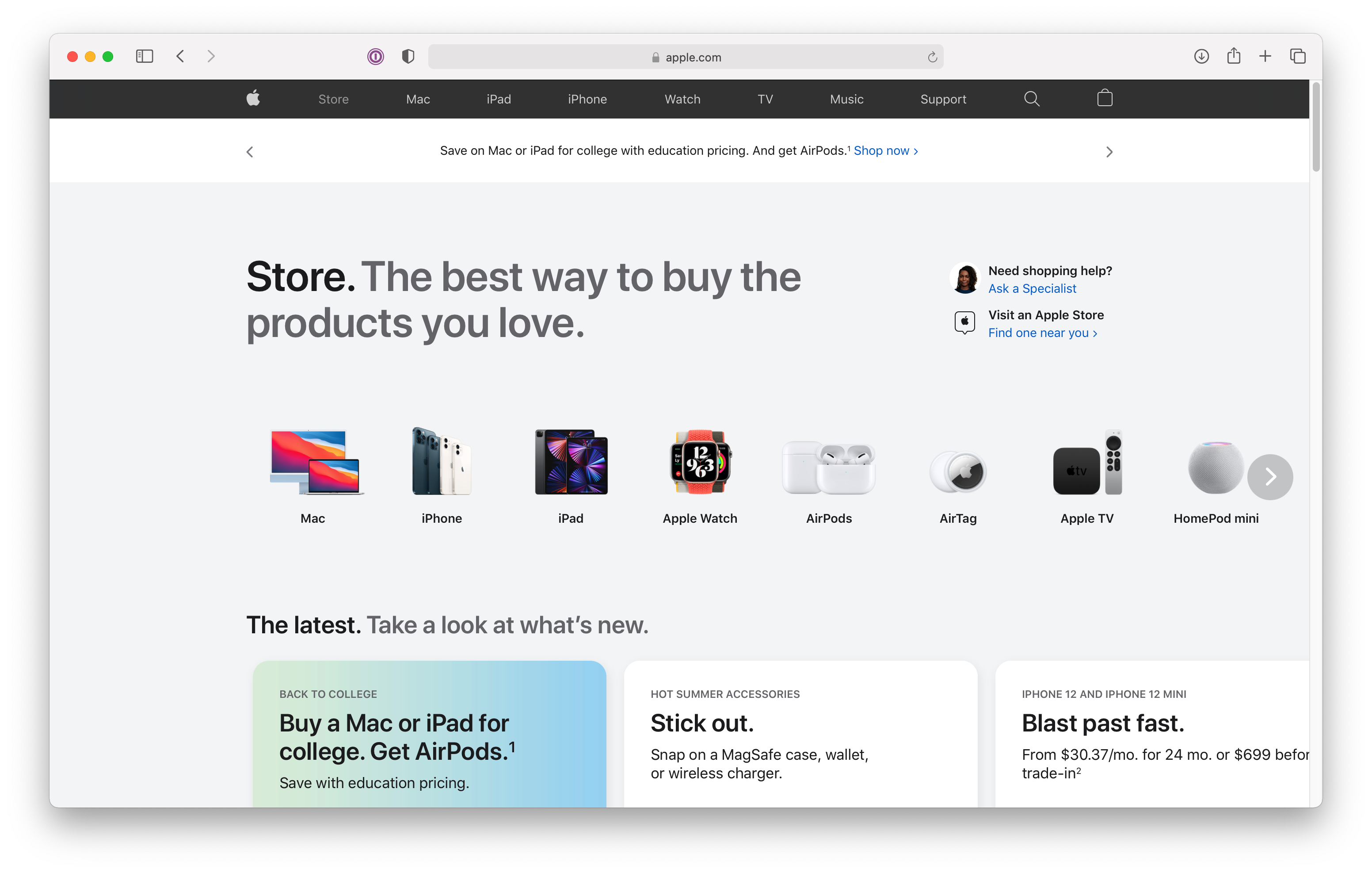
The new Store page on apple.com
Of course, Apple has been selling products online for a long time. But the previous version of the site didn’t feature a top-level store page. Instead, the entire site was treated as a store, with Buy buttons prominently featured on product pages.
As Nick Heer points out, one (unintended?) consequence of this approach was that it downplayed secondary and tertiary products:
While every section of the then-new site featured an “Accessories” page, it often felt cumbersome to find some of Apple’s oddball products, which became particularly noticeable when HomePods and AirTags were launched. There was a lot more hunting around than was required in the iOS Apple Store app.
This is because Apple’s primary products (e.g., iPhones, iPads, Macs) were featured items in the site’s primary navigation bar, but accessories such as AirTags and AirPods weren’t. The dedicated Store page puts all products on a more even keel, while still providing access to the primary products in the site’s main nav bar.
Heer also points out that we know Apple considers the new Store page important because it’s the first menu item after the Apple logo. When designing navigation bars, item order matters. The first item in the menu will have the highest priority, since it will be most visible.
In their book Nudge, Richard Thaler and Cass Sunstein write about choice architecture. As they explain it,
A choice architect has the responsibility for organizing the context in which people make decisions.
The placement of items in relation to each other creates a context that changes how users understand available options and which they prefer over others. All possible configurations entail tradeoffs; giving priority to some items over others will favor some outcomes over others.
Thaler and Sunstein illustrate the concept with an example: A school food service director wants to influence kid’s choices when eating at school cafeterias without changing schools’ menus. This implies affecting student choices through food item placement in cafeteria lines.
Students don’t choose what to eat in the abstract. Instead, they perceive some options as more desirable than others depending on how accessible they are, what sequence they’re presented in, lighting conditions, etc. Whoever determines the order of items in the cafeteria line influences what kids eat.
There isn’t a single optimal order: some variations will drive for student health (i.e., by prioritizing healthy choices) while others will drive school profits. Determining the “right” order requires clear values. In placing the Store option first in its primary navigation menu, Apple tells us something about its values and the expected primary function of its website.