Many SaaS (software as a service) companies make a distinction between their “product” websites and their “marketing” websites. The former refers to the service itself, the tool or application that customers use. The latter refers to the site where customers learn about the service before they sign up. Although the audience for both is often the same, product and marketing sites serve different purposes. As a result, it’s not unusual for these sites to have different navigation structures. Few companies illustrate this distinction as well as Mailchimp.
Let’s start by looking at Mailchimp’s marketing website. Here’s the site’s primary navigation bar:

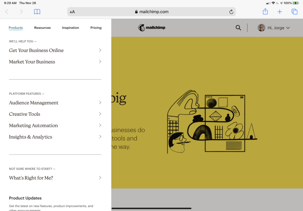
Clicking (or tapping) on any one of these top-level navigation elements (except Pricing) reveals vertical menus, which swipe in from the left edge of the screen:
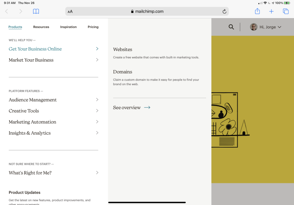
Selecting one of these menu items reveals a second level of menus:
These are the mechanics of navigating Mailchimp’s marketing site. Let’s also look at how the site is structured — the main distinctions it asks users to understand:
- Products: the company’s offerings, framed in terms of the value they provide to users (“We’ll help you…”) and features of the Mailchimp platform.
- Resources: content meant to help users get started or become productive with Mailchimp, including documentation, examples, access to relevant third parties, etc.
- Inspiration: ancillary content such as podcasts, blogs, videos, workshops, etc.
- Pricing: leads to a page that does more than explaining mere pricing: it also lays out the company’s business proposition in terms users can understand (and that hopefully relate to their needs.)
There are three other elements in the site’s primary navigation bar: the company’s logo, search button, and the “user” menu. (If users are logged in; if they aren’t, they’re shown buttons for logging in and signing up instead.) The logged-in user menu isn’t revealed with the left-to-right swipe of the main navigation elements, but is instead presented in a more traditional dropdown menu:

Note the View Dashboard button. This is where the (logged in) user can cross over to the product site.
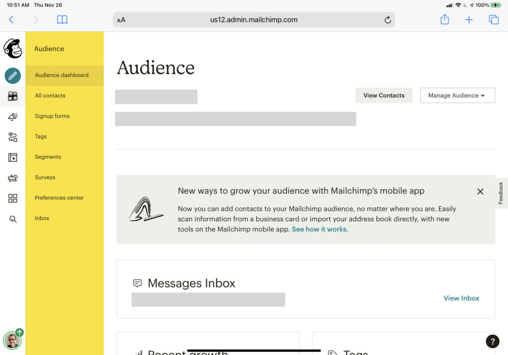
This marketing navigation system is standard fare; I’m sure you’ve seen lots of site structures like this one. Mailchimp’s product navigation, on the other hand, is unique — and very different from the one in the company’s marketing site. Here’s what you see after you click on that View Dashboard button:
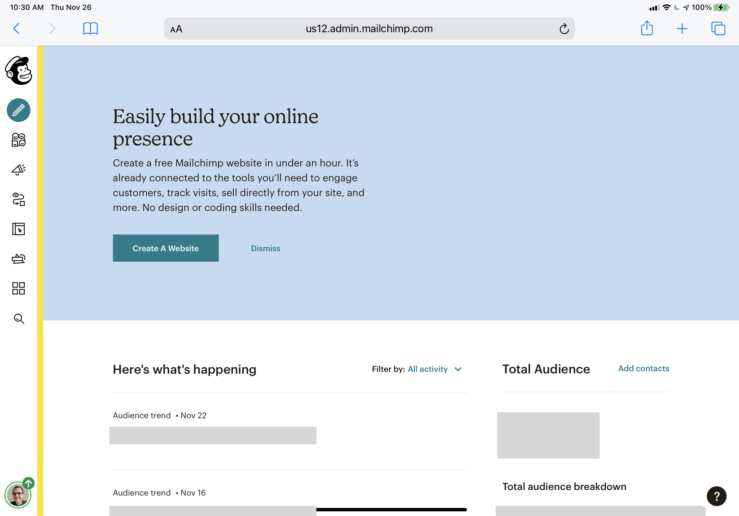
The first thing to note is that the navigation bar is no longer laid out horizontally across the top. Instead, we’re shown a tall and narrow vertical bar aligned with the page’s left edge. A thin vertical yellow bar draws our attention to this navigation bar.
This navigation bar starts with the Mailchimp logo. Unlike the logo in the marketing navigation bar, this instance doesn’t include the Mailchimp wordmark. In fact, none of the items in this navigation bar have obviously visible labels. Hovering the pointer over the icons reveals what they are:
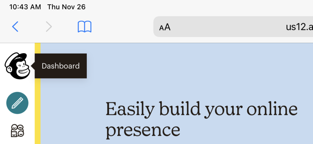
This mechanism is essential because most of the icons in the product navigation bar are somewhat obscure.
(Perceptive readers may have noticed I’ve been sharing screenshots from my iPad in this post. I’m using an Apple Magic Keyboard with my iPad Pro, which includes a trackpad that makes mobile Safari behave more like a desktop browser. For touch-only interactions, the labels appear on the first tap and the menu appears on the second tap. This additional interaction adds a bit of friction to the experience on large-screened mobile devices. In devices with smaller screens, Mailchimp’s product navigation structure collapses to a hamburger menu that shows labels next to the icons by default.)
These are the labels for each icon in Mailchimp’s product navigation bar:
- Dashboard
- Create
- Audience
- Campaigns
- Automations
- Website
- Content Studio
- Integrations
- Search
- Profile
Look again at the screenshot above. Do these labels come to mind when you look at those icons?
As with the marketing navigation system, clicking (or tapping) on each icon reveals a vertical menu:
Note the yellow background, which evokes the narrow vertical line that first drew our attention when we first saw this navigation system.
Helpfully, these menus start with the icon’s label. The options in these menus are all “places” within the product. But unlike the marketing site, people don’t visit these places to learn about the system but to do things: create a survey, write an email, configure steps in a customer journey, etc.
Still, being able to use any system effectively requires that the user form an accurate mental model of what each option does and how it works. Navigation isn’t just a means for moving around; it also helps users grok the main elements of the system, how they relate to each other, and how these relationships can help users get things done.
While these elements may be labeled using ordinary words, the words carry particular meanings in this context. As such, these distinctions aren’t as obvious as the ones in the marketing site. Revisit the list I transcribed above. Do you have a sense for what they do just from looking at the list?
To wit, “audience” and “campaign” are central elements of Mailchimp’s platform, and they have particular meanings in the system. Users can’t effectively work with this system if they don’t understand these meanings. These concepts become clearer as users move around in the system, getting a sense for the distinctions-within-distinctions that characterize multi-level navigation structures like this one.
I suspect the absence of recognizable icons and visible labels in the first level of Mailchimp’s product navigation structure slows down this learning process. The first time users see this navigation structure, they must hover over all the icons and hold their names in short-term memory to get a sense of the whole.
After a while of using the system, even the most obscure icons acquire meaning in the user’s mind. For example, after several months, I’ve come to associate the third icon in Mailchimp’s product navigation with “audience” and the fourth (the megaphone) with “campaigns” — the two parts of the system I use most. However, I still don’t remember what some others do. I explored these other parts of the system while preparing to write this post and found useful features that I can use for my business. I wonder if I’d discovered them sooner had they been labeled more clearly.
It’s worth noting that unclear labeling isn’t a problem with the marketing site; its primary navigation labels and their underlying menus go to great lengths (and a relatively large amount of screen real estate) to explain themselves to the user. This effort is understandable: visitors to the marketing site are fickle; they must understand the main points as quickly as possible. You can’t assume visitors to the marketing site will stick around to expend time and energy learning the system.
On the flip side, users of the product already expect a learning curve. They want to get things done, and once they’ve learned the system’s conceptual model, navigation shouldn’t be in the way. So, the tradeoff is between a more obtrusive and somewhat redundant navigation system and one that aims to occupy as little space as possible and stay out of the way until the user needs it.
Apart from aesthetic considerations — i.e., color and font choices — Mailchimp’s marketing and product sites are very different from each other. They only share two navigation elements in common: the company logo, which in both cases leads to each system’s version of “home,” and search, which presents different interfaces on either site. Everything else — including, as I’ve pointed out, the navigation bar’s position and orientation on the screen — feels very different.
These differences may be appropriate, given that both sites serve different purposes and create very different contexts. However, given my challenges with using the product site, I wonder if they may be too different. Perhaps clearer labeling (as evidenced in the marketing site) would make the product site easier to use. In any case, the sharp contrast between these two navigation systems makes for an interesting case to study.