From a report on The Verge:
Starting [February 27], Spotify is rolling out a new look to its iPhone app. The changes prioritize universal icons and visual indicators over written words, which Spotify says makes the app a more accessible experience for users all over the world.
In other words, the app is ditching labels in buttons, and going only with icons.
As noted above, the objective is to make the experience more accessible globally. I’m taking this to mean that interfaces with few or no words on them are easier to translate into different languages than those that include words. But that’s a gain for designers and developers, not necessarily for users.
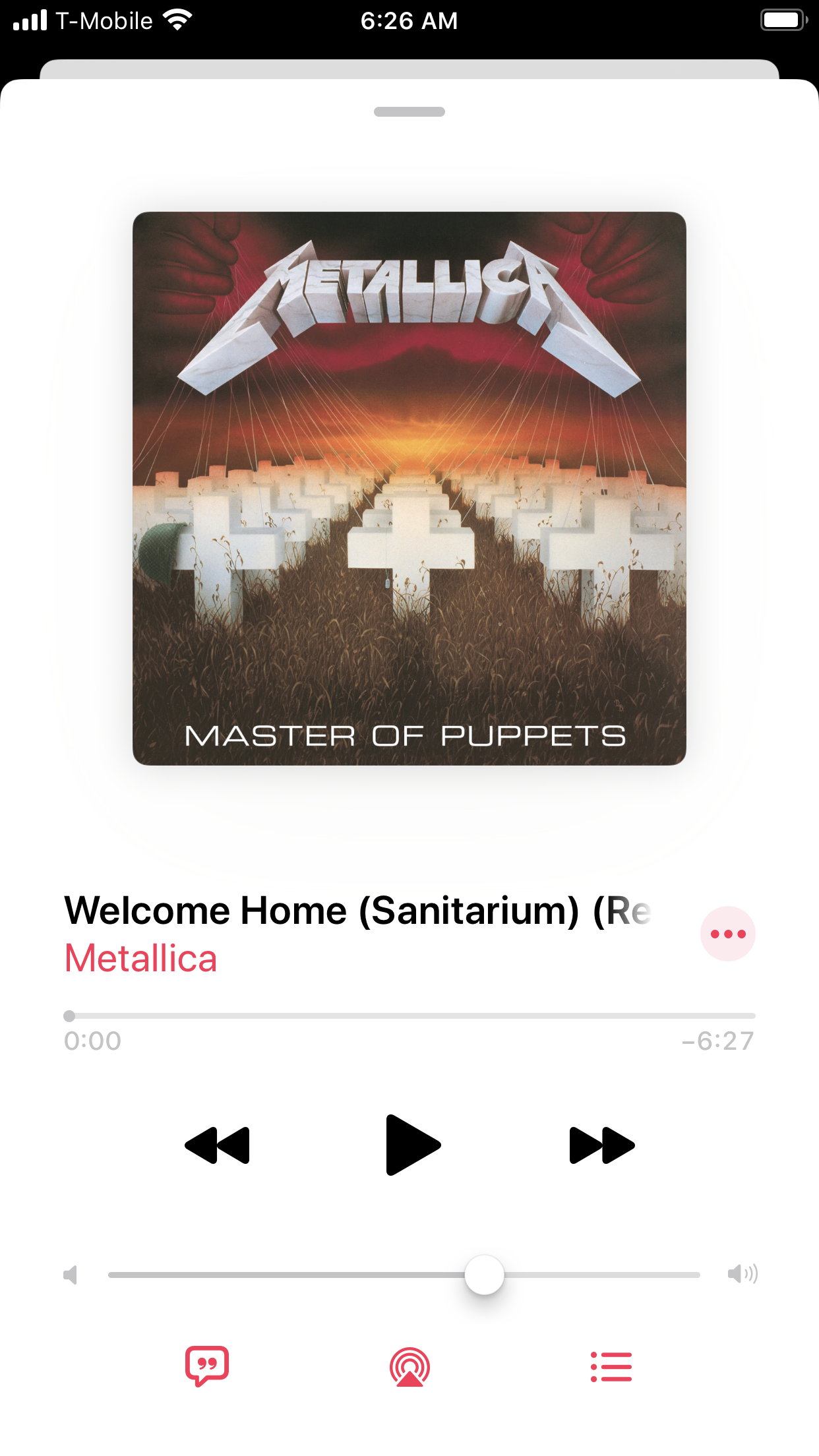
This label-less approach to buttons works best when working in a domain that already has rich iconography. Spotify operates in such a domain — i.e., music players. If you had to design an interface with buttons to play, pause, go backwards or forwards, you’d have a clear starting point; we’ve had devices with buttons that accommodate these behaviors for a long time. My preferred music player (Apple Music) also has label-less buttons for those actions:

Modern music-playing apps must also accommodate other actions that may not have well-known icons. For example, the video above highlights the user downloading a track to their phone. In the new Spotify UI, the button for this action shows a downward-pointing arrow inside a circle. Downloading tracks from the internet to local devices hasn’t been around as long as play/pause/rewind has. I’d bet more folks would get tripped up by such a button in the absence of labels.
Note in the video that some buttons in the new Spotify interface don’t have icons at all; they consist solely of labels. For example, the “Follow” button simply consists of the word “Follow.” When pressed, the label changes to “Following” to indicate the object’s changed state. This is a rich interaction that would be difficult to communicate clearly using only icons.
Spotify is rolling out a new look for iOS that ditches word-based buttons