Getting information architecture right is essential for successful UX, especially for large websites and complex products. But it’s not easy. For one thing, few people know what IA is and how to go about it. For another, IA is a team effort. The person leading the charge must keep everyone aligned. In this post, I’ll share a framework that helps me do it.
The main challenge is how communications happen in today’s work environments. Key stakeholders and collaborators learn what’s happening synchronously (i.e., in meetings) or asynchronously (via Slack or Teams.) In either case, they only get small glimpses of what’s going on with the project, often with the aid of a slide deck or spreadsheet.
Most of these artifacts focus on details: results from user interviews, a draft taxonomy, a site map, etc. And that’s the problem: too much focus on trees, not enough on the forest. What’s needed is a place where stakeholders and team members can see details without losing sight of the big picture.
In the ‘before times’ (i.e., pre-COVID,) teams would set up ‘war rooms’ for larger projects. These were physical rooms with a table and wall space where team members could post artifacts as the project progressed. If anybody wanted to see anything related to the project, they’d go into the room.
This is also where many project meetings happened. When meeting in the room, you could point to different artifacts to remind team members of what was said, or direct their attention a particular artifact. As a result, war rooms were an effective means for getting everyone aligned.
Moving the War Room Online
Of course, war rooms were rare even before the pandemic. Meeting spaces were always in short supply. Dedicating a room to a single project for several weeks or months only made sense for the largest or most critical projects. I only used a few war rooms in my career. They were glorious but scarce.
Anyway, those days are gone — and that’s okay! One of the pandemic’s silver linings is that it made online work more palatable. Most meetings now happen over Zoom or Teams. We share updates over email and Slack. We don’t need physical spaces to do any of it. As a result, it’s now easier and cheaper to set up a war room. Instead of a physical space, we use an ‘infinite canvas’ app such as Mural, Miro, or FigJam.
Whenever I start a new project, I set up one of these boards to be the ‘command center’ for the project. (I find the ‘war room’ metaphor both distasteful and inaccurate.) In the project kickoff meeting, I let everyone know that this board is where they can expect to see everything related to the project at any time.
The board is also the main ‘visual’ in meetings. Everything goes in there. New research insights? In the board. A list of competitors? In the board. Sketches of the new nav structure? You guessed it — in the board. After a few meetings, team members get used to the idea that this is where they can expect to see the latest on the project.
A Structure for the Command Center
Now, you may be thinking: surely, this board will be a mess after a few weeks. If everything related to the project goes in there, it’ll start getting cluttered and people will have a hard time finding stuff. Yes, that can be a problem. If only there was a way to make information more findable and understandable!
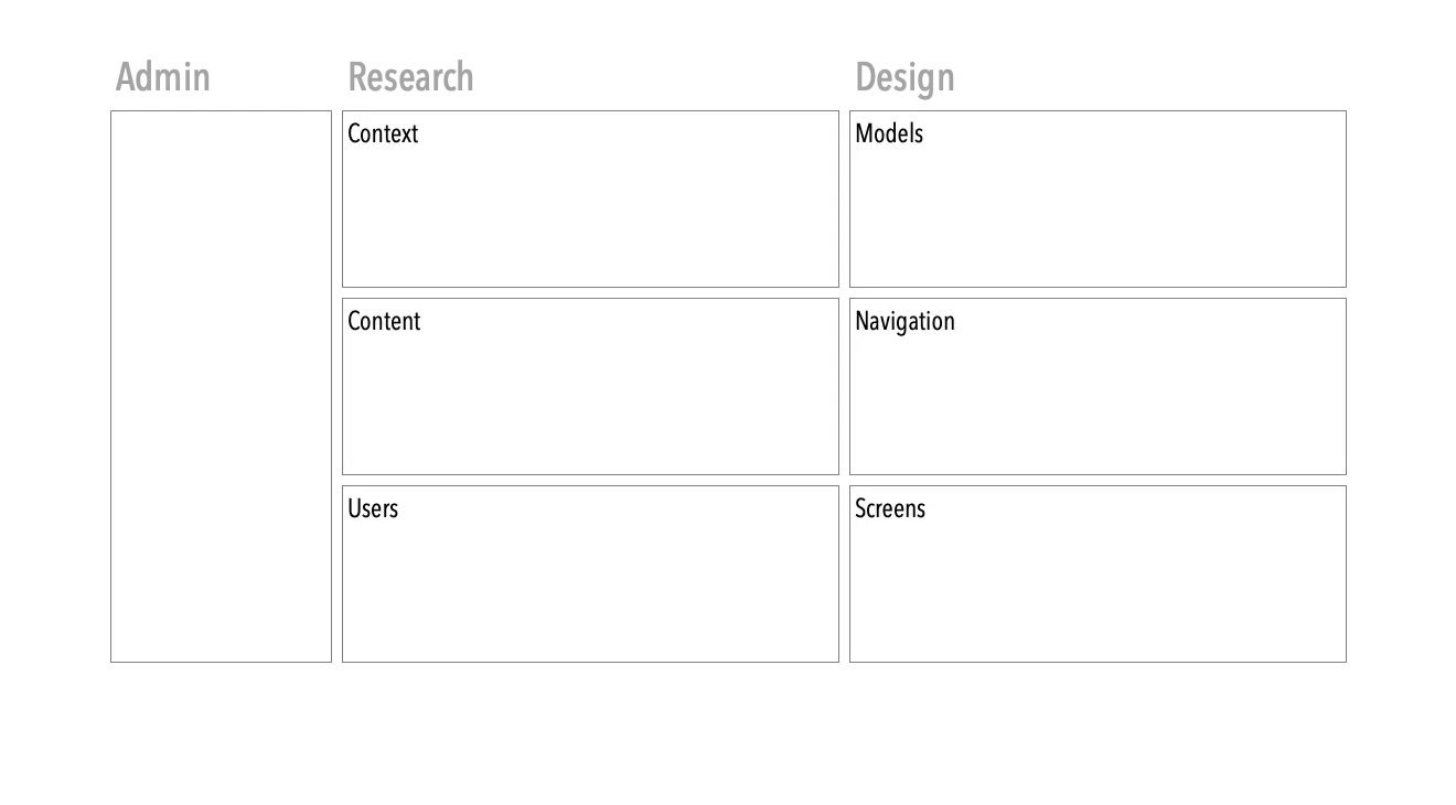
The answer, as you may have guessed, is information architecture. This isn’t a free-form board. That would be chaos! Instead, the board starts out with an intentional structure. After some trial and error, I’ve arrived at one that works well. It consists of seven regions divided in three columns.

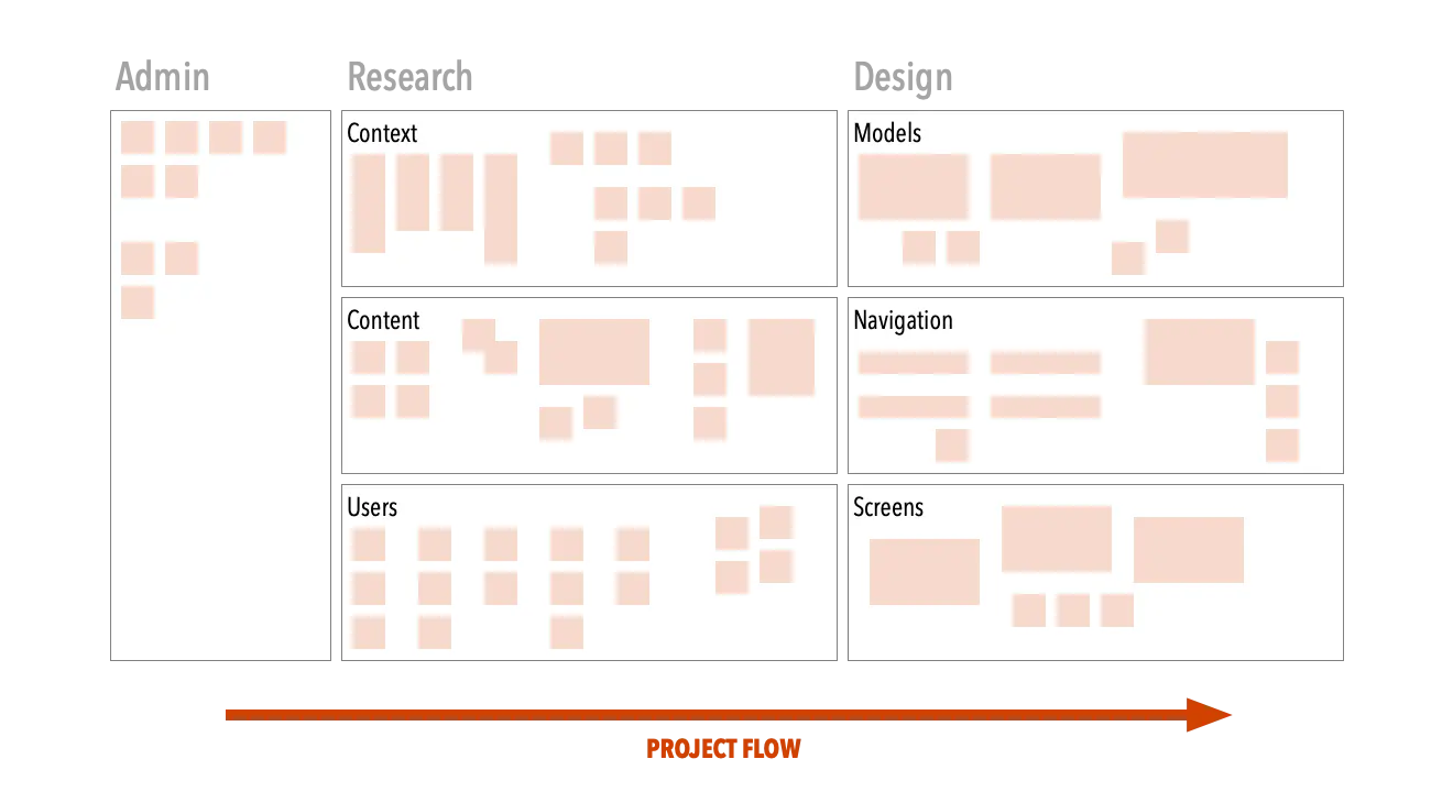
The first column is for administrative materials. Here, we capture information about the project itself:
- Key team members
- RACI matrices
- Schedules and milestones
- Outcomes from our premortem exercise
- Etc.
The second column is dedicated to research. It’s subdivided into three rows:
- Context includes what we’ve learned about the project’s business context, including competing products, infrastructure details, business goals, design principles, etc.
- Content includes stuff about system content: current site maps, content audits and inventories, any particular jargon or special terminology we’ve come across, etc.
- Users is where we add what we’ve learned from user research: interview highlights, demographic details, personas, mental models, etc.
The third, and last, column is dedicated to design artifacts. Whereas the research column captures what we’ve learned, this one captures what we create — that is, the information architecture itself. It, too, is divided into three rows:
- Models contains conceptual diagrams of how the system will be structured at a high level, including conceptual models, content models, proposed site maps, etc.
- Navigation includes sketches and wireframes of proposed navigation structures, including global and local nav bars, search interfaces, filtering mechanisms, etc.
- Screens is for capturing sketches and wireframes of screen layouts.
As work progresses, the framework gets filled out from left to right. First, we complete admin stuff, since that’s often known beforehand. Then, we complete the research column, before moving onto design. (That said, we’re flexible: if a good model emerges during the research phase, we immediately capture it on the design side.)

Rules for Using the Framework
This structure is a great starting point. But it won’t maintain itself. Left to their own devices, team members might add stuff arbitrarily. So I make a point to explain a few ground rules during project kickoff meetings.
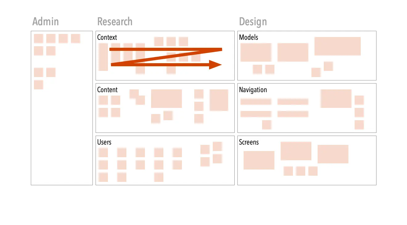
First, we add materials chronologically from left to right inside each section. For example, the first things we learn about users go on the leftmost part of the users section. As we learn more, we add stuff on the right. This allows everyone to replay what happened at any time. (Of course, reverse the order for right-to-left languages.)

If any section starts getting tight, we simply expand it (while preserving the overall layout of the board.) Try doing that with a physical room!
Second, team members must be disciplined about adding stuff in a timely manner. If you complete a new template wireframe, you dump out an SVG and add it to the screens region of the board, ideally with a link through to its Figma file. Same for all other project artifacts and deliverables. (Instilling the discipline to do this is one of the hardest things about using this framework.)
You may be wondering how so much stuff can fit into these regions. The answer is that some of what we include are links to richer artifacts. For example, you wouldn’t want to peruse a content inventory on this board. Instead, I drop a link to a Google Sheets spreadsheet with a little screenshot as a thumbnail to make it easy for team members to grok. This also works for prototypes, PDFs, and pretty much anything else that has a URL.
The key to this working, of course, is discipline. Once you make an exception — e.g., drop a research asset on the design side — you break the architecture. From then on, everyone will question whether they’ll be able to find things. So it’s important to be mindful of where things go. That said, there’s no need to be precious. These whiteboards are working documents; it’s okay to have a little local messiness as long as it doesn’t break the overall structure.
Advantages of the Framework
Using this framework has improved my project flows and communications. This is for several reasons:
- The board gives team members a central project location. There are no questions about where things are; the latest version of any artifact will always be in a predictable place.
- It’s a visual punch list for the project. For example, you can see at a glance whether you have more research documentation for users than for context, which gives you clues about what to prioritize. Same for the other regions of the board.
- It documents the project. These boards create an incremental record. If there’s a need afterwards to revisit the reasons for choices, the board is there. (This is yet another advantage over physical war rooms, which are often dismantled when the project is done.)
- It encourages “working with the garage door open.” I hate big reveals; stakeholders and team members should have access to work in progress so they can see what’s going on and (more importantly) give feedback early and often.
- It reduces preciousness. I like an informal and agile approach to projects. Rather than spend lots of time producing elaborate deliverables, I take advantage of the whiteboard’s crude drawing tools and (especially) sticky notes to convey ideas. Since these same tools are available to clients and stakeholders, this gives them permission to participate more proactively.
- It makes onboarding easy. I’ve been part of long projects that have new team members joining partway through. Walking them through the board is an excellent way to get them up and running quickly. The structure makes it possible to easily explain the project at different levels of granularity.
- It makes clear just how much work goes into IA. It’s very satisfying to look back at the board at the end of the project and see how far the team went. And of course, it’s also a great way to show clients and stakeholders where their money went.
Closing Thoughts
These boards have transformed how I practice information architecture. Before, projects often felt vague and disorganized at the beginning and only got messier the more work we did. Now, everyone starts with a clear sense of what needs to be done and in what sequence, and stay on board throughout the project. (Pardon the pun!) The board also gives the team confidence, since the structure gives them a clear vision of what needs to be done and in what order.
That said, this exact structure might not work for your particular needs. If so, make one of your own. Setting up a location to serve as the ‘control center’ changes project dynamics. You can easily pin the link to this board in Slack rooms, Discord channels, or wherever the team communicates. Gone are the days when people wondered where things are!
The pandemic was a catastrophe. Nudging knowledge workers to adopt remote work — and more digital collaboration tools — was one of its few upsides. Now stakeholders and team members gladly meet and collaborate using digital whiteboards. With a bit of upfront information architecture, these boards can become the key to keeping your project on track. This specific framework has helped me — I’m sure it can help you, too.
