
A version of this post first appeared in my newsletter. Subscribe to receive posts like this in your inbox every other Sunday.
Many designers have internalized the quote attributed to Leonardo, “Simplicity is the ultimate sophistication.” We love to make things simple. Simple things are easier to use than complicated or messy things. Simple is more beautiful and desirable.
But simple isn’t always better. Sometimes, in trying to make things simpler, we make them harder to use. The fact that something looks simpler doesn’t mean it’s easily understood. Case in point: notifications in macOS.
Macs have been lauded for their ease of use since they launched in 1984. This is due to their conceptual simplicity: pointing at icons is easier than using arcane text commands. The graphical user interface has many advantages, so most personal computers work this way today.
Long-standing systems such as macOS evolve; today’s computers do things unimaginable in the mid-1980s. New features have brought new capabilities — and more complexity. The question is: how do you add functionality without making the system harder to use?
Alas, designers sometimes frame this dilemma differently: rather than focusing on adding features without making things harder, we focus on expanding the system without adding clutter — i.e., reducing simplicity.
So, on to notifications on the Mac. The feature’s purpose is to make users aware of important — and sometimes time-sensitive — stuff so they can do something about it without undue distraction.
In its current version (12.5.1), macOS brings things to the user’s attention by popping up bubbles in the upper-right corner of the screen. This approach isn’t uncommon, but there are issues with this particular implementation.
For one, these bubbles don’t make clear what actions the user can take. Hovering the cursor over each bubble reveals buttons for dismissing it or taking some other action. Hiding affordances by default makes the screen look less cluttered, but that doesn’t make it easier to use.
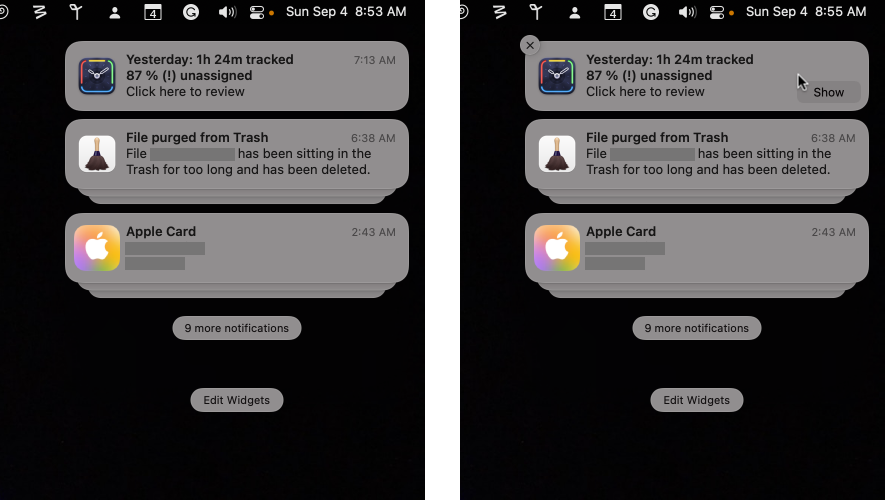
Also, the system hides notifications in stacks grouped by the apps that generated them. Note the “9 more notifications” button in the screenshot above. Clicking it doesn’t reveal nine more notifications; it shows more notifications and stacks. There’s lots more here than meets the eye.
While looking less cluttered in screenshots, in practice, this approach doesn’t do such a good job of bringing actionable stuff to the user’s attention. It’s an example of superficial simplicity at the expense of actual simplicity and usefulness.
Superficial simplicity isn’t the goal of design. Some things are, by nature, complex. In such cases, you should aim for clarity rather than “simplicity.” Users will be better served if you strive to make complex systems more understandable and learnable than simply simple.