The architecture of information:
Ron Amadeo, writing in Ars Technica:
Google will finally start rolling out the Gmail redesign it first showed off last year. The company is calling the interface in the update the “integrated view” because the goal is to integrate Google’s latest messaging service, Google Chat (a Slack competitor and the successor to Hangouts) and Google Meet (a Zoom competitor) into Gmail. The main section will remain mostly the same, but there are plenty of changes coming to Gmail’s navigation sidebar.
Currently, the Gmail sidebar houses the sections you would expect, like the Inbox, Drafts, Trash, and your list of labels. The redesign will add a second, new higher-level navigation panel to the left side of the page, letting users jump between Gmail, Google Chat, Spaces (Google Chat group chats), and Google Meet. Besides the four app-navigation options, the new sidebar also has a stack of icons at the bottom, and it’s not entirely clear what they are. They look like chat profile pictures, so they could be either active chats or starred contacts. Since no one has tried this interface yet, we don’t know many details.
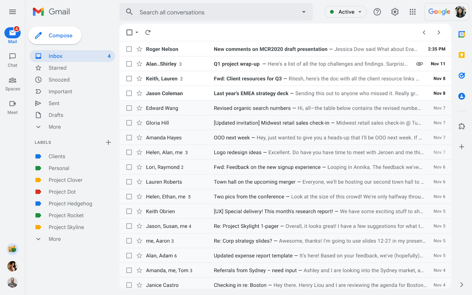
Image: Google
It’s hard to judge this change from just screenshots. As Amadeo points out, the function of some elements is unclear. That said, this looks like an improvement over the current Gmail interface.
In 2020, I wrote about the changes to Gmail’s user conceptual model. How those changes were implemented — i.e., using accordions on the application’s left panel — put Chat, Spaces, and Meet on the same conceptual level as Mail. But Chat, Spaces, and Meet aren’t as important as Mail, which is Gmail’s primary functionality.
The Mail accordion itself features an outline that includes labels and mailboxes. At least one item in this outline can also be collapsed. Thus, the accordion-based interface features at least two levels of collapsable elements. Such multi-level collapsable navigation outlines can become cluttered and make it more difficult for users to find specific items — especially in devices with smaller screens.
This brings me to another point: in the current interface, users can also keep more than one of these top-level accordions expanded at any time. So, Mail, Chat, Spaces, and Meet can be open simultaneously. I don’t use these services (other than Mail,) so I can’t speak to the usefulness of this arrangement. But having all panels expanded feels cramped and hard to parse. Here’s the current Gmail UI, for reference:
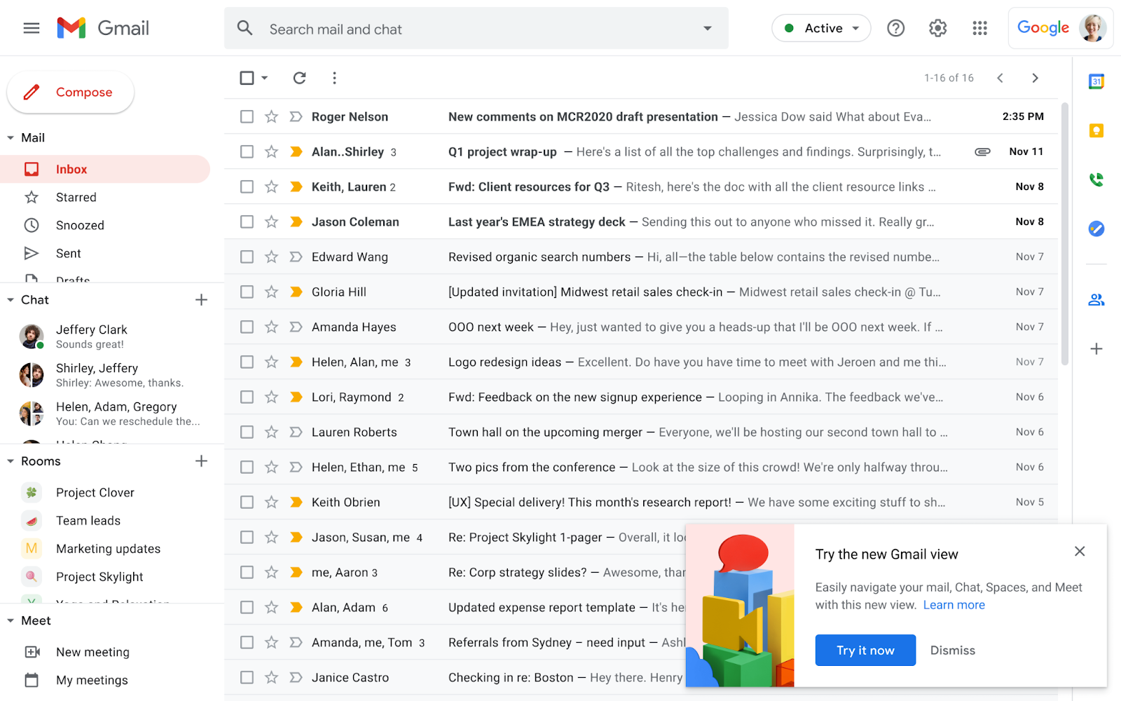
Image: Google
The new layout replaces the accordions with a much clearer hierarchical layout that includes a set of higher-level options to the left of the current navigation panel. The app’s four main areas (Mail, Chat, Spaces, and Meet) appear as tabs, not accordions. Thus, we can expect users to only focus on one area at a time, which conceptually feels much cleaner. (But again, I can’t judge since I don’t use these services.)
Gmail’s next big redesign starts rolling out next week | Ars Technica