Mark Wilson, writing in Fast Company:
According to a new research paper published by the analyst firm Forrester—for which researchers interviewed nearly 200 design teams and dozens of frontline workers in fields like retail—the enterprise software we use at work is slowing us down, and for all sorts of reasons, from individual components of the UI to the workflows that take us from one piece of software to another.
We connected with Andrew Hogan, Forrester’s principal analyst specializing in design, who led the research. He points out some of the biggest problems he sees in these tools and offers critical insight on how some companies are fixing enterprise UX.
Hogan discusses several issues with enterprise software, including slowness, unclear workflows, and — my favorite — bad labels. The article also covers some reasons why enterprise software tends to suck.
None of it is surprising if you’ve been exposed to enterprise IT. But I thought it worthwhile to call out because of an unintentional bit of irony: reading the article itself wasn’t a good experience.
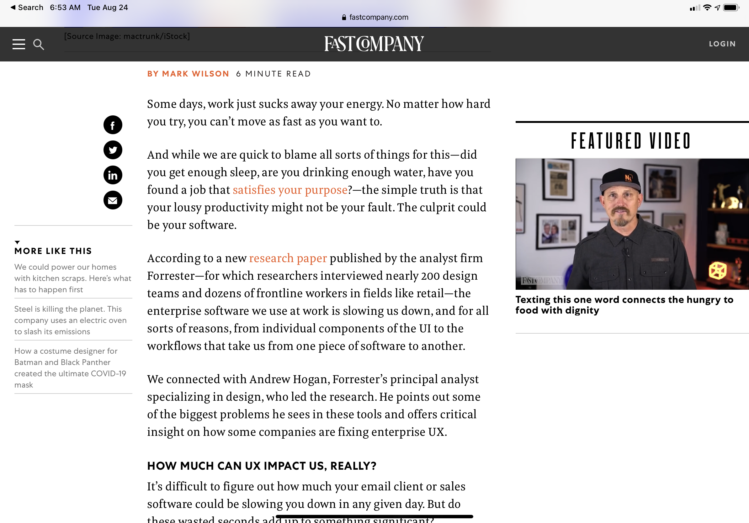
Many online publications show some cruft alongside their articles. (Ads, promotions, etc.) In this case, the cruft manifested as a hovering “featured video” that, as far as I could tell, was unrelated to the article’s content.

The prominent video shown alongside this article makes it difficult to focus on the story.
As I read the story on my iPad, this fast-cut video constantly snatched my attention. As a result, I lost my place several times before resorting to “Reader View” mode. I was surprised at how much relief I felt when the website’s standard UI disappeared, leaving only the plain text.
It’s not just enterprise software: bad UX is pervasive. It’s caused by 1) lack of care and 2) bad incentives. In the case of online publications, at least we readers have an easy fix.