Ten Years Ago is a compendium of 14 major websites as they looked on February 18, 2011. The site isn’t a significant innovation on its own but is instead a convenient collection of links to The Internet Archive. I’m highlighting Ten Years Ago here because it illustrates a fundamental principle in the design of information environments: the aesthetics of user interfaces change faster than their structures.
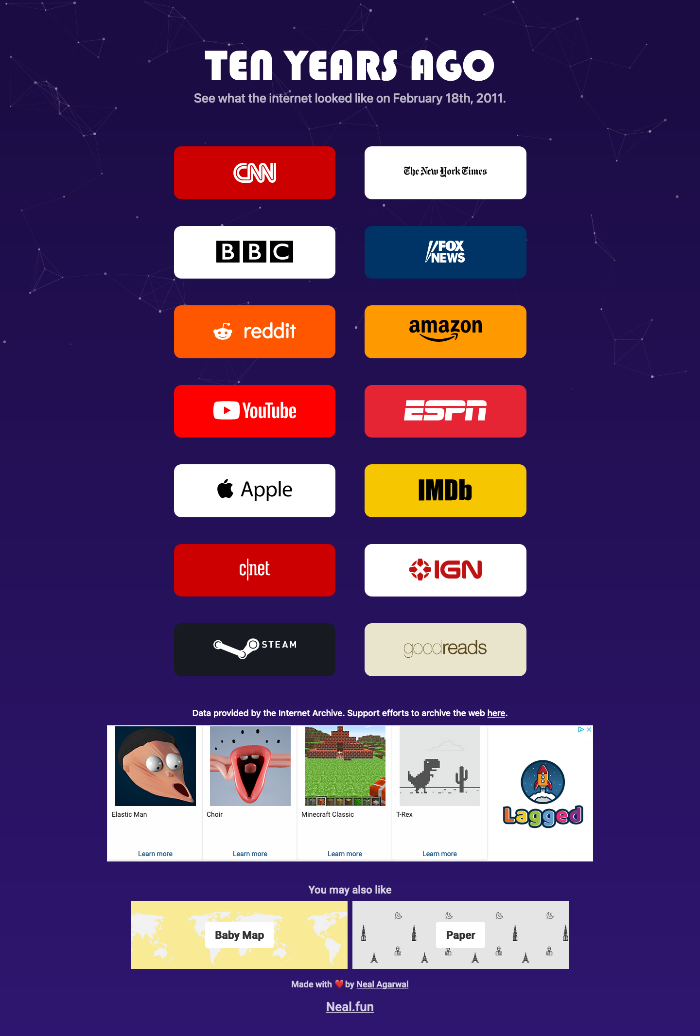
(In case you’re unfamiliar with The Internet Archive, it’s a nonprofit organization that manages a browsable archive of the internet. The Archive’s Wayback Machine allows you to ‘roll back’ many publicly accessible websites so you can see what they looked like in the past. It’s an invaluable service that is well worth supporting.)
Most of the sites featured on Ten Years Ago are either media (CNN, The New York Times, BBC, Fox News, etc.) or marketing sites (Apple, Steam, Goodreads.) The lack of ‘product’ sites on the list isn’t a surprise since Archive.org doesn’t index logged-in experiences. Also, many of these sites don’t go deeper than the home page. As a result, this survey doesn’t aspire to be comprehensive. Still, it’s interesting.
Let’s look at five of the sites featured on Ten Years Ago.
Apple
Here’s apple.com in 2011:

And in 2021:

I’ve clipped it here so you can compare both editions’ navigation structures more easily. But Apple’s homepage has grown considerably over the last ten years. This is what the entire page looks like in 2021:
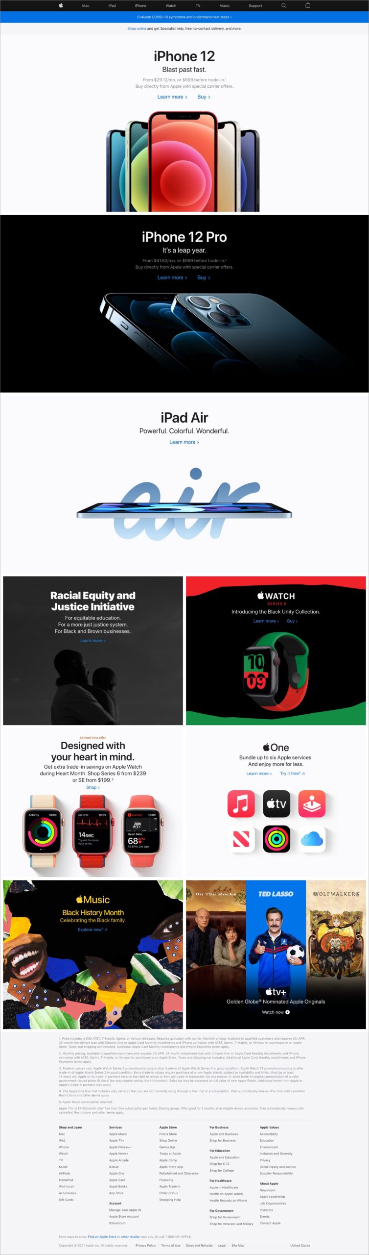
Apple’s homepage has grown in the last ten years.
The most apparent difference between both editions is how much more stuff there is in the newer version. The 2011 page featured five content blocks: a primary one (advertising the iPhone 4) and four ancillary blocks below. The 2021 edition has nine blocks: three primary ones with six ancillary ones below. While the newer version’s blocks are more prominent, they’re visually reminiscent of the ones in the 2011 edition. You can tell this is the same site.
The page layout has also changed. As with many sites of the era, content on the older version of apple.com was fixed inside a 980-pixel wide container. The newer version eschews this fixed layout in favor of a responsive one that adapts to different browser window widths. This fluid approach makes the site easier to read on smartphones, which comprise a higher percentage of browsing devices in 2021.
Another significant layout change is in the site’s footer. Whereas the 2011 site featured a relatively sparse set of navigation elements, the 2021 edition includes a comprehensive menu below a list of clarifications and disclaimers. (While the menu is an improvement, the disclaimers feel like a step back.)
Now on to the main attraction: the site’s primary navigation bar. The primary differences between the nav bars in both versions are visual. The 2011 edition is width-constrained in the same way as the site’s content. The older edition also has a margin that allows it to ‘float’ on the page, as opposed to the 2021 edition, which is set flush with the top of the page and spans the browser window’s width. The 2011 edition also has subtle gradients and highlights that make it look dimensional, whereas the 2021 edition is ‘flat. ‘
That said, look at the navigation elements in both sites: they’re almost identical. The top-level choices in both sites point to Apple’s main product categories. The primary differences are the expected ones, given how product portfolios evolve. For example, ‘TV’ replaced ‘iPod,’ a more important product line in 2011 than today, and ‘iTunes’ has been renamed ‘Music.’ The 2021 edition doesn’t highlight the Store, which is now an integral part of the site today (and therefore no longer worth calling out separately.) The 2021 edition also adds a shopping bag and collapses the search box to an icon. But other than that, the two navigation bars are very similar.
ESPN
Here’s espn.com in 2011:

And in 2021:
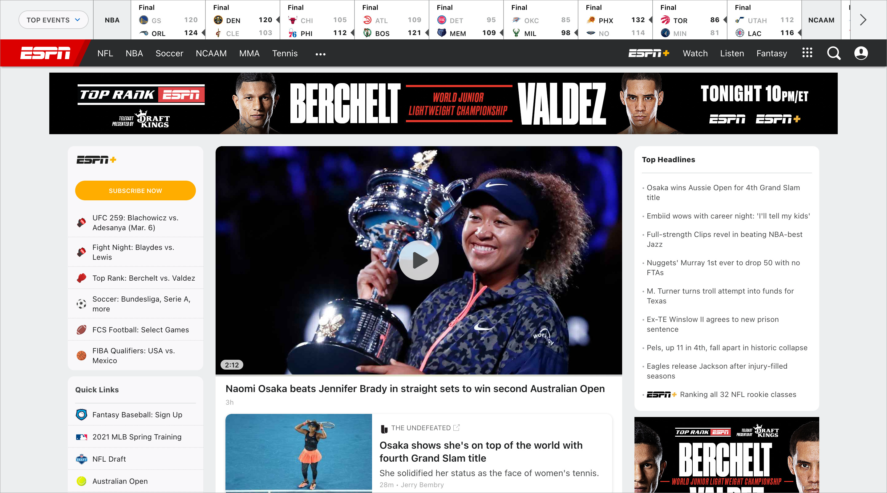
ESPN looked very different ten years ago. The most salient change is the loss of the bold gradient background of the older site. This visual design feature would’ve been less striking in 2011, when the most common computer displays weren’t as wide as the ones we use today. Still, it looks dated. (I believe the empty gray zone on the lower right corner of the 2011 screenshot is due to a missing ad in Archive.org’s system. I can’t imagine ESPN would leave such valuable real estate empty.)
The difference in typography between both editions is also striking. As with many older sites, the 2011 edition of ESPN used smaller fonts than we do today. I believe this, too, is an effect of the smaller and lower resolution displays of the era. The older site also featured smaller images, perhaps to accommodate users with slower connection speeds. (I’m assuming broadband access wasn’t as common in 2011 as it is today.) Also, as with many other sites today, today’s ESPN features a responsive layout.

But once you look past visual style and layout, the structure of these pages is similar. Both are dominated by a large editorial block with a featured story. Both have a ‘Top Headlines’ block. Both feature advertising blocks. (Again, I believe the 2011 screenshot above is missing an ad.) And both have similar navigation bars: one for sports leagues (NFL, NBA, MLB, etc.) and another for sports event scores. Navigation in the 2011 edition is more cluttered; the 2021 edition hides some links under a menu button. (The grid next to the search loupe.)
Goodreads
Here’s goodreads.com in 2011:
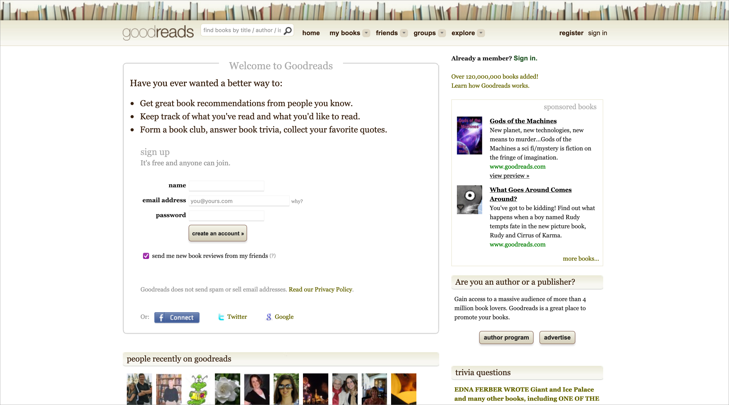
And in 2021:

At first glance, Goodreads seems to be the exception that proves the rule. Yes, visually, the two editions of the site look different: as with other samples here, the older version has smaller fonts and fewer images. However, the colors and overall feel of both pages are similar. But more strikingly — and potentially damaging to my point — the navigation of both sites is very different. To wit, the 2021 edition of the site doesn’t seem to have a primary navigation bar at all. What’s going on here?
Look at the featured content in both editions of the site. While the 2021 edition promotes user-driven book rankings — i.e., surfacing the unique value of the Goodreads community — the 2011 edition features a signup form. This approach is an excellent example of “show, don’t tell”: the 2011 edition of the site tells us why we should join and gives us a signup form, the 2021 edition shows us. The form is still there in the newer site, but it’s not on center stage.
What isn’t there is the primary navigation, which is clearly targeted at people who are already Goodreads users. This navigation bar is also present on the 2021 site, but only after you log in.

As you can see, the current menu is remarkably similar to the 2011 edition. Both feature the same layout and (mostly) the same elements in the same order. Both have minimalistic dropdown menus. There are a couple of differences: in the 2021 edition, ‘Friends’ and ‘Groups’ have merged into a ‘Community’ option, and ‘Explore’ has been renamed ‘Browse’. But otherwise, they’re very similar structurally and visually.
Here’s reddit.com in 2011:

And in 2021:

Reddit looks very different today than it did in 2011. It’s interesting to note that the 2011 edition featured a fluid layout that spans the browser window’s entire width, whereas the 2021 edition keeps content within a 988-pixel container. This change is the opposite of what we see in most of these other examples. That said, the 2021 edition of Reddit has a mobile responsive layout, something the 2011 edition didn’t.
A more obvious difference between both sites: while the 2011 edition included some small thumbnails, the 2021 edition features large images that dominate the page. The 2011 edition is dominated by a list of ‘old school’ hyperlink entries, whereas the 2021 edition has a more modern ‘card’ interface. Also, the site’s logo has changed. The overall effect is of a more professional and buttoned-up organization today.
Reddit’s site is also interesting in that the site’s primary navigation mechanism has also changed. The 2011 edition featured tabs and a search box. The search box is the primary navigation mechanism in the 2021 edition, and the tabs have been replaced with a set of filters. These filters serve the same purpose as they did in the ten-year-old site, but are more flexible. (Thankfully, the ‘Controversial’ tab has been replaced by a ‘Rising’ filter in 2021.)
While the interaction mechanism is the same — tabs vs. filters — the underlying structure is the same: both allow users to sort and filter the content feed for recency and primacy (based on upvotes.)
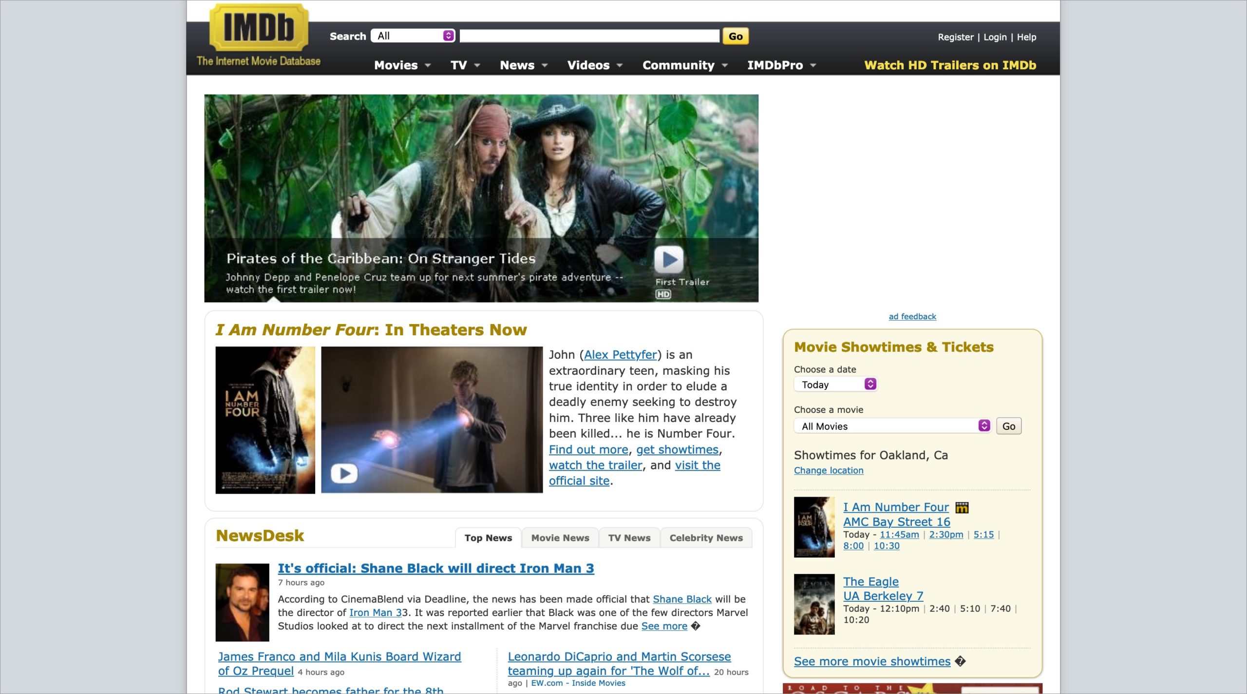
IMDb
Here’s imdb.com in 2011:
And in 2021:
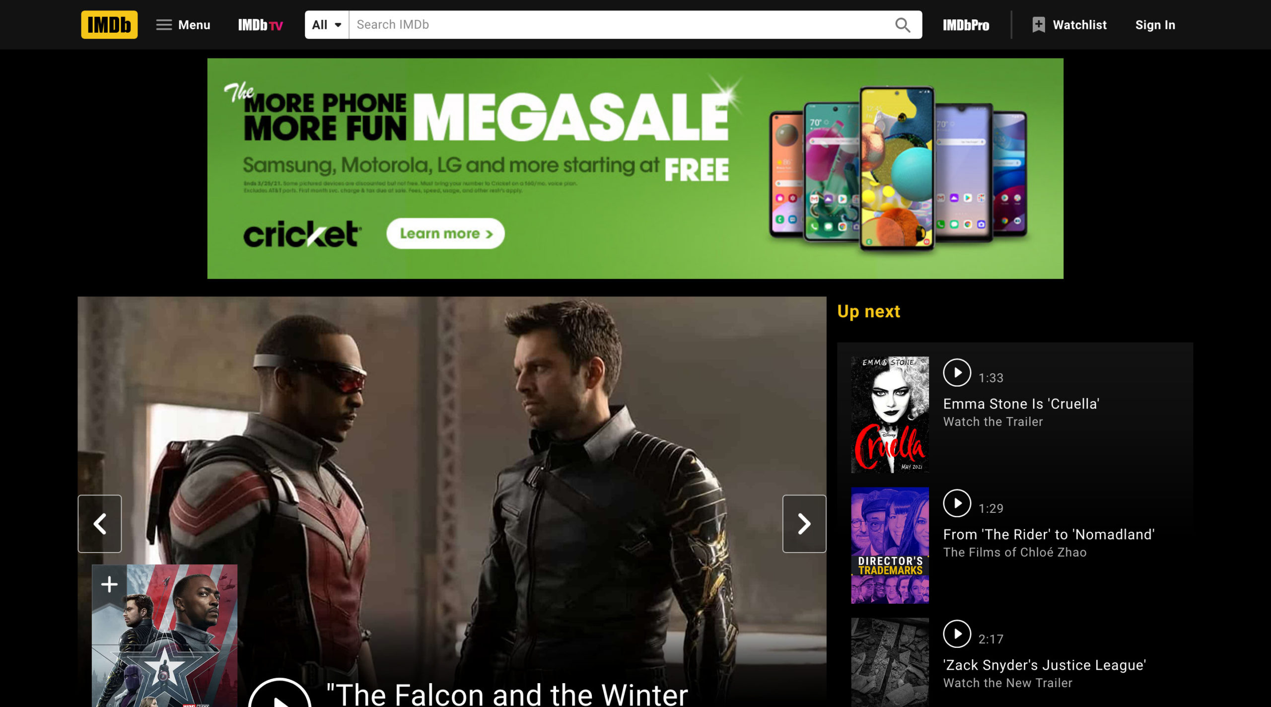
IMDb is another example of a site that looks very different today than it did ten years ago. The most obvious difference is the dark background of the current site — a better choice for a site that highlights stills from movies. Like some other advertising-supported sites, IMDb can change this background to suit individual campaigns. The result competes with (and in some cases, may overwhelm) site content.
IMDb’s 2021 site featuring a takeover ad.
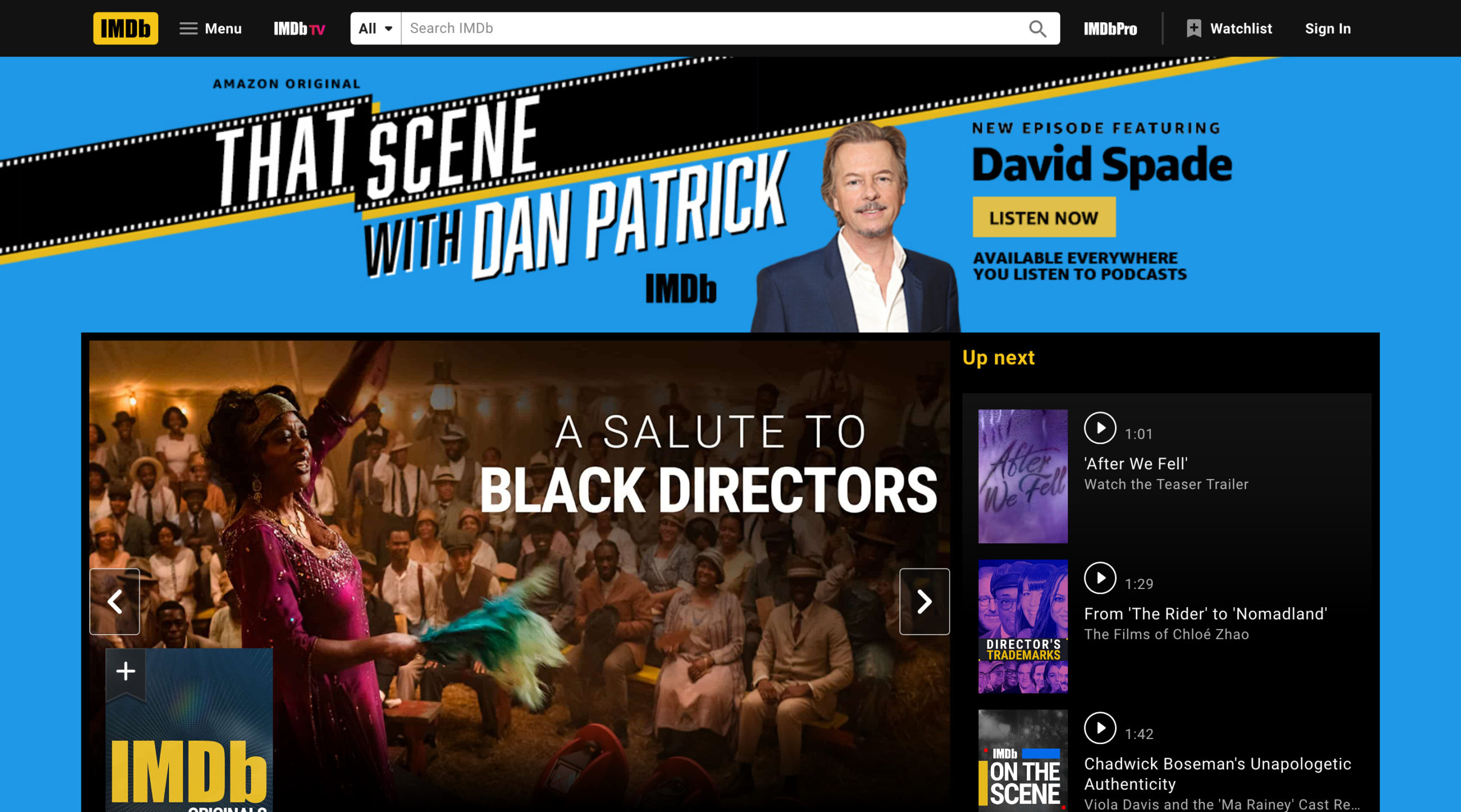
While the look-and-feel of the 2011 and 2021 editions is very different, their navigation structures are similar. Both feature a search box as the primary navigation mechanism, and both have a browsable list of content categories. The 2011 edition showed subcategories using dropdown menus in a primary navigation bar. In its stead, the 2021 edition features an approach more common to today’s responsive sites: a mega menu under a ‘Menu’ button.

IMDb’s 2021 site features a mega menu.
Plus ça change
What can we learn from this exercise? After all, these are just five websites — not a statistically meaningful sample. Still, I think they illustrate the evolution of common design patterns.
Modern sites feature better (and overall larger) typography. They also have larger and more colorful images. Modern layouts are cleaner and make better use of screen real estate. They’re also responsive, making the sites readable in devices with different screen sizes. Site elements such as navigation and search bars are less fussy and ‘themed’ — for the most part, they do their job and stay out of the way. Modern sites also feature ‘Menu’ buttons, using either hamburger or grid icons. Current sites also seem to devote more real estate to advertising.
But these are mostly cosmetic changes on top of structures that have remained relatively unchanged over a decade. As I’ve said many times before, structure changes more slowly than look-and-feel. These five sites offer compelling proof.