Most website navigation systems rely on words. Terms like Products, Industries, and About Us have become standard; many companies have such phrases or subtle variants on their websites. Other labels are more particular to each company or industry. But in general, website navigation systems are primarily verbal.
Some websites break that norm. Color Palettes is an interesting example.
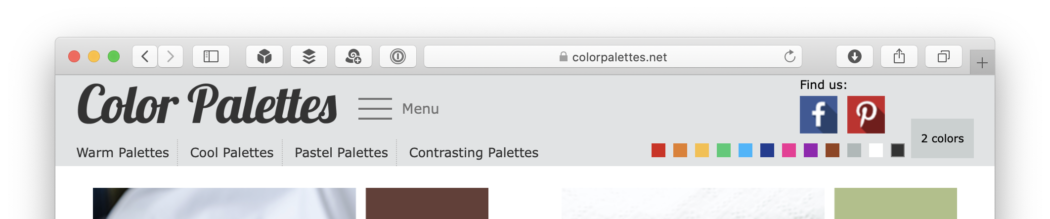
Let’s examine this site’s header. The most prominent element is the site’s name. Below the name, in the position usually occupied by the primary navigation bar, is a list of choices:
- Warm Palettes
- Cool Palettes
- Pastel Palettes
- Contrasting Palettes
To the right of the name is a standard “hamburger” menu icon. If you click on this icon, you see a list of choices rendered with words.

So far, this is all standard stuff. These choices are rendered using words — including the hamburger icon, which has the label Menu.
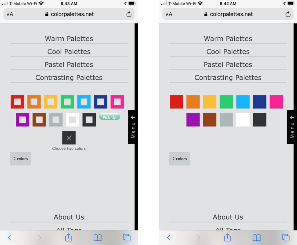
But look at the other half of this header. If the left side features mostly words, the right side is primarily visual. The most prominent elements on that side are two (unfortunately large) social media icons. Again, standard stuff. Below these icons is where things get more interesting: there’s a row of twelve colored squares followed by a button labeled “2 colors.”
These colored squares are a key part of the site’s navigation system. For example, if you click on the violet square, you’re taken to a page that lists color palettes that include violet.
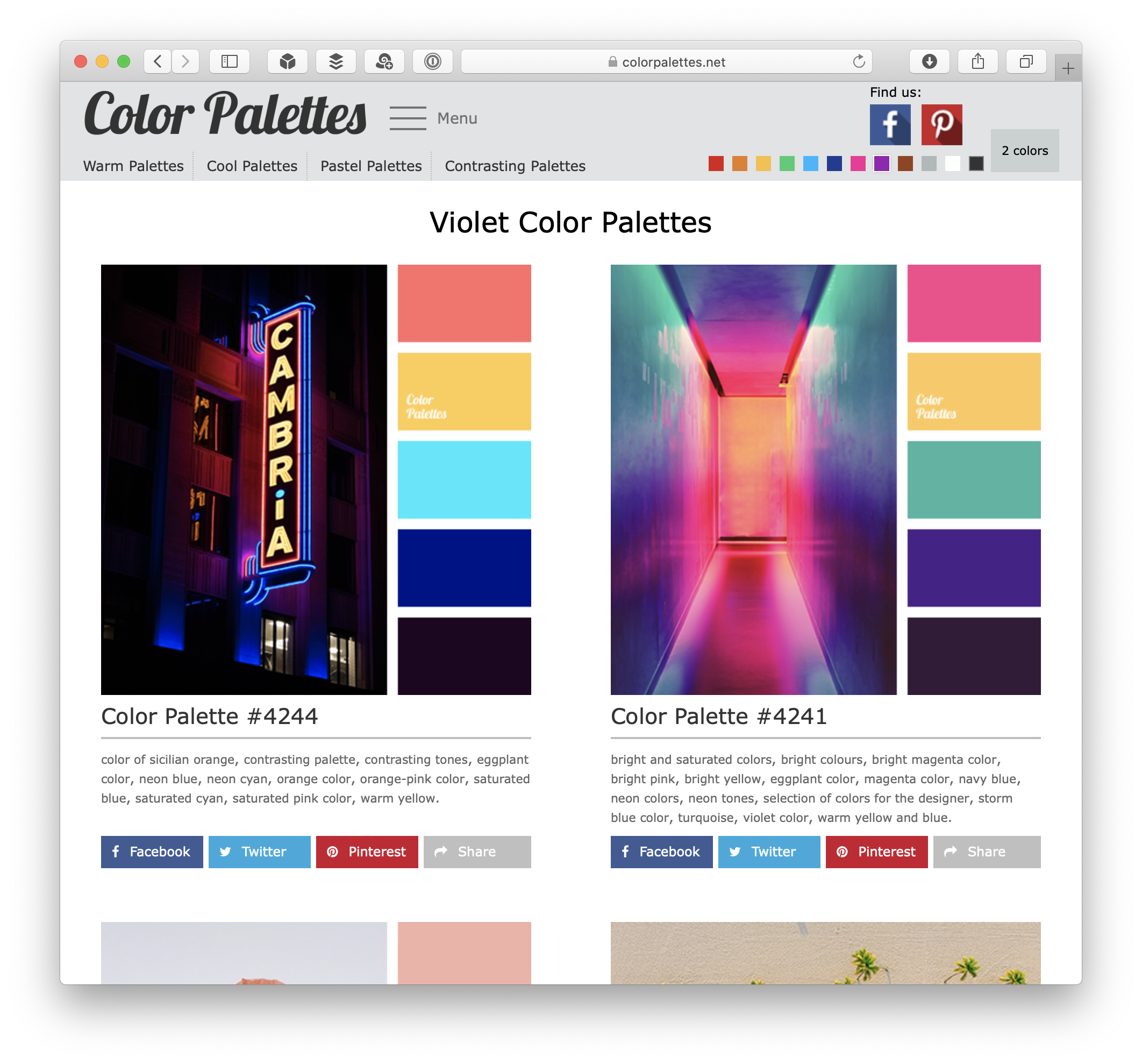
The “color palette” element that shows up in these pages is the core object in this system. Each of these color palettes has five colors, identified by their hex values, and a numeric identifier. The palette also includes a photograph that features its constituent colors.
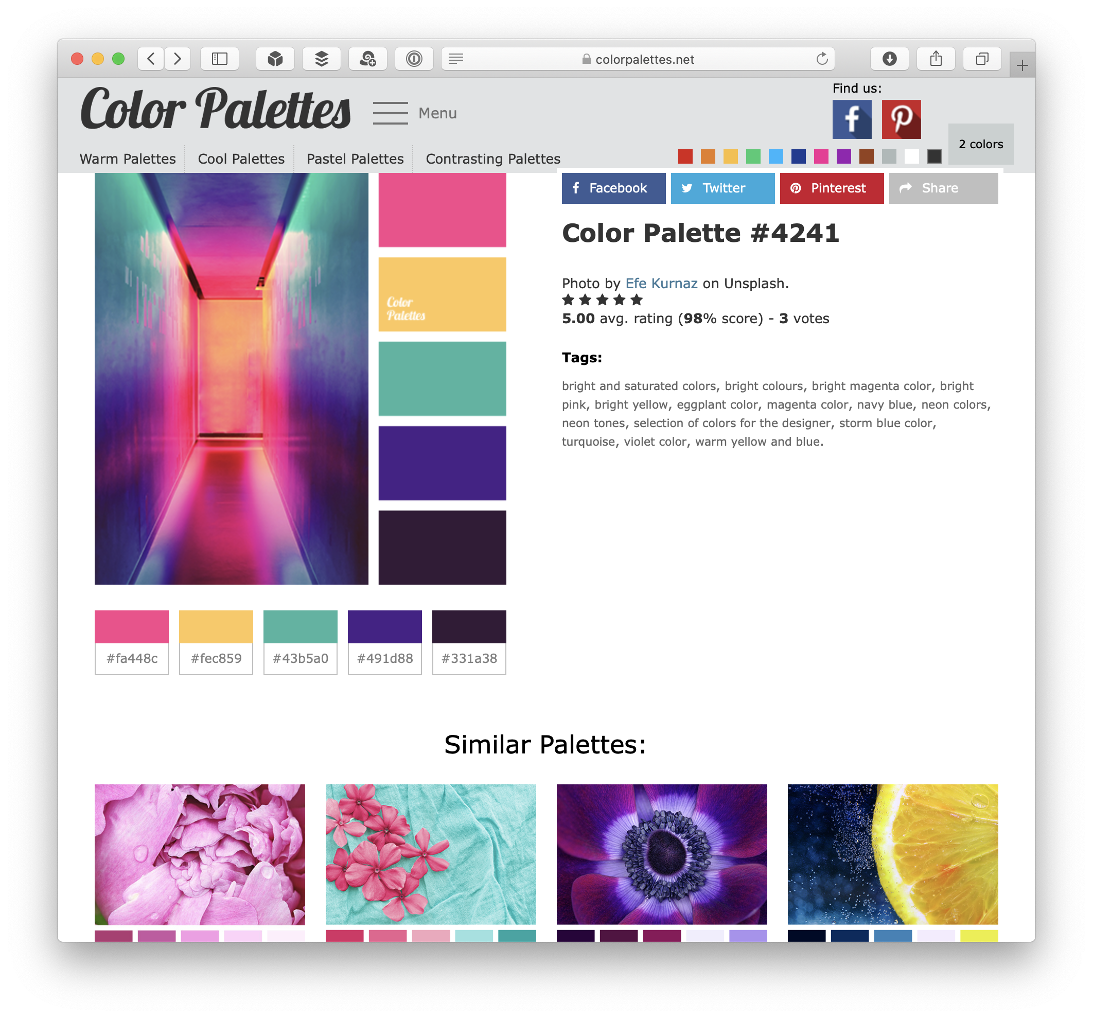
Palettes also have metadata, including ratings and tags. The latter consist mostly of color names, spelled out in English. Some tags also include use cases (i.e., “beige shades in room decor”)
The site’s primary navigation system lets you find palettes that meet one of two criteria: they either correspond to one of four types of color sets (warm, cool, pastel, and contrasting) or feature one or more specific colors. The latter is where the colored boxes are useful. A violet box is less ambiguous and subjective than the word “violet.”
This site’s navigation also offers the option of finding palettes that feature two colors. If you click on the “2 colors” button next to the colored boxes, a panel with more options is revealed below the site header:
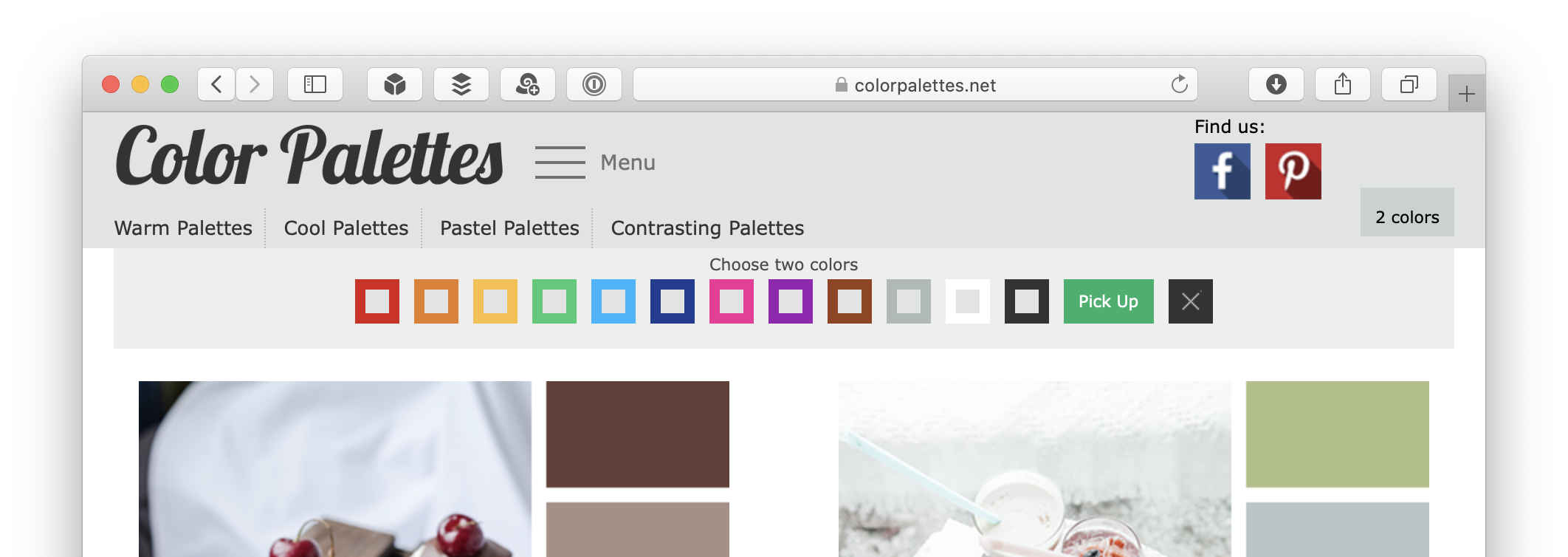
When I first saw this expanded panel, I thought the two colors were gray (represented by gray squares) and one of the twelve colors that frame the gray squares. But when I clicked on a color, I realized that the gray squares are checkboxes. Using this mechanism, you can select two colors. (You can un-select them by clicking the “X” button.) If you press the (curiously labeled) “Pick Up” button, you’re shown a page that lists color palettes that feature your two selected colors.

This “2 colors” panel is modal: You can’t pick individual colors while the “2 colors” panel is expanded, and vice-versa. This switch is more obvious when you use the site on a mobile device.
Non-verbal navigation isn’t unique to this site. Navigation bars that rely on visual elements aren’t uncommon in mobile devices. Small screens are cramped, and icons can take up less space than words or phrases. However, icons can also be ambiguous or have different meanings for people in different cultures.
But what Color Palettes is doing is different. Whereas icons represent particular concepts (e.g., the “hamburger” icon represents a menu), Color Palettes’ colored squares don’t stand for anything. Violet = violet. What more direct way to browse than by using not a representation — whether verbal or iconic — but the thing itself?