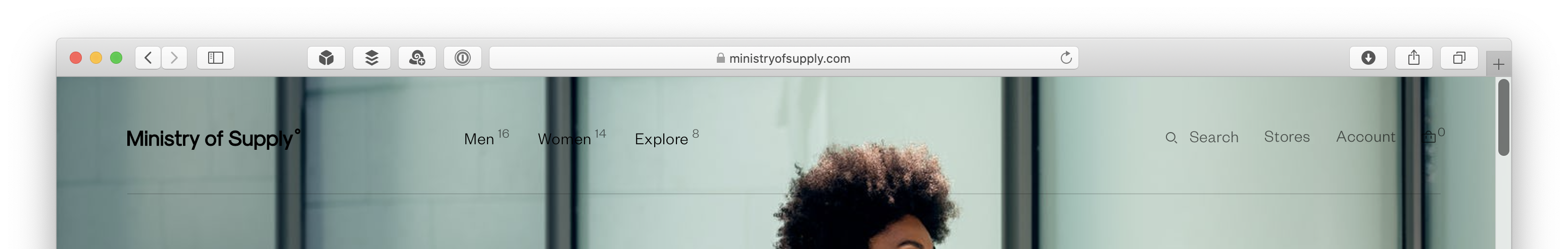
The website for clothing retailer Ministry of Supply has an interesting navigation system. While the nav structure itself is conventional for a clothing business, its presentation includes a novel detail:
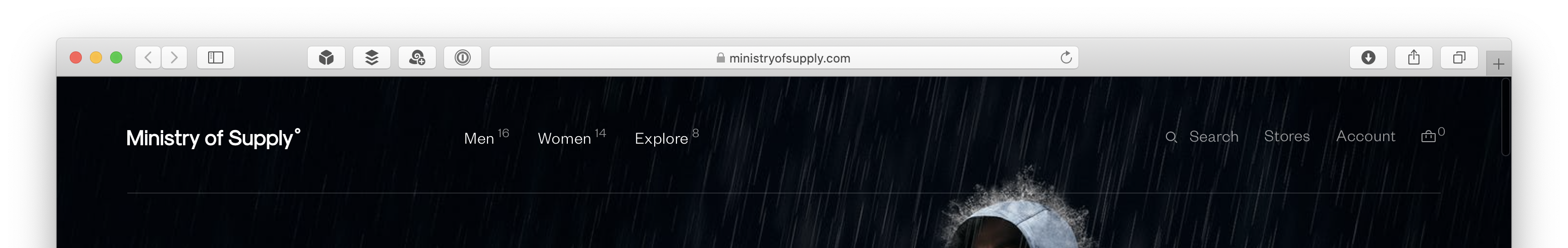
See the little numbers next to the primary nav labels? They represent the number of items in each category. For top-level categories, such as Men, Women, and Explore shown above, the items are subcategories. For example, the Men category has sixteen subcategories, which you can confirm by opening that menu.
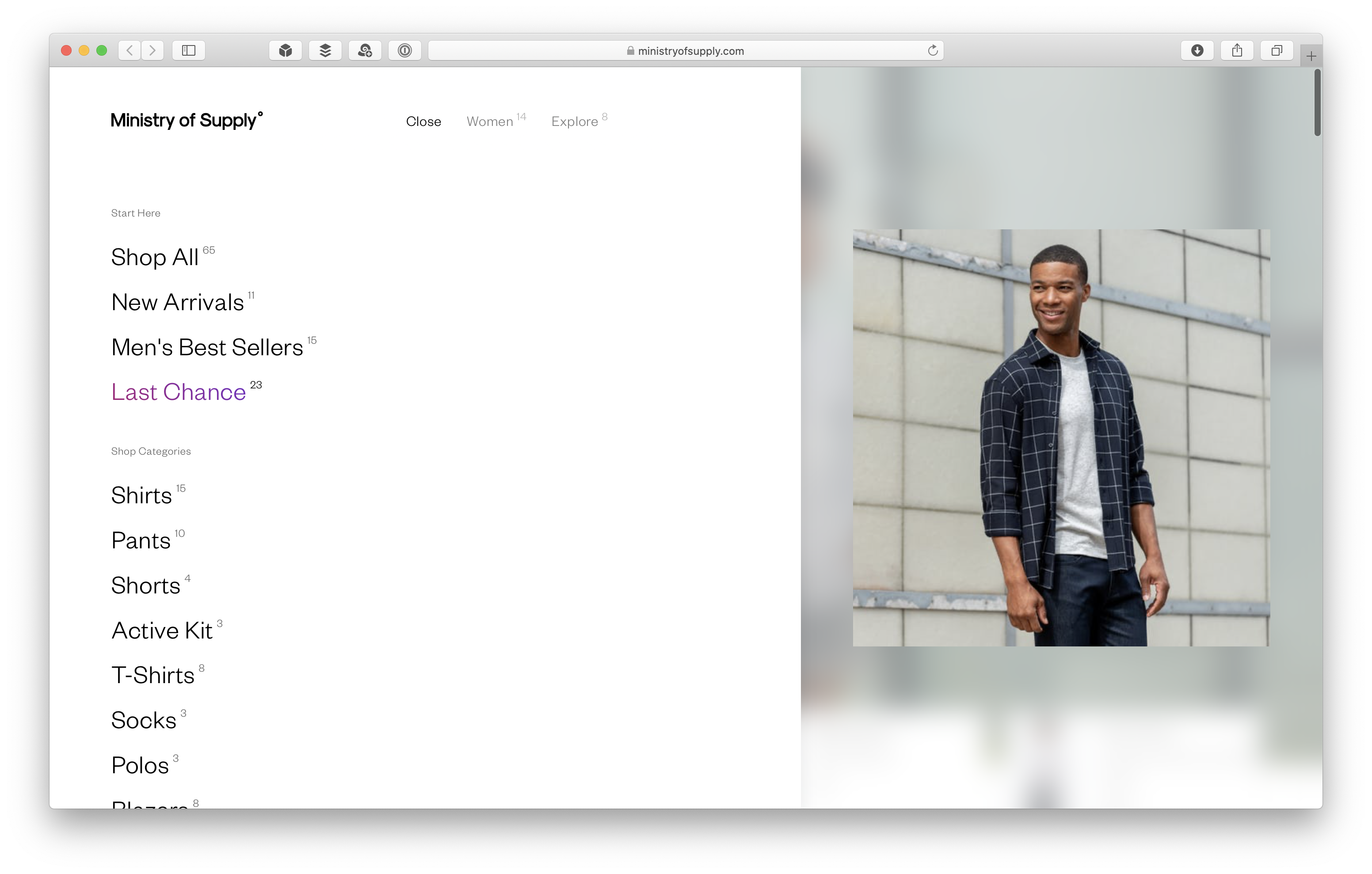
Note the subcategories also have numbers next to them. At this level, they indicate the total amount of different products available in that subcategory.
There are other noteworthy details in these menus. One, they take over the entire screen, making them effectively modal. The user can get out of “menu” mode by clicking on the right side of the menu, where the photo of the model appears. When you hover over the right part of the menu, the cursor changes to a close button. The label that opened this menu (in this case, the Men category) also changes to a Close link.
Another interesting detail is a region at the bottom of the menu that shows featured deals. This region scrolls horizontally to pack in more information. The mouse pointer changes to a grab cursor when hovering over the region. (I suspect this feature is easier to use in touchscreen-based devices.) The options in this region don’t include the numbers next to the category label.
I’ve seen navigation systems before that list the number of items in categories. However, I don’t recall seeing that conceit used as a pervasive user interface device. (Ostensibly in service to branding.) I wonder about its usefulness. It may be of some value to know how many shorts are available in the store, but does the user care how many subcategories there are in the Explore menu?
This Explore menu also highlights a downside of the scheme: if used pervasively, the numbers must also be shown in parts of the site where they makes less sense.
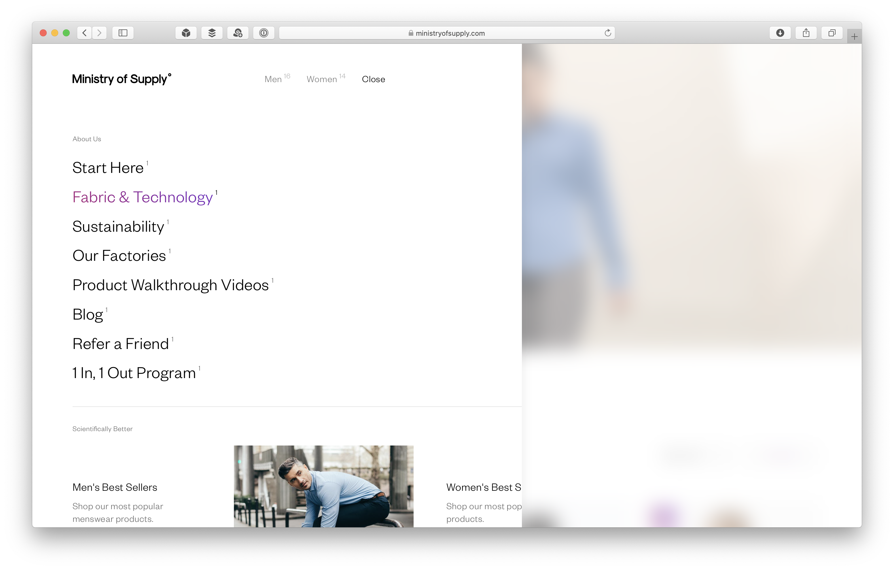
As opposed to the other two primary categories, Explore isn’t a catalog of product choices, but a set of pages that explain how Ministry of Supply is different from other retailers. As a result, the options in this menu aren’t subcategories, but individual pages, so the number label for each reads 1. At his point, the scheme seems a bit awkward.
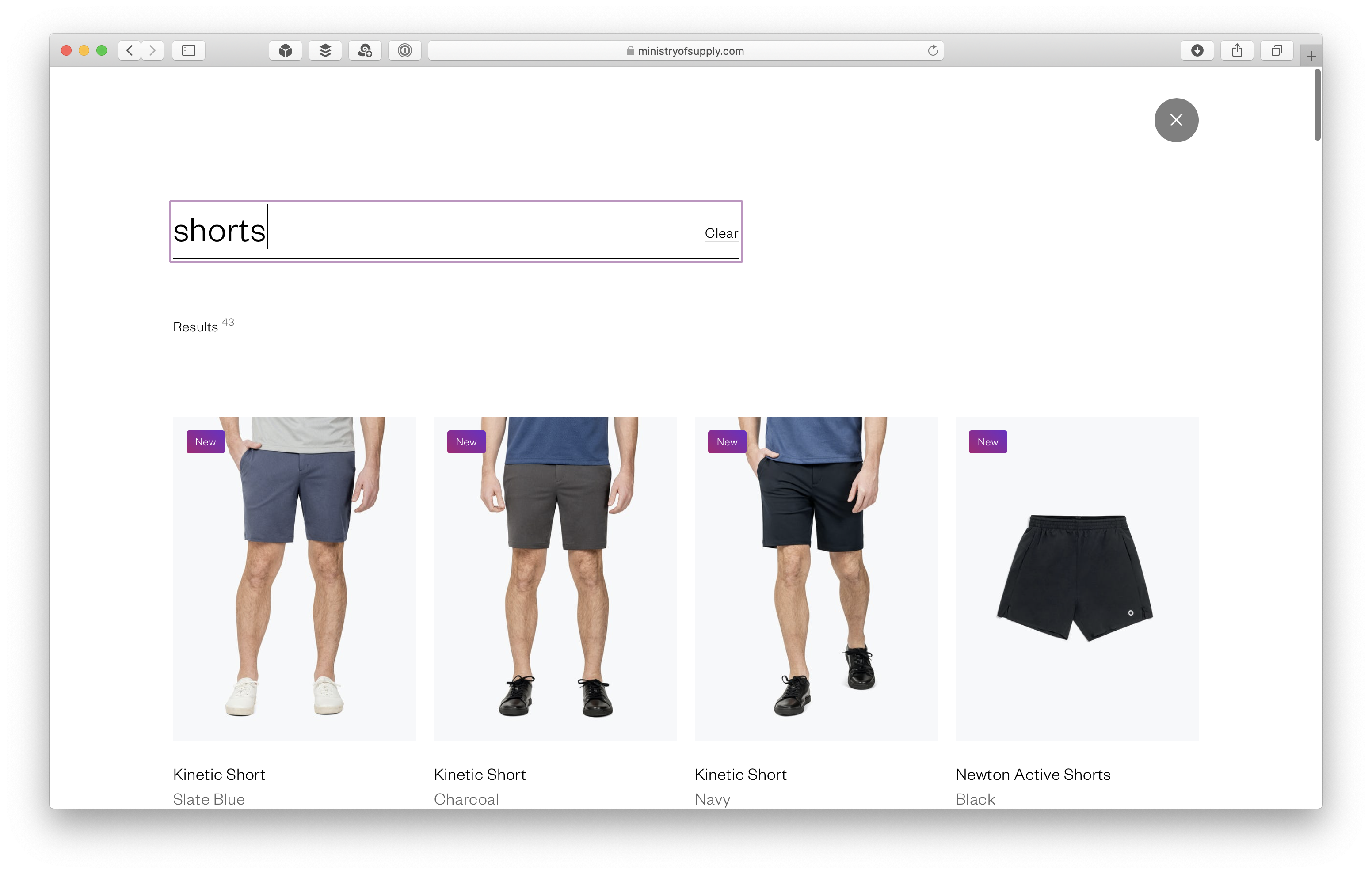
One place where the scheme offers more utility is in search. Many search systems let the user know how many items have matched the query. True to form, Ministry of Supply uses the “exponential” number to represent the total number of search results:
One final observation about this site’s navigation system: the homepage rotates between different background images. Some images have light backgrounds, while others are dark. The color of the nav labels changes to dark (when the image is light) and light (when the image is dark) to maintain contrast. However, one of the images has dark regions on a mostly light background, making some labels hard to read.
I only saw this on one of the three images, and they switch frequently enough where it might not be a big problem. However, I’m wary of navigation bars with transparent background set over arbitrary background images, since future updates to the site could compromise the legibility of the top-level items.
Overall, I’m intrigued by the visual presentation of Ministry of Supply’s navigation system. The rendering of the little numbers is unobtrusive, so they don’t affect the legibility of the option labels. They add a bit of utility in the lower levels, where the user is looking at product categories. At the upper levels, the value is all in branding. I was a bit confused when I first saw this nav, but then I found it somewhat endearing — points awarded for trying to do something different and memorable.