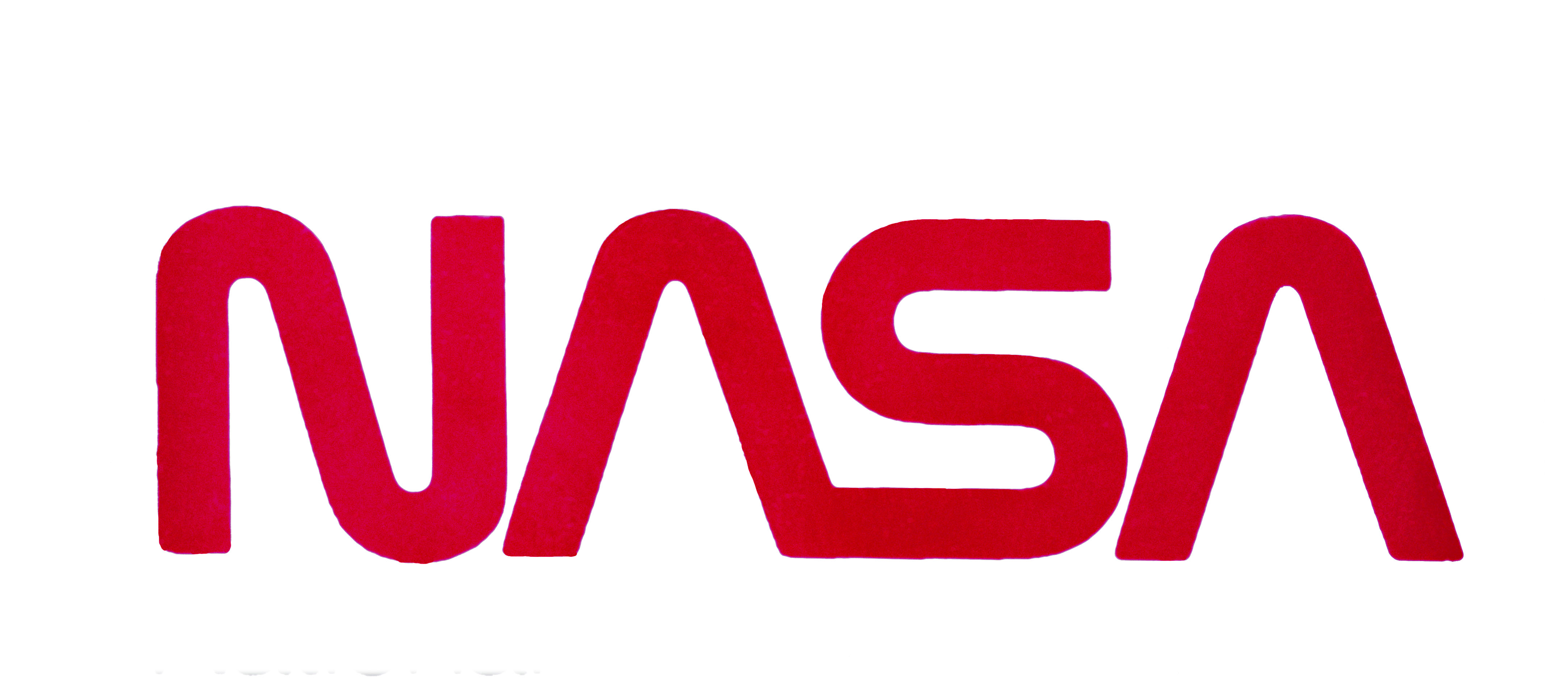
This week, NASA announced the return of its mid-1970s “worm” logo:
The retro, modern design of the agency’s logo will help capture the excitement of a new, modern era of human spaceflight on the side of the Falcon 9 launch vehicle that will ferry astronauts to the International Space Station as part of the Demo-2 flight, now scheduled for mid- to late May.

Image: NASA
NASA had retired the worm in 1992, when the agency returned to using its late-1950s “meatball” insignia:

Image: NASA
Most organizations change their identities in an effort to remain relevant to continually evolving popular tastes. People tend to be conservative about changing beloved products and institutions, and identity changes can seem jarring at first. (Consider the negative reactions to BMW’s recent logo redesign.) Still, I can’t think of many organizations that repeatedly restore their old identities.
When changing an organization’s identity, designers must balance familiarity with freshness. Abrupt changes risk alienating people, but modest variations won’t generate excitement. The right balance depends on how the organization wants to be perceived. The logo for a Silicon Valley startup can change abruptly. In contrast, the logo for a stalwart brand (think Coca-Cola) will likely change more subtly and slowly.
NASA should be one of our most forward-facing institutions. Why is it trafficking in nostalgia? Why not celebrate a “new, modern era of human spaceflight” with a new identity? I sense the agency mines its past because it wants to project confidence and competence. The decade from the mid-1960s to the mid-1970s — the era of the moon landings — was a high water mark for both.
The worm logo reflects the same modernist ethos that informed the aesthetic of the original (1971) Tomorrowland at Walt Disney World. When I first visited that place, in the early 1970s, the technocratic vision of the future it represented felt bright and optimistic. Space exploration was a key concept in that vision. But when I visited Tomorrowland again a decade and a half later, it felt old, stodgy, and mildly bureaucratic. The place hadn’t changed much, but popular culture had moved on. In the mid-1990s, Disney redesigned Tomorrowland with a different aesthetic that celebrated fantasy, irony, and imagination instead of science, technology, and progress. The makeover felt like a relief.
When I was a child, space exploration was a potent symbol of progress. The return of NASA’s 45-year-old logo makes me think space exploration now symbolizes a time when we had the commitment and wherewithal to boldly go where no one had gone before, when we still believed in progress through science, technology, and expertise.
(Perhaps the pandemic will nudge us to reconsider that possibility?)