Last weekend I had the opportunity to take my kids to see an exhibit of the work of Charles and Ray Eames at the Oakland Museum of California. The Eameses are among the most famous designers ever, so little of the work on display was unfamiliar to me. Still, seeing so much of it together in one place was inspiring and enlightening.
The Eameses had a compelling mix of rigor and joie de vivre that has universal appeal. The show captures the playfulness of the resulting work. (My kids were a bit apprehensive about going to see a museum exhibit but got into it once they realized some of the items on display were toys they could play with.)
Three ideas stood out to me in this visit that I thought worth sharing. They apply to design in all domains.
Framing is a creative act
Careful composition and selection — determining what to leave out of a problem domain — opens up new ways of understanding and approaching familiar problems. As Brian Eno has written, “A frame is a way of creating a little world round something… Is there anything in a work that is not frame, actually?”
So much of the Eames’s’s work was about creative framing of ordinary things. In their myriad photographs, framing was the central (and literal) creative gesture; Powers of 10 moves the frame up and down levels of granularity to change our understanding of our place in the universe; the Case Study Houses re-frame the materials, construction techniques, and aesthetic of housing.
Accommodate a range of experiences
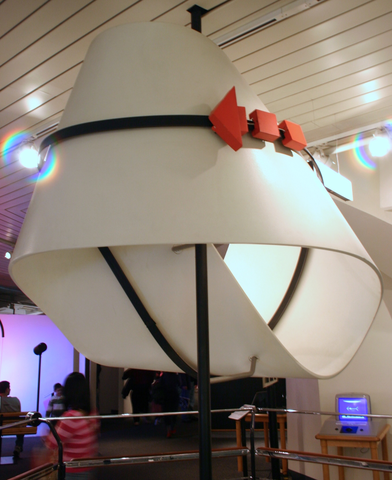
In the part of the show that presented the Eameses’s Mathematica exhibit, a quote from Charles Eames stood out to me; it reflected their aspirations for the exhibit. He said, “[Mathematica] should be of interest to a bright student and not embarrass the most knowledgeable.”

A physical model of a mobius strip, part of the Eameses’s Mathematica exhibit. Image by Ryan Somma CC BY-SA 2.0, via Wikimedia Commons
The idea of accommodating a range of experiences is very important, and in some cases, challenging. Sometimes we must design for users that have very different perspectives and degrees of experience. This calls for 1) a solid understanding of the problem domain, 2) maintaining a beginners mind, and 3) testing and iterating.
It’s structure all the way down
I’ve always been inspired by the breadth of the Eames Office’s output. They excelled in film, graphic design, industrial design, architecture, exhibit design, and more. Beyond the obvious joy the Eameses got from experimenting with media, materials, techniques, and craft, the unifying conceptual drive behind all of this work was an acknowledgment that it was all underpinned by structure.

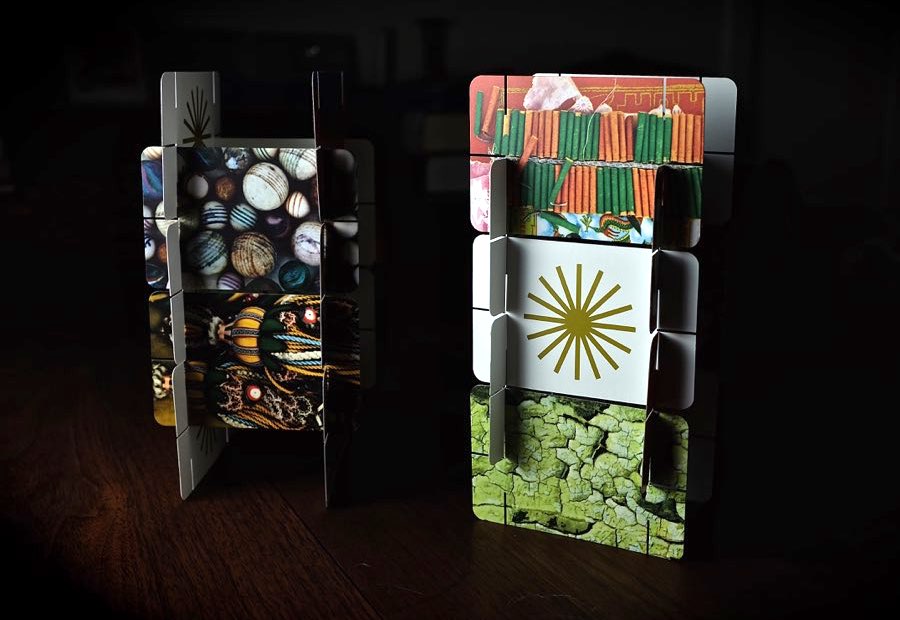
Photo by Cliff Hutson on Flickr
A building has structure. House of Cards — a delightful toy that consists of playing cards with carefully placed slits that allow them to be interconnected with each other — has structure. So does a chair, and a film. Even given the wide scope of their work — and the fact that most people saw them as “designers” — Charles Eames saw himself as an architect. “I can’t help but look at the problems around us as problems of structure,” he said, “and structure is architecture.”
The World of Charles and Ray Eames runs in the Oakland Museum of California until February 18, 2019.