When designing an information environment, you must ensure distinctions between parts of the environment are clear. This means users must be able to look at labels in navigation bars and section headers and understand the differences between them. When distinctions are clear, users don’t have to think about them: they know where to go and what they can expect to find and do there.
That this is obvious doesn’t make it easy. Often distinctions aren’t all that clear. Perhaps designers have tried to group too many things in that part of the environment, leading to labels that try to contain too much. Or maybe folks from the branding team have insisted that labels must include language that is only clear to people already familiar with the organization’s offerings. Whatever the case, to quote an old Martin Gore song, “Finding the right words can be a problem.”
Let me give you an example. I want to take my kids to an amusement park. There are two big parks near where we live: California’s Great America and Six Flags Discovery Kingdom. Both of these parks have websites. Here are their primary navigation bars:


Great America’s navigation bar seems simpler; it’s got five items (whereas Six Flags’s has eight) and it has a “cleaner” visual design. Great America has also surfaced an important piece of information (the park’s opening hours) to the utility navigation bar, which Six Flags has as an item in its primary nav bar. I also question some of Six Flag’s choices regarding granularity. Why are “Groups,” “Passes & Memberships,” and “Tickets” three separate areas? Shouldn’t these all be under “Tickets”?
That said, when navigating both sites, I found Six Flags’s navigation structure easier to use. The main reason is that they’ve used plain language to establish clear distinctions between important parts of the environment. I understand the difference between “Things to Do” and “Plan Visit.” Instead, Great America uses two non-obvious labels: “Explore” and “Play.” This is a curious choice of verbs. What’s the difference between exploring and playing in this context?
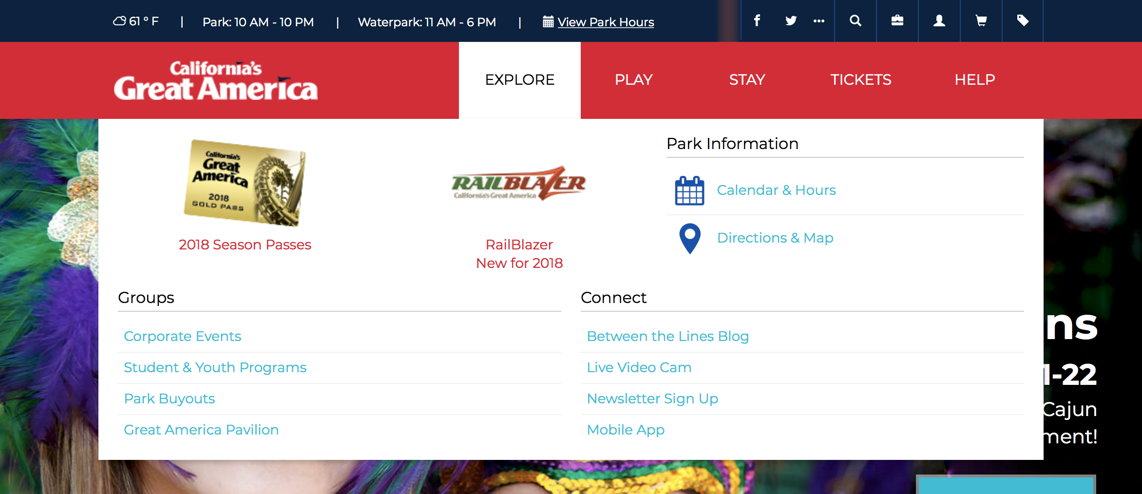
I came to these sites to look for the height restrictions for their rides. I know where to find the rides in the Six Flags site (“Things to Do”). But where are they in the Great America site? I’m guessing they’re under “Play,” but they could easily be under “Explore.” (As in, “explore our park.”) It turns out they’re under “Play;” the “Explore” section contains a mix of news, park information, and other important items that don’t seem to fit neatly in other sections:

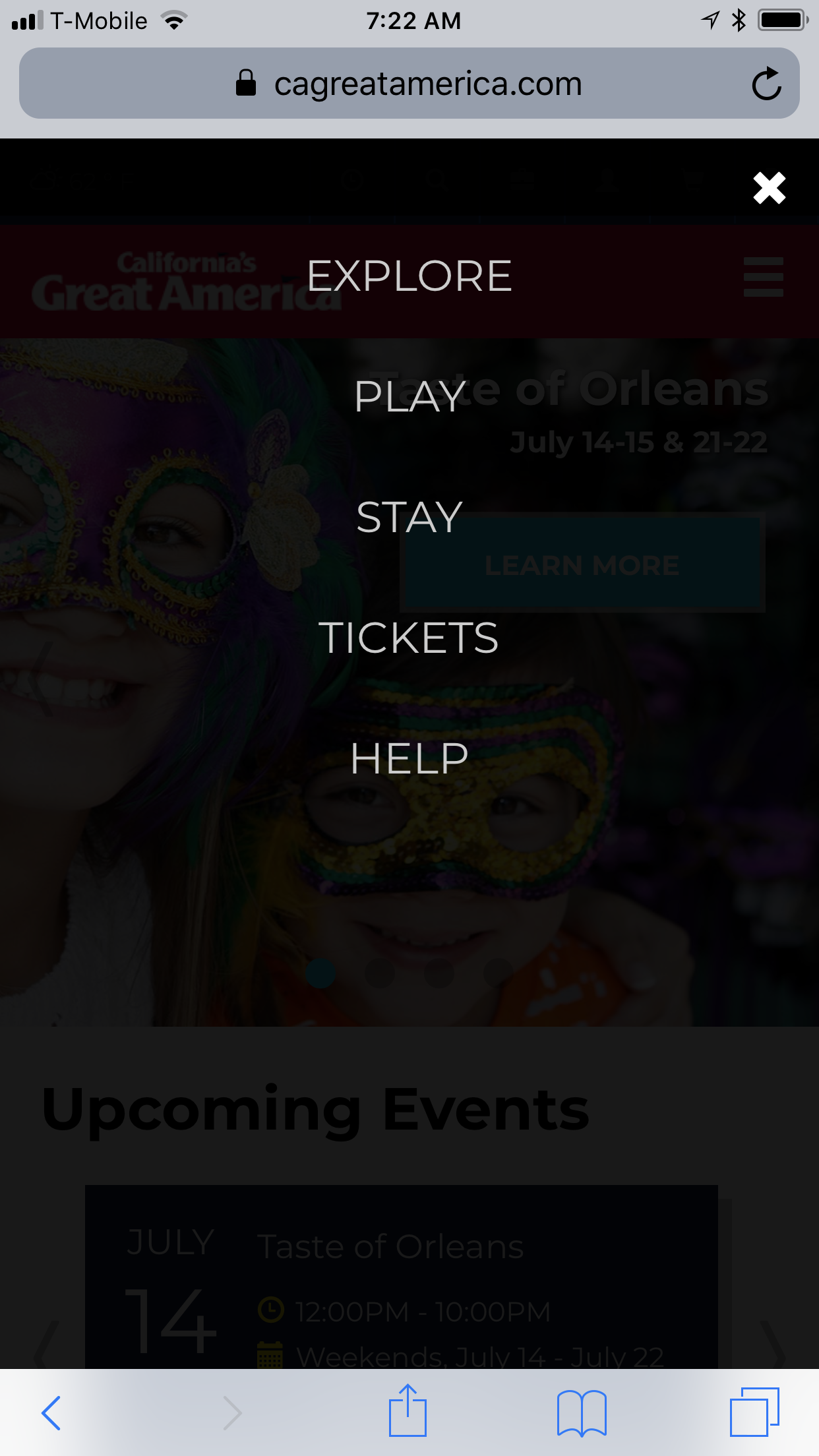
Note that I was able to determine the contents of the “Explore” section by merely hovering over the nav bar. The use of mega menus such as this one has alleviated some of the confusion caused by ill-defined distinctions. That said, mega menus don’t help in the mobile context (which is where I first experienced this particular site):

If you find yourself struggling with labeling the distinctions in an information environment, consider the possibility that the grouping may have problems; it may be trying to do too much, or be driven by concerns that aren’t user-centered. And of course, test the labeling and grouping to ensure it’s clearly understood by the people who need to use it.