The architecture of information:

How do you show meaningful geographic information at various scales in a small screen? That’s the challenge faced by designers of mapping applications on smartphones.
Both Google and Apple — makers of the two most popular maps applications — keep evolving their apps to improve their clarity and information density. (Justin O’Beirne has published a fascinating look at how Google and Apple Maps evolved over the course of a year. Worth checking out.”)
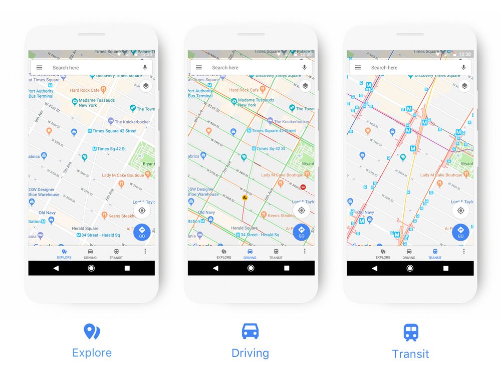
Yesterday, the Google Maps team announced a new look for the app:
First, we’ve updated the driving, navigation, transit and explore maps to better highlight the information most relevant to each experience (think gas stations for navigation, train stations for transit, and so on). We’ve also updated our color scheme and added new icons to help you quickly identify exactly what kind of point of interest you’re looking at.
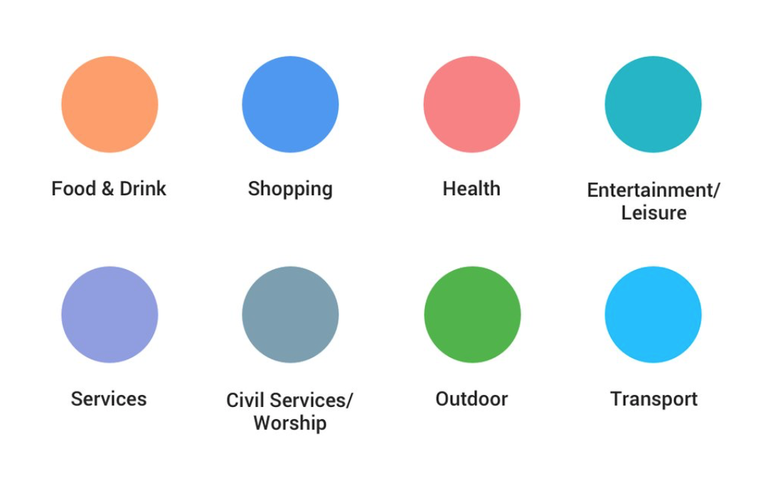
The latter point is particularly interesting to me. Points of interest are marked with a variety of icons that can be in one of eight colors:

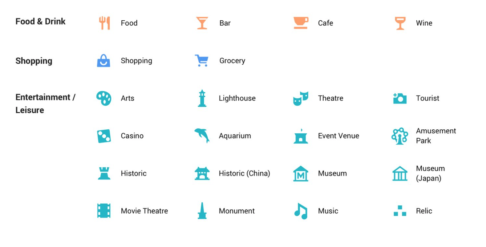
The combination of colors with the form of the icons gives you information about what they are in a very compact form:

The first thing that comes to mind when I see such schemes is, “what happens with people who are color-blind?” This particular application doesn’t appear to rely completely on color (icons are a fallback), but color is central to the maps’ visual hierarchy and some of these seem awfully close.
That said, Google Maps and Apple Maps do an admirable job of conveying useful information in smartphone screens. Designers of such apps face various challenges that aren’t present in many other systems, including the fact that users can arbitrarily vary the scale of the map. This requires careful consideration of hierarchy: knowing which elements to present when is key. It’s worth studying the ongoing evolution of these apps as they move to display ever more information in the same constrained space.
Via The Verge