If you design software, you need to know about placemaking. Why? Because the websites and apps you design will create the contexts in which people shop, bank, learn, gossip with their friends, store their photos, etc. While people will experience these things primarily through screens in phones, tablets, and computers, they actually perceive them as places they go to to do particular things.
Your users need to be able to make sense of these information environments so they can get around in them and find and do the things they came for, just as they do with physical environments such as towns and buildings. People need to form accurate mental models of these environments if they are to use them skillfully.
As a discipline, software user interface design has only been around for about sixty years. However, we’ve been designing places for much longer. There’s much we can learn from architecture and urban design to help us create more effective apps and websites. This article is a short case study in the design of a particular physical environment that has valuable lessons for those of us who design information environments: Disneyland.
Why Disneyland?
To start with, as a designed place, Disneyland is unarguably successful. Since its opening in 1955, it has received over 650 million visitors and has become a cultural touchstone. (And it’s not even the most popular of Disney’s “castle” parks!)
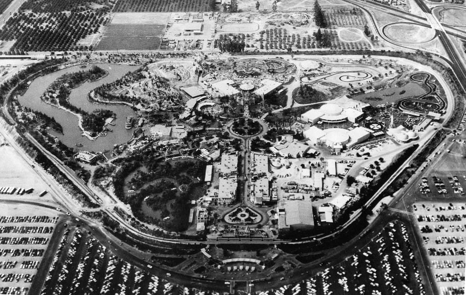
Aerial view of Disneyland in 1956. Image: Wikimedia (Public domain)
Disneyland is also a large-scale environment (smaller than a town, but larger than a building) that has been carefully designed and managed by a single entity — the Walt Disney Company — for over sixty years. This allows us to examine the evolution of major placemaking principles in a very crisp way over a long period of time.
Another reason to study Disneyland is that it was designed with storytelling in mind, so it has rich semantic and narrative layers that separate it from most other built environments. As a result, it has more in common with interactive information environments than many other physical places.

A “hidden Mickey” in the queue for Gadget’s Go Coaster in Disneyland. Image: Loren Javier
And finally, Disneyland is a lot of fun! It’s not only fun to visit: it’s also fun to read and write about. But as we’ll see, Disneyland is serious fun, since it addresses and reflects the anxieties and aspirations of the time and place it was created in. In fact, Disneyland is a perfect example of what the architect Christopher Alexander calls good fit: a successful relationship between a form and the context it was created to address.
So in this article we’ll be looking at Disneyland as an information environment that happens to be built in the real world, and see what we can learn from it. Let’s start at the beginning: with the core vision that animates the design of the place.

Lesson 1: Start with a vision that resonates with your users
One Saturday in 1947, Disney animator John Hench drove into the parking lot at the studio and saw a peculiar sight: his boss, Walt Disney, was pacing an empty lot across the street. When Hench asked Walt what he was doing, he told him he had this idea for a “Mickey Mouse park” to entertain studio visitors.
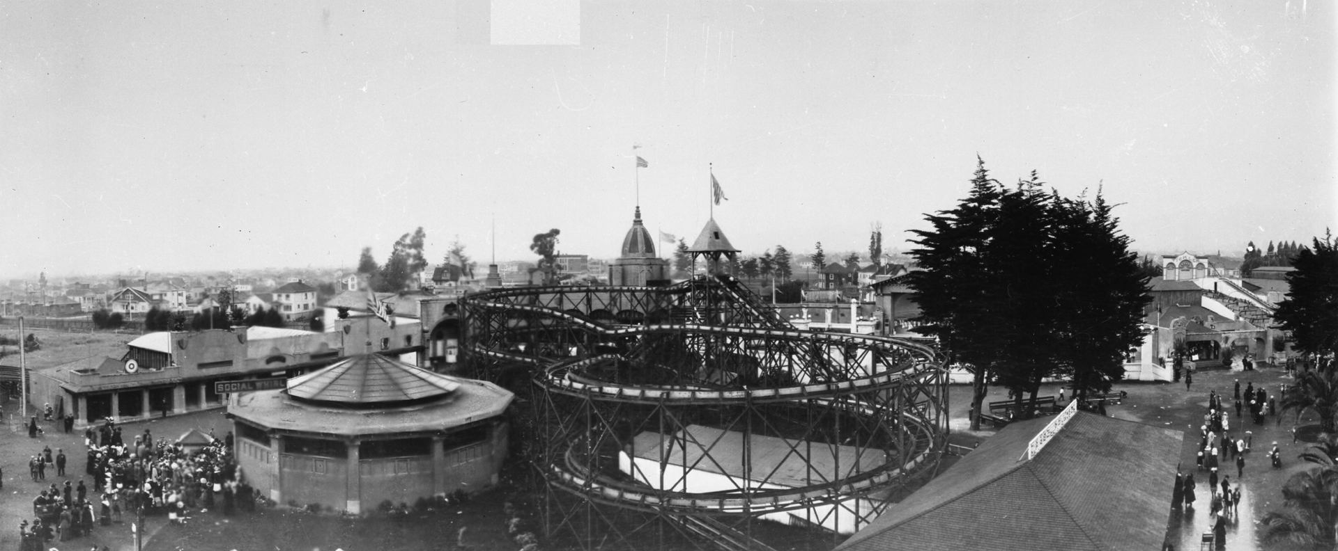
World fairs and places like Coney Island, Kennywood, and “trolley parks” such as Oakland’s Idora Park (pictured here) had been entertaining people since before Walt was born. Image: Wikimedia (Public domain)
Amusement parks had been around for a long time prior to the mid-1940s. These parks were groups of independently owned attractions, and tended to be chaotic, dirty, and seedy. Walt had a different idea for his park: He wanted a clean, family-friendly place that emphasized storytelling through unified theming, a place where the people who loved Disney movies could come to experience them “in real life”.
The initial plan was to create an Old West-themed park in the narrow lot across the street from the studio where Hench had seen Walt pacing. However, Burbank city officials rejected this plan and Disney had to look elsewhere.
Walt’s ambitions grew to encompass more than just the Old West. Given this broader scope, the design team divided the park into sections, called lands, which represented various themes. For example, one land would be devoted to fairy tales such as those featured in Disney movies, another to the Old West, etc. (Lots of different themes were explored at first, including clunkers such as Lilliputian Land, in which everything would be miniaturized — including tiny hot dogs which could be purchased and eaten!)
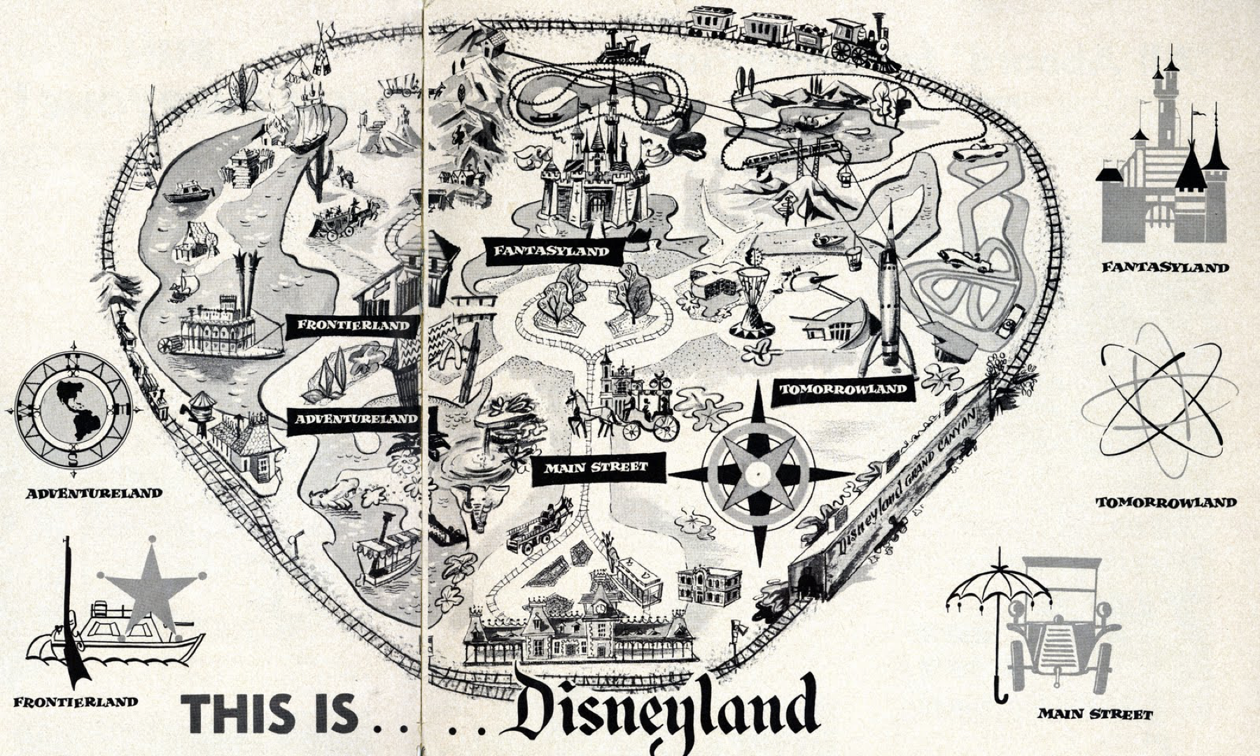
Early Disneyland map. Image: Disney (via Malia Munday)
The park would eventually open with five themed lands:
- Fantasyland, which brought fairy tales to life,
- Frontierland, a recreation of the American Old West as understood by 1950s audiences,
- Adventureland, an expression of exotic locales and cultures,
- Tomorrowland, which presented an optimistic view of a future made better through science, technology, and corporate largesse,
- and Main Street U.S.A., a nostalgic recreation of the type of small-town American Main Street that automobile culture was displacing at the time.
These themed lands became the conceptual framework around which the entire Disneyland experience was organized. It’s worth noting that this exact framework also served as the organizing principle for Disney’s first foray into the new medium of television — a show also called Disneyland — which appeared concurrently with the park’s construction (and which helped finance it).

Stills from the first season of the Disneyland TV show (1954). Image: Disney
The Disney organization is often cited as an early case study in corporate synergy: different, but related, businesses working in concert to improve each other’s position in the marketplace. The TV show would promote the park, the park would promote the movies, the movies would promote consumer products, in a virtuous cycle revolving around a consistent set of themes: nostalgia, fantasy, adventure, the old frontier, and new frontiers, all of which informed the products of the Disney studio (and many of its competitors) in the mid-1950s.
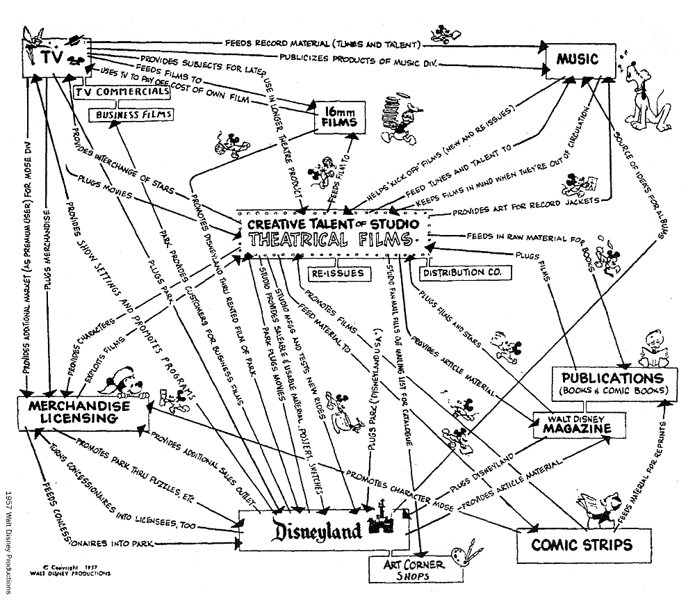
Mid-1950s map of Disney’s various interrelated businesses. Image: © 1957 Disney (via Phillipe Boukobza)
This was no coincidence. In 1950s America, the economy (and the population) was booming, the automobile (and the interstate highways and suburbs it enabled) was changing the ways people lived, and the Cold War (which brought the ambivalence of technology to the fore) cast a shadow over everything. The themes that informed early Disneyland (the opening of the frontier, nostalgia, the promise of tomorrow) resonated deeply with this primary audience. More than an amusement park, Disneyland would be a place where Americans could physically indulge in fantasies about their past, their future, and the innocence of youth.
This is a powerful vision, and it would prove an important competitive advantage for the park when it opened. You’re reminded of it every time you enter the park; it’s engraved in a little plaque that hangs above the entrance. It reads:
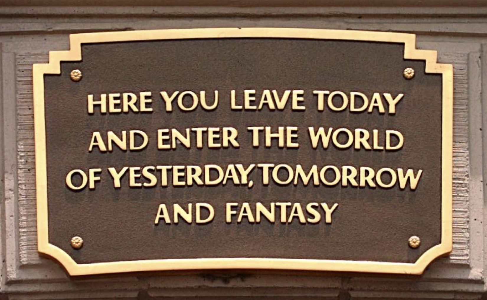
Image: Cburnett
A clear, compelling vision such as Disneyland’s can inspire and guide design teams around a singular direction. That said, having a compelling vision and a clear conceptual framework is not enough. The vision and framework must be organized in a way that makes it possible for people to relate to it, to interact with it. This brings us to our second lesson.

Lesson 2: Organize the experience into a coherent structure
The second lesson is the importance of having a coherent, extensible structure. This structure brings order to what could otherwise be a chaotic environment, and helps create a clear mental model so people experiencing the place can understand where they are, what they can do there, and where they can go next.
Disneyland’s structure makes it easier for new visitors to understand the place. It also allows the park to change and grow gracefully. Let’s examine three key structural aspects of the Disneyland experience:
- Its taxonomy
- Its topology
- The use of language and metaphor in the park
The taxonomy of Disneyland
As I mentioned previously, Disneyland is divided into various lands, such as Tomorrowland, Fantasyland, and Adventureland. This group of lands, and the attractions they contain, can be represented as a traditional taxonomy. For example, the Jungle Cruise attraction is located in Adventureland, and only makes sense there.
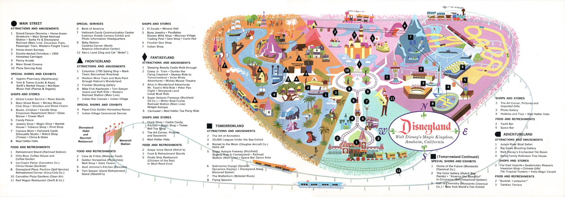 1963 Disneyland map. Image: Disney (via Tom Simpson)
You could create an outline of the lands in Disneyland and the attractions and other elements they offer, and it would look much like the outline for the structure of a website. You can think of this taxonomy as a map to the content of Disneyland: the specific things it offers.
The topology of Disneyland
When you examine this taxonomy, you’ll notice that even though each land contains things that are unique to it, such as the Jungle Cruise in Adventureland, all lands offer the same types of things: They all have attractions, restaurants, shops, and guest services facilities (such as bathrooms, first aid stations, etc.) I call this self-similarity between the main areas of the place its topological structure.
Topology is a term that comes from mathematics: It’s the study of the properties that are preserved when something undergoes non-destructive transformations such as twisting, stretching, and scaling. Think of a circle. If you stretch the circle, you create an ellipse. The ellipse and the circle are topologically equivalent. However, if you tear the ellipse in half, it would no longer be topologically equivalent to the circle.
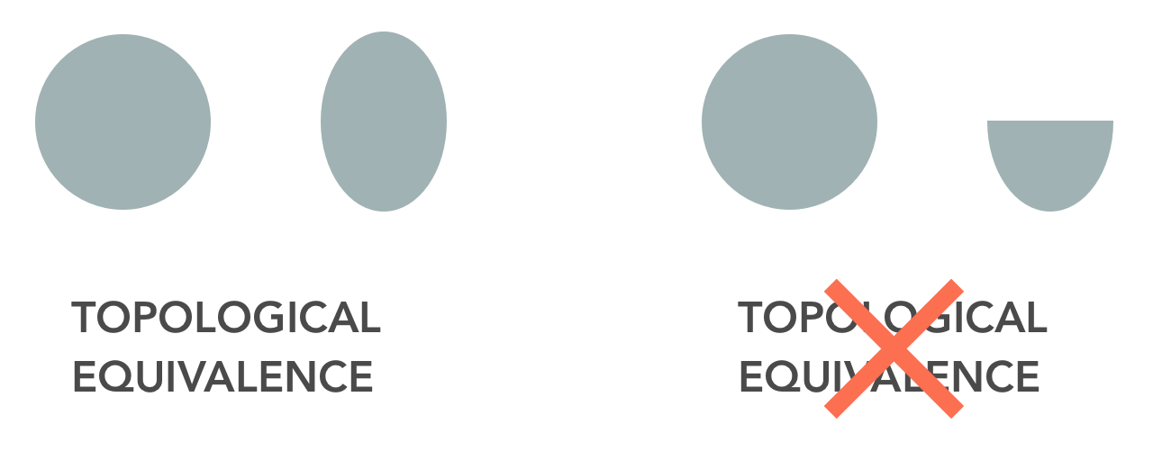
Even though the lands in Disneyland feature very different attractions, they share a common structure that make them topologically equivalent with each other. The attractions-restaurants-shops-services template is an invariant structural construct: all lands in all Disneyland parks use it.

This arrangement has an important effect in the way visitors understand and navigate the park. For one thing, the themes are made clearer because they are presented as narrative variations on top of an invariant, predictable structure.
For another, this also makes the environment easier to learn, since the affordances provided by one land are present in all the others. Should the Tomorrowland visitor feel the sudden urge to use the restroom, he doesn’t need to rush back to Main Street U.S.A. since he knows all lands have at least one restroom facility.
It’s worth noting that this invariance doesn’t mean the relationships, proportions, and amounts of the elements are identical in all the lands. Adventureland has more attractions than Main Street U.S.A., for example. What’s important is that the underlying structure itself remains constant as the visitor moves from one land to the next.
This topological structure has made it possible for Disneyland to change and grow over the decades while preserving the clarity of the environment. Park designers occasionally add and remove attractions, restaurants, shops, and services to the park. Every once in a while, they also add a new land, with its own set of attractions, restaurants, shops, and services. (There’s a new one being built right now, based on the Star Wars movies.) And of course, the entire park-land construct can be replicated. (It has been, once per decade, over the past sixty years. There are now Disneyland-style parks in Florida, Tokyo, Paris, Hong Kong, and Shanghai.)
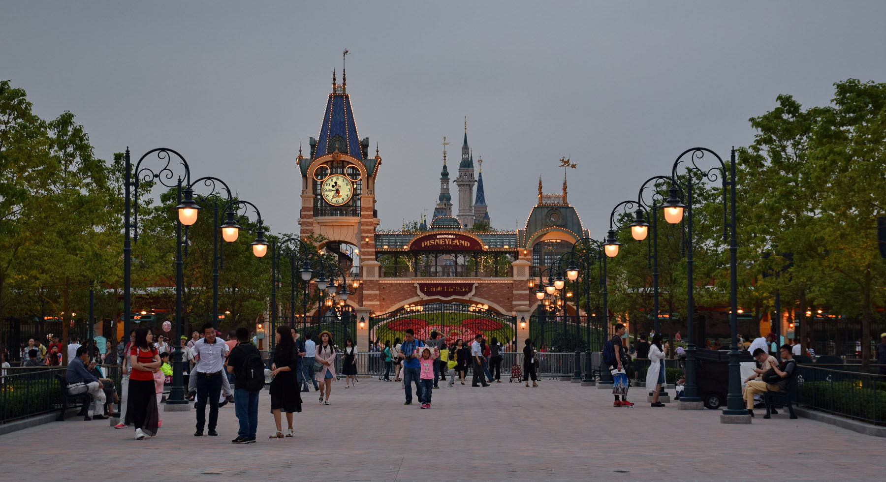
The latest Disneyland park opened in Shanghai in June 2016. Image: Baycrest
So how does this apply to UX? Consider how a key function of content strategy is identifying and defining content types so large-scale information environments can change organically while maintaining coherence and understandability. These content types are a topological construct of the sort I’m talking about. That said, topologies are applicable to more than just content-heavy systems; they’re an important consideration for any large information environment that must adapt to change over time. (Don’t they all?)
Language and metaphor in Disneyland
Another cunning use of structure in Disneyland is the way Disney designers use language and metaphor to influence behavior. For example, the people who work in the park are not called employees; they are cast members. These cast members don’t wear uniforms; their on-the-job clothes are referred to as costumes. And did you notice I referred to park visitors as guests? This was another semantic innovation Disney brought to the amusement park business. (The traditional term used in the industry was marks, which says a lot about how park operators thought of their customers.)
Underlying these terms is a ubiquitous metaphor: that the park and its employees are putting on a show. This metaphor informs everything about the Disneyland experience. For example, areas of the park that are forbidden to guests are said to be backstage. When something in the park is broken in plain sight of guests, it is said to be bad show.
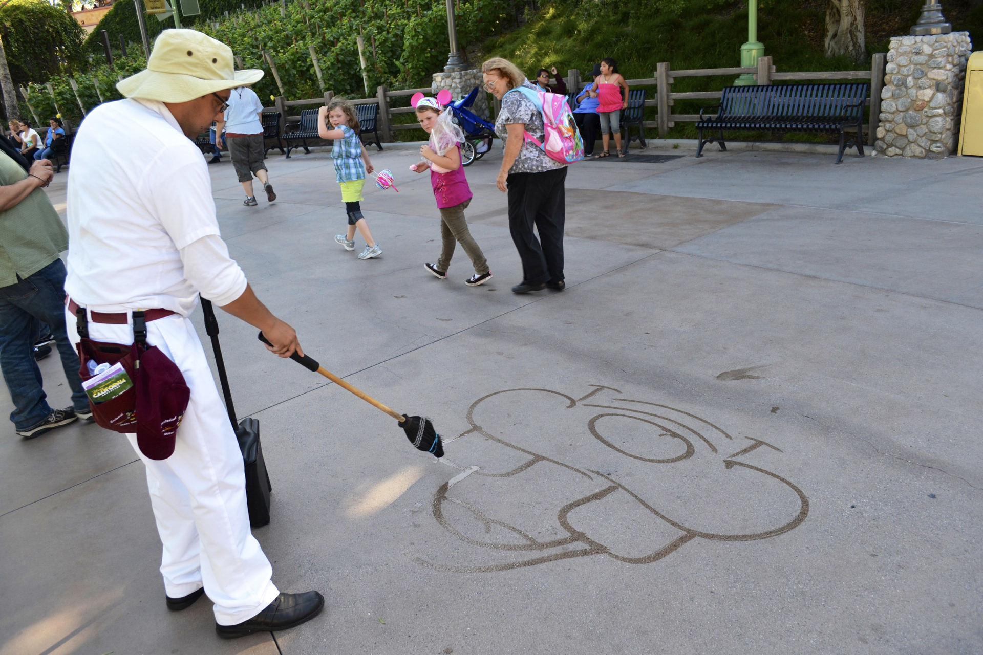
Custodial staff member entertaining guests. Image: Loren Javier
The choice of words we use to describe elements and actors in information environments has an important effect in how we act with and within them. Think about the way your team talks about the people who use your information environments. Do you refer to them as users? Maybe you may think of them as customers? Or perhaps you have some other term, particular to your industry, such as patients. Whichever the case, the term you use will have a subtle influence in the way you design for and interact with these people. Because Disney refers to its customers as guests, Disneyland cast members are more willing to accommodate their whims than if they thought of them as marks.
This showbiz metaphor, as expressed through particular language, is an important part of the semantic structure that organizes and directs the Disneyland experience. This structure establishes the divisions and connections between the elements that compose the information environment. A coherent structure can make the environment easier to learn and navigate, and makes it possible for the environment to grow and change over time.
Semantic structures have a huge influence in how people think and behave when they interact in an environment. That said, these are abstract ideas. For people to be able to relate with the environment, these structures must be made into things people can actually experience. That brings us to the final lesson: the importance of using traditional placemaking principles to create an environment the people can actually interact with.

Lesson 3: Use traditional principles to create a sense of place
With a structural framework in place, we now face the challenge of making a place that people can move around in and enjoy. This is where the learnings from urban design and architecture really pay off.
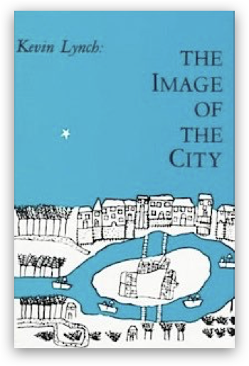 The Image of the City (1960)
The study of how people form mental models of the places they inhabit can be particularly useful. Kevin Lynch’s book The Image of the City (1960) offers insights into this. It presents five elements that define how people experience urban environments:
- Districts: The sections of the town or city, which have their own character, and which people have a sense of being “inside of”.
- Paths: The means by which people get around the environment.
- Landmarks: Physical structures that give people a sense of bearing.
- Edges: Boundaries between two phases, lines that break continuity in the place.
- Nodes: Areas of concentration of activity that serve as focal points for people to go to or from.
Particular combinations of these elements make cities and towns different from each other and allow people to create mental models of the one they’re in. Because Disneyland is an urban-sized environment that has been designed and maintained by a single entity, these elements come together in a particularly harmonious and focused manner. Careful attention to the hierarchy of the various components of the environment, the transitions and boundaries between areas of the park, and the connections between them, create a place that is not only easy to get around in, but also coherent, learnable, and memorable.
When navigating an information environment, we also need to make sense of where we are, what we can do there, and where we can go next. Studying these elements can help us design information environments that make this possible. Let’s examine how they come together in Disneyland.
Paths, nodes, and landmarks
Let’s start by looking at how people navigate the environment. When UX designers think of navigation systems, we usually think about navigation bars and search engines. The purpose of these things is to make it possible for people to move from one area of the website or app to another, to get closer to what they’re looking for.

usatoday.com’s primary navigation system allows visitors to go to the main areas of the site.
Navigation in Disneyland has similar purposes. However, since the park is a physical environment, it takes its design cues from architecture and urban design.
Disneyland implements a “hub and spoke” navigation model: There is a central hub, and all lands radiate off it. The park’s original design had a single entrance, located in the front of Main Street U.S.A., which led directly to this central hub. (It’s worth noting that this, too, was a Disney innovation in amusement park design: when Walt consulted other amusement park operators during the design of Disneyland, he was told this scheme wouldn’t work because it would limit the amount of people that could enter the park.)
Visitors enter the park from two tunnels underneath a train station. They then head down Main Street U.S.A. towards the hub, from which they can choose to visit any of the other four lands. Main Street U.S.A. is an example of the paths Lynch presents in his book: a way for users to get from one place to the next.
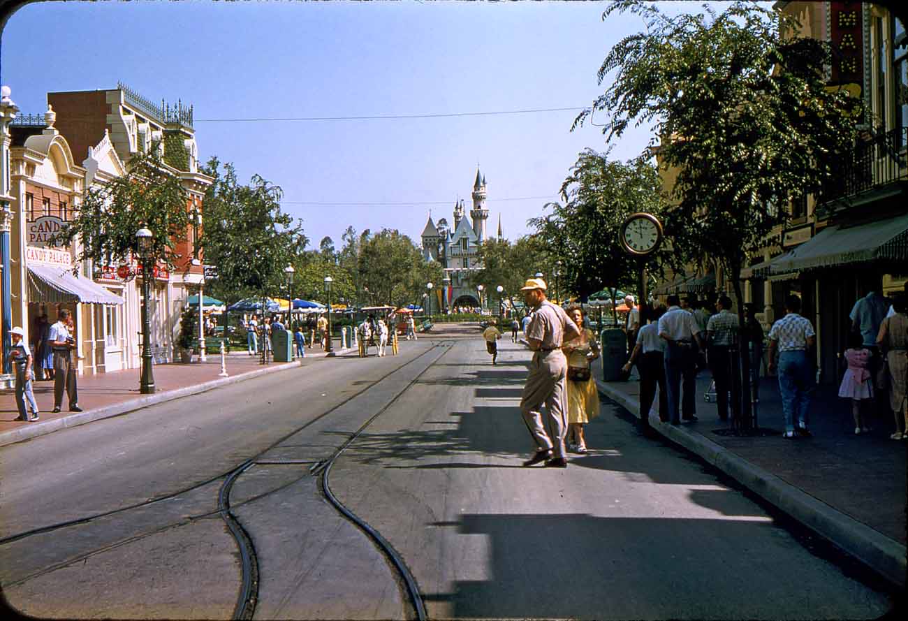
Main Street U.S.A. in the 1950s. Image: Major Pepperidge
People instinctively know to walk down Main Street because their attention is drawn to a very unusual element at the end of the street: Sleeping Beauty Castle, a sight never before seen at the end of a traditional American Main Street. The castle is an example of what Walt called a wienie: a prominent vertical element meant to pique the interest of guests and entice them to move in that direction.
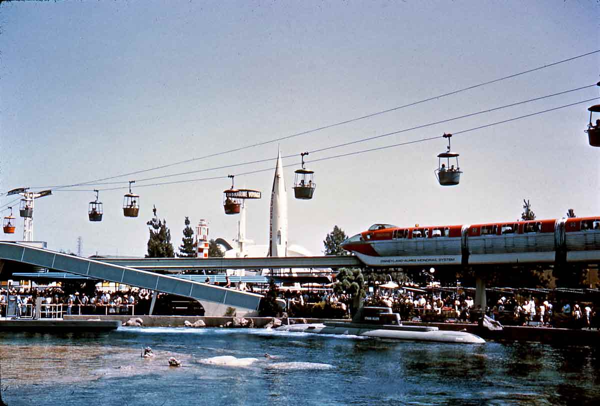
The TWA Moonliner rocket served as an early Tomorrowland landmark. Image: Tom Simpson
Once in the hub, guests would look around and see other wienies beckoning them: the Swiss Family Robinson’s tree house in Adventureland, the Mark Twain riverboat in Frontierland, and the TWA rocket ship in Tomorrowland. In Disneyland, these wienies serve as landmarks: they not only attract people by standing out, but also help keep them oriented as they move around a potentially chaotic environment.
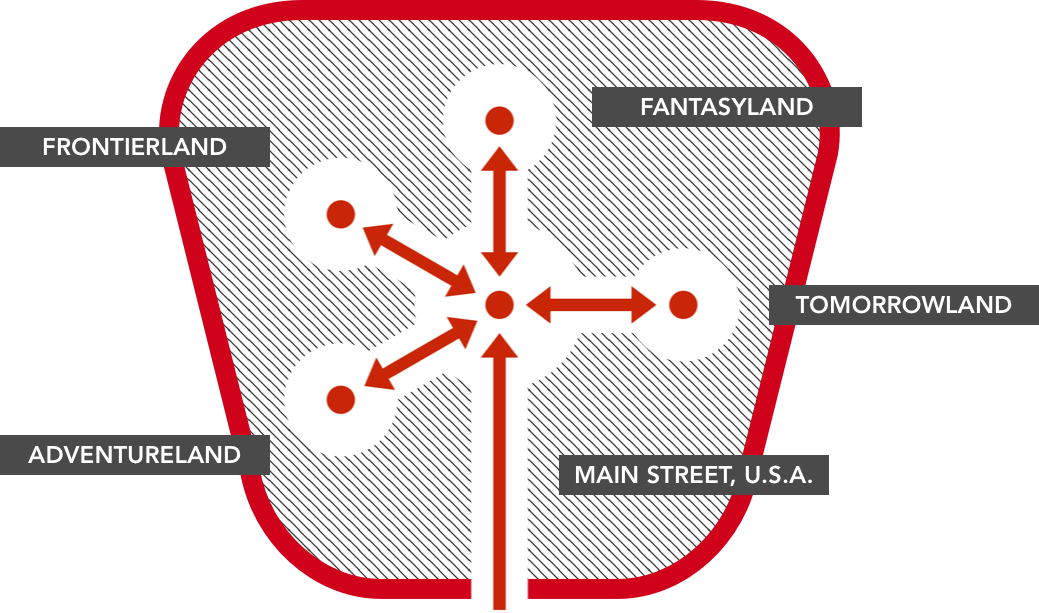
Placemaking elements in Disneyland’s original (1955) layout.
Walking toward the weinies, Disneyland visitors eventually find themselves in a central opening, or plaza, where they can experience the theming, attractions, etc. that are unique to each land. These are examples of nodes in the sense Lynch talks about.
This combination of nodes, paths that connect them, and landmarks that draw people’s attention towards them, makes Disneyland easy to move around in. We have equivalents to all three in user experience design. As I’ve mentioned, navigation bars and search systems provide means for users of information environments to go from one part of the environment to another. Semantic elements such as labels and icons provide the landmarks and affordances that indicate where people can go within the environment, and second-level screens serve as nodes by providing concentrated access to related information elements and a sense of local identity for different areas of the environment.

With its prominent location, the iconic Amazon shopping cart serves as a wienie, always beckoning the user to initiate the checkout process.
Districts
These different areas of the environment can be thought of as districts in the sense Lynch talks about. As you may have guessed, Disneyland’s individual lands — Fantasyland, Adventureland, Tomorrowland, etc. — are districts in this sense; they all have unique characteristics that set them apart from each other and give them particular flavors.
The lands convey these concepts and narrative — i.e. the things that make them different from each other — through incredibly thorough and detailed theming. For example, everything in Adventureland — the architecture, the foliage, the music, etc. — has been carefully designed to make you feel like you’re standing in an exotic jungle outpost.
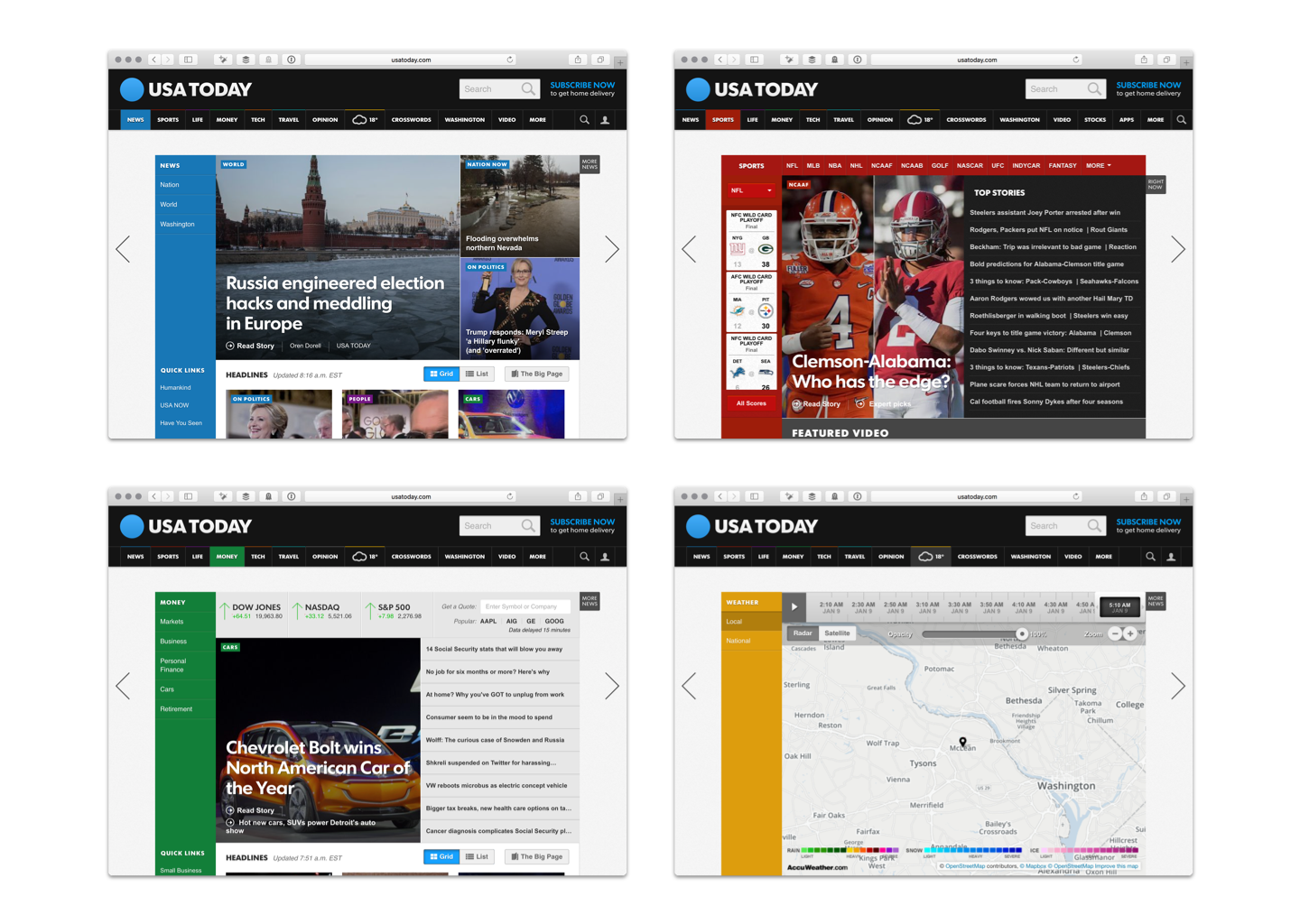
The main sections of the USA Today website are differentiated using color and particular semantic structures.
When I think of theming in the context of UX, two main areas of focus come to mind:
- Visual presentation
- Style of writing or tone of voice
In both cases, style and theming should be in service to the conceptual framework that underlies the work. Many designers understand the importance of choosing the right style or tone when it comes to language. However, when it comes to visual design, we are still much too driven by trends.
For example, think of the move we saw a few years ago towards “flat” visual design, which eschews “skeuomorphic” (or “realistic”) details in favor of a more pure “digital” esthetic. While I have nothing per se against this style, I don’t like it when designers select it for their projects just because everyone else is doing it. Visual style should reinforce and support narrative.
Disneyland would’ve been much less successful if its designers had decided to have the environment reflect the “pure” nature of the materials it’s made from: fiberglass, wood, steel, etc. Instead, designers harnessed the plastic capabilities of those materials to reinforce the differences between lands, in support of the conceptual framework that makes the park such a compelling experience.
“Gratuitous”, “skeuomorphic” (or to be kinder, “whimsical”) theming is not only ok to do — sometimes, it’s the right approach.
Edges
Finally, let’s look at edges. One of Disneyland’s most interesting design features is how it deals with transitions: those between the individual lands, and those between the park itself and the outside world.
The park’s lands have been carefully designed so their themes blend smoothly into each other. If you’re walking from Adventureland to Frontierland, you won’t experience an abrupt change. Instead, the architecture, foliage, etc. subtly blend together to achieve what has been compared to a cinematic cross-dissolve in real-life. (Many of Disneyland’s designers came from the movie industry; the park’s design is heavily influenced by cinema.) These smooth transitions are what I refer to as “soft” edges.
The opposite, “hard” edges, are transitions that have been intentionally designed to keep things apart. Disneyland also offers a prime example of these. Walt wanted to keep visitors from seeing the outside world so their experience of being in the park could be more immersive. To do this, he surrounded Disneyland with a train track atop a raised earth berm, which occludes sight lines into and out of the park. When the park first opened, this berm was crossed at only one point: the entrance tunnels leading to Main Street which we have spoken of earlier. So you could say this is a very hard edge.

In order to occlude views of the outside world, Disneyland is surrounded by an earth berm with a railroad running on top of it. Note the tunnels passing under the tracks on both sides of the train station. Image: Imagineering Disney
In UX design, we often have to deal with edges between different parts of information environments, and we need to decide how hard or soft they need to be. For example, many financial services websites include areas of the environment that are meant for public use and the more private, “logged in” areas meant for customer use only.

The public and private areas of citibank.com look similar, but are in fact very different places. Crossing this boundary requres entering a user name and password. This is a rather hard edge.
Some of these transitions need to be very hard, with the user being explicitly presented with stops when they try to cross over from public to private. In others, this boundary is much softer: the transition happens more gradually. Knowing these edges can have different levels of softness helps us frame the conversation with the design team so that decisions happen in an informed manner.
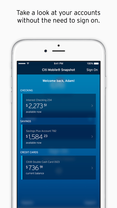
The Citibank iPhone app, on the other hand, offers an intermediate state between logged in/out that offers the user some information about her accounts before she’s logged in. The user can also log in faster using Touch ID. This is a much softer edge. Image: Citibank
Let’s recap
People form mental images of urban environments, such as towns and cities, using five elements: districts, edges, nodes, paths, and landmarks. Information environments have comparable elements that help people make sense where they are and what they can do there.
These placemaking elements are most effective when they work together to implement a semantic structure that brings coherence to the environment. This structure implements differentiations and metaphors that allow people to relate to and understand the environment.
This structure is most effective when it’s informed by a clear vision. In the case of Disneyland, this vision was set forth early on in the design process. It guided the design team towards the creation of a new type of environment that had never been experienced before, and which resonated deeply with its users.
These three components — vision, structure, and placemaking elements — build upon each other respectively. It’s difficult to create a meaningful structure if the vision isn’t clear, and designing placemaking elements without a clear semantic structure supporting them can only lead to an incoherent environment.
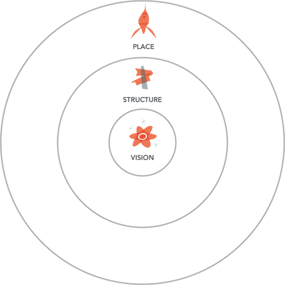
As they do with physical environments, people who use an information environment need to be able to create a mental model of the environment so they can act skillfully in it. As designers, we can help them along by using traditional principles to create a strong sense of place, informed by a coherent structure that articulates a resonant vision. Disneyland offers a perfect model for us to study.
Postscript: Crafting a vision statement for your environment
While all three components — vision, structure, and placemaking — are critical, designers most often take for granted the vision component. Design projects usually start with some sort of brief that lays out high-level requirements and objectives, but the vision of what the place is going to be (and how the people who use it will experience it) is seldom discussed. Because everything that follows will build upon it, it’s critical that the vision of the place be clear from the start.
In order to help clarify the vision for the design team, I’ve started doing a small exercise at the beginning of projects to produce what I call a “here you”, or vision of place, statement. This is a short sentence that articulates succinctly and powerfully what this place will be about, and how it will act on the people who experience it.
It’s called a “here you” statement because we use as our model Disneyland’s vision of place statement. (“Here you leave today and enter the world of yesterday, tomorrow, and fantasy.”) We take out everything but the words “here you” from Disneyland’s statement, and fill out our own words from there on:
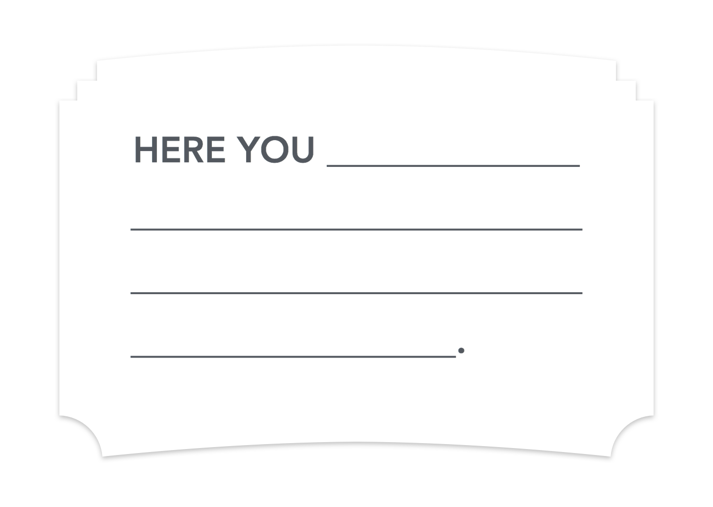
A few guidelines to help you create a “here you” statement:
- Keep it short! (It should be able to fit in the brass plaque above the entrance to Disneyland.)
- You’re not writing a vision for your team or your organization. You’re writing a vision for the place you are creating.
- It should not reflect your point of view of the place, but that of the people who use your place. (That’s why it starts with the words “here you,” addressing the visitor.)
- The language should be energizing. Visitors should be excited to visit this place; avoid clichés.
- Be realistic about what you’re trying to achieve with the place you’re making. That said, don’t be afraid to aim high!
- You’ll have better traction if you work on this together with your team.
A well-crafted vision of place can help energize the design team, and get it working in a singular direction. When the time comes to make difficult design decisions, the vision of place statement can help the team make the right decision by honoring the intent behind the project.
This post was originally published in Medium.