This post is based on a speech I wrote for two back-to-back keynotes delivered in November 2016 at Interaction South America (Santiago, Chile) and the Italian IA Summit (Rome). The U.S. election was decided on the eve before I flew to Rome.
When architects tour Rome, one of the things they learn is that buildings can last a long time. When I was younger, I had the privilege of studying architecture for two semesters in the city, and one building stood out for me: the Basilica of San Clemente al Laterano, a beautiful church built during the middle ages. I was struck by the fact that the basilica had been built on top of an earlier building: a 4th century church which you can visit by descending to a basement under the main structure. That church, in turn, was also built atop an earlier building which was used by followers of the cult of Mithra, and which you can also visit today. The Basilica of San Clemente has been used as a place of worship for almost twenty centuries. When you visit it, you have a tangible experience of the evolution of Western spiritual practice over that span of time.
Buildings serve more than mere utilitarian purposes, such as keeping us dry from the rain or giving us a safe place to rest. They’re also physical manifestations of the political, social, and cultural environments that produced them. Buildings tell stories about who we are — and who we were — as a people. As an architect, I often think about the longevity and cultural import of buildings and how it contrasts with what I currently design: software. If buildings are among our longest-lived cultural artifacts, apps and websites are among our most ephemeral. Software is changing all the time, sometimes in big ways. For example, iOS 7 introduced a completely new visual design to the iPhone’s operating system. From one day to the next, the feeling of the entire information environment changed. Perfectly functional applications that didn’t immediately implement the new style suddenly looked old and out-of-place. This change was experienced by millions of people, literally overnight.
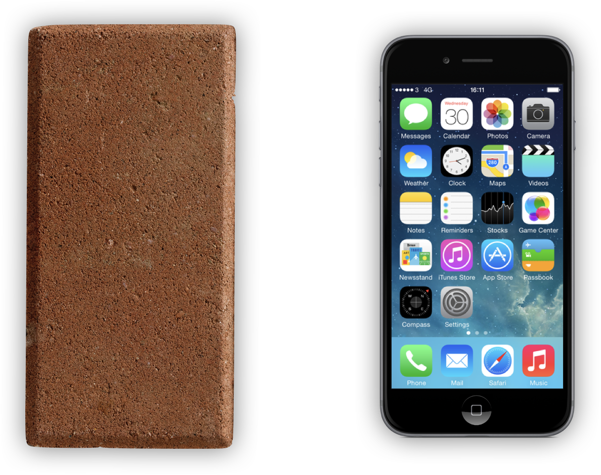
There’s some irony in the fact that the first cell phones were derided as “bricks”.
Unlike building materials, such as brick, wood, and steel, software is malleable, reproducible, iterative, and ubiquitous. These characteristics have allowed it to address a wide variety of problems, and to get better, faster, and cheaper all the time. As a result, software is taking over more and more tasks we previously did in buildings. It wasn’t long ago that you would’ve visited a record store if you wanted to buy music. Now you pay for the (temporary) privilege to stream to your phone the bits that represent music. Record stores are all but gone, and many musicians have had to shift to other means of earning a living. This transformation is a clear illustration of the phenomenon described in Marc Andreesen’s Wall Street Journal essay Why Software is Eating the World, in which he proposed that
we are in the middle of a dramatic and broad technological and economic shift in which software companies are poised to take over large swathes of the economy.
And it’s not just information-based industries, such as music, that are being “eaten”. We’re also adding a layer of information on top of the physical world that changes how we experience it. Think of an app like Yelp, which allows us to locate the best nearby gelateria. You’d expect ice cream — that most sensuous of gastronomic pleasures — to be immune from being eaten by software, yet many shops and restaurants are coming to depend on digital information as the primary means for people to find them.
Software also makes possible things that were previously impossible. I recently traveled to the Netherlands, where I had the opportunity to test Google Translate’s “Word Lens” feature, which uses my iPhone’s camera to provide a live translation of non-English words in the environment. This allowed me to get on the right train, and to order food from a menu, even though I can’t read Dutch. The ability to act skillfully within an environment encoded in a language I don’t understand is a superpower I now have, and it was made possible by software. This changes my relationship with the physical environment.
We need to recognize that in some important ways, software is taking over from architecture as the medium where many of our day-to-day activities happen. The writer and designer Edwin Schlossberg has said that “the skill of writing is creating a context in which other people can think.” Well, I think the skill of designing — especially designing software — is creating contexts in which other people can work, learn, play, organize, bank, shop, gossip, and find great gelato.
As someone tasked with designing these information environments, I find this exhilarating. We have such a broad scope of action! However, when I speak with other designers, I get the impression that often our focus is too narrow. Many of us are thinking about very small parts of these environments; one component of one screen of one version of one app on one platform at a time. Enthralled by the amazing artifacts we’re creating, we’re oblivious to the bigger picture. Again, the things we’re designing are complementing — and often obviating — physical environments that have served as our contexts for centuries, and we’re doing so with extremely ephemeral mechanisms. If we’re going to build our society upon software, it’s not unreasonable to expect that it provide us with the sort of contextual stability we’ve come to expect from our built environments. So the central question for me at the moment is: How can we design information environments that support wholeness in the long-term?
Harvard Business Review, September 2015
This is easier said than done, in no small part because designers have been blindsided by success. Design is now accepted as key aspect of business, and competent designers are in high demand. At a time when the middle class is shrinking, salaries and jobs for designers seem secure. Even the Harvard Business Review touts our accomplishments! Why should we be concerned about wholeness and longevity? Well, we should be concerned because we — and our kids — need to live in the world we’re creating. As you may have surmised, I’m not convinced we’re going about the design of information products and services in a way that leads us to a viable future.
In the early 1990s, the U.S. Army War College created an acronym to describe the geopolitical situation after the Cold War: VUCA. It stands for volatility, uncertainty, complexity, and ambiguity, four characteristics they saw as defining the multilateral post-Cold War world. The rise of information technologies — and the internet in particular — has radically transformed our political, economical, and social reality. We are all now living in a generalized state of VUCA. We see signs of it everywhere.
VUCA is when a few disenfranchised citizens come together in a social network and start a movement that topples a 30-year-old dictatorship in a matter of weeks.

Image source: Wikimedia
VUCA is when our appliances start attacking us.
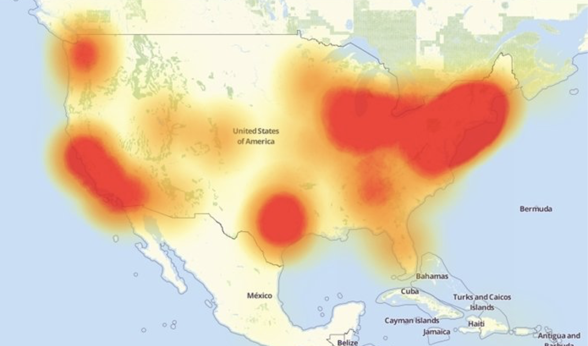
Image source: downdetector.com
BREXIT is a sign of VUCA. So is the election of Donald Trump.
The things we design are the mechanisms more and more people are using to understand and interact with the world and with each other. Information environments can either help open our minds and increase our understanding, or mislead us by feeding us “fake news”, or trapping us in “opinion bubbles” that make us believe everyone thinks the same way we do. Information environments can help us act more skillfully in a VUCA world, or make us victims of our circumstances. Designers need to approach our craft with much greater conscientiousness. With that in mind, I’d like to offer three perspectives to help us design information environments that create more viable contexts in the long term.
Structure
The first perspective is that all information environments have underlying semantic structures that support them. These structures exist whether they’ve been designed intentionally or not. I’m talking about information architecture, which includes (among other things) the categories, hierarchies, and particular language that make one information environment different from another.
For our purposes here, it’s important to recognize that these semantic structures change more slowly than the user interfaces they support. When I was working on the fourth edition of the polar bear book, one of my tasks was updating the examples in the book. This required that I re-visit many of the websites featured in previous editions. One of those websites — fedex.com — had a very different visual presentation in the mid-2000s (when the third edition of the book was written) than it did ten years later. However, when I started examining the site’s semantic structures, it struck me how little they had changed over that decade. I’ve seen this in my work as well: It’s not uncommon for organizations to overhaul their websites’ and apps’ “look and feel” while leaving their major categorization and language schemes largely untouched.
Of course, this phenomenon is not unique to information environments. There are many other things in the world that don’t change in a uniform way. In his book How Buildings Learn: What Happens After They’re Built, Stewart Brand explains that buildings are composed of layers that change at different rates. These layers are (from slowest to fastest): site, structure, skin, services, space plan, and stuff. “Site” — the ground upon which the building rests — changes very slowly, at geological pace. “Stuff”, on the other hand, refers to the things we put inside buildings, such as furniture and appliances, which can easily be moved and therefore change much faster. As buildings adapt to change over time, the form they take is affected on the differences in malleability of the various layers.

Brand’s “shearing layers” model (1994)
In a subsequent book, The Clock of the Long Now, Brand extended this “shearing layers” model to explain how civilizations change. This broader model is also composed of six layers (again, from slowest to fastest): nature, culture, governance, infrastructure, commerce, and fashion. Brand explains that because fashion (and art) change so quickly, this is where the civilization experiments with new ideas and ways of being. Worthwhile ideas are assimilated into the underlying layers, where they become more permanent parts of the civilization. As Brand explains,
The combination of fast and slow components makes the system resilient, along with the way the differently paced parts affect each other. Fast learns, slow remembers. Fast proposes, slow disposes. Fast is discontinuous, slow is continuous. Fast and small instructs slow and big by accrued innovation an occasional revolution. Slow and big controls small and fast by constraint and constancy. Fast gets all our attention, slow has all the power. All durable dynamic systems have this sort of structure; it is what makes them adaptable and robust.

Brand’s “pace layers” model (1999)
This is a very useful insight. It helps us understand how the unevenly-changing parts of a system can help make it stronger as it evolves.
As I’ve been thinking about how to make information environments more resilient, I’ve started mapping my work to a pace-layer model. These are the layers I’ve come up with, from slowest to fastest:
- Purpose: Why the organization, team, or product exists. This is not a goal, since it can never be achieved; it’s an aspiration that the system is always working towards.
- Strategy: How the organization aspires to do things differently in order to strive towards its purpose; how it’s going to compete.
- Governance: How the organization shapes itself to implement its strategy. The rules and means of engagement, including the organization’s internal hierarchy.
- Structure: The information architecture that will inform end products and services.
- Form: The user interfaces that people use to interact with the organization’s products and services. This is where the structure is articulated as artifacts that humans can experience.

I separate form from structure for two reasons:
- As I mentioned earlier, the structure that informs these products and services changes more slowly than the user interfaces that are built upon it.
- We experience the things we design through apps, websites, social media, and a variety of other touch points. For the sake of coherence, an organization’s various user-facing artifacts should share a common semantic structure.
Many designers spend a disproportionate amount of time focused on the user interface layer. This is understandable. The UI is where the “new and shiny” action is happening. It’s also much easier to discuss UI artifacts, since structure is more abstract.
Note that the first three layers aren’t normally thought to be the domain of designers at all; the last two are where we’re usually brought in. However, in order to be successful, designers should be conversant in all of the layers, and move effortlessly between them. Understanding which layer we’re acting on at any given time is key to being effective as change agents, since all the layers require different approaches. I’ve found this pace layer model useful to not only understand the relationship between form, structure, and strategy, but also in helping us navigate complex design challenges at Futuredraft.
In any case, as designers we need to acknowledge that structural decisions are going to be a part of our information environments longer than its user interfaces. If we expect these environments to last, we need to pay careful attention to their structural underpinnings.
Systems
The second perspective is that the products and services we design don’t exist on their own: they create and participate in systems. As a passenger, the Uber app in your phone would be useless if there wasn’t someone out there driving around with a complementary Uber driver app in their phone, and an infrastructure — invisible to you both — which brings you together. Uber isn’t really a product or service: It’s a marketplace; a system. The touchpoints you experience — the driver app, the passenger app, the Uber website — are merely how you interact with this system. They can’t stand on their own.
What is a system? Simply, it’s a set of elements connected to each other in ways that allow them to form complex wholes. Think of your body. It’s composed of various organs (your liver, brain, lungs, etc.) and sub-systems (your digestive system, your circulatory system, etc.) working in concert to make a more complex whole: you. The system that is your body serves a purpose: keeping you alive. It has feedback mechanisms that let it know when it needs more energy (sleepy! hungry!), when it needs to cool off, and more. You’d be in deep trouble if these mechanisms failed.
What I’m saying here should be obvious. Systems are everywhere. They’re part of our day-to-day experience. However, understanding systemic relationships requires looking at things holistically (looking at the “big picture”), a skill that seems to have atrophied after three centuries of mostly reductionist thinking. We like to break things down into smaller chunks we can understand. We want quick, easy answers. We want someone to blame when things go wrong. As a result, we suffer from a cultural blindness to systems and their implications.
Systemic failures are everywhere. For example, recently Wells Fargo — the third largest bank in the U.S. — was engulfed in a huge scandal. Bank personnel had been pressured to sell new accounts, and some of them resorted to “selling” close to two million accounts to existing customers without their consent. The bank’s management denied any “orchestrated effort” to defraud customers, and blamed employees. Orchestrated effort or not, the incentives to meet sales quotas at Wells Fargo (which reportedly included denying bathroom brakes to underperforming employees) were clearly stronger than incentives to obey the law (and common decency). As Steve Jobs said,
Incentive structures work. So you have to be very careful of what you incent people to do, because various incentive structures create all sorts of consequences that you can’t anticipate.
Misaligned incentives, like the ones in the Wells Fargo case, are a systemic problem.
For an example closer to our discipline, consider iTunes. It may not be obvious now, but iTunes was once considered an example of a well-designed system. As the folks from Adaptive Path pointed out in their book Subject To Change (2008), the success of the iPod was due in part to the fact that it was designed to be a participant in a broader system in which the device itself took on the minimal possible functionality (playing media) while other required functions (such as acquiring and managing media) were delegated onto iTunes. iTunes was never a simple application, but it was simple enough to get many jobs done well. Over the last decade, however, the ecosystem around it has become increasingly complex: Instead of merely “ripping, mixing, and burning” music to load on their iPod, today’s iTunes users can also buy or stream music, buy or rent movies and TV shows, subscribe and listen to podcasts, sit in on university courses, manage their ringtones and audiobooks, examine their iOS (but not macOS!) apps, manage device backups, and much more. Although iTunes has changed cosmetically over the past decade, it hasn’t scaled to serve these new functions of the system in an elegant way. The result is often frustration.

So how can designers think more systemically? One way to start is by mapping out the elements that will be part of the system and the relationships between them. Before architects start to design the form of a building, they often explore the possible relationships of its spaces using bubble diagrams, simple sketches that eschew such critical details as materials and physical structures in favor of more abstract representations. This allows architects to run quick what-if scenarios to solve high-level project goals such as meeting functional requirements, establishing the right balance between private and public spaces, and enabling efficient circulation. The building’s “look and feel” can be resolved later, once these deeper issues have been thought through.
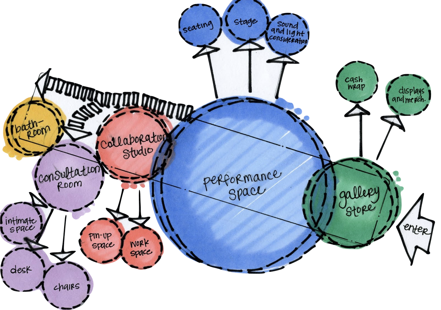
An architectural bubble diagram. Image source: Lily Glover.
In experience design, the equivalent of a bubble diagram is the conceptual model. These are diagrams that articulate the concepts the users of a system will be interacting with and the relationships between them. As with bubble diagrams, designers can use conceptual models to quickly evaluate high level what-if scenarios without getting mired in aesthetic discussions. Conceptual models are key to the design of effective information environments, and a good tool to help us start thinking more systemically about the work we do. (For a deeper discussion of this subject, see Conceptual Models: Core to Good Design, by Jeff Johnson and Austin Henderson.)
Sustainability
Let’s move on to the third perspective. As we saw with iTunes, systems aren’t static: they’re always evolving as they react to changing external and internal conditions. Perhaps the means people use to interact with the system have changed in some fundamental way (e.g. iPhones versus iPods), or the system must provide a new service (e.g. streaming music). In any case, change will happen, and the system should respond in ways that allow for (at least) its continued operation. In other words, the system must be sustainable.
When you see the word “sustainable”, you may think of the physical environment. For example, you may have heard it’s unsustainable for us to keep relying on fossil fuels for our energy. Why? Because we now understand they will run out at some point, and burning them can harm the environment. These factors cast fossil fuels as a threat to the long-term viability of our civilization. If we left our dependency on them unchecked, the system would eventually collapse.
You can think of sustainability as creating the conditions necessary for a system to meet the needs of its present stakeholders without compromising the needs of its future stakeholders. In the case of the physical environment, our primary goal should be to ensure it can sustain life in the long term. When dealing with an information environment, our goal should be to ensure that it can remain viable and useful in the long term. In order to do this, it must sustain:
- Itself; it should be able to generate enough resources to support its continued existence.
- Its purpose; it should generate these resources without compromising the reason(s) why it exists.
- Its social context; it should achieve its purpose(s) without compromising the societies that host it.
These goals mirror the goals of sustainable development formulated during the 2005 World Summit on Social Development: the economic, social, and ecological “pillars”, or fundamental aspects of the system. Let’s see how they map to our work.
The Economic Pillar
Creating and maintaining an information environment requires resources. This includes labor to design, create, test, and manage software, servers to host it, energy to power them, infrastructure to deal with logistics, and more. The system should be able to generate enough value to produce the resources necessary to ensure its continuing existence. This seems like an obvious statement, perhaps one not even worth mentioning. However, in the past couple of decades we’ve seen many information environments capture our attention without generating enough value to remain viable in the long term.

The Social Pillar
Information environments exist within a broader social construct. In order for them to remain viable in the long-term, society as a whole must remain viable as well. Again, this seems like an obvious thing to say. However, many information environments are based on business models that, while viable from the economic perspective, may be unsustainable from the social perspective. For example, advertising-based business models can be problematic, since advertising drives us towards more consumption and does so by targeting us as members of ever-narrower demographic segments. Given the challenges we face as a society, we should be striving to be more mindful of our consumption and more focused on the things that unite us.

The Ecological Pillar
The third and final pillar is the least obvious, yet no less important: the ecological pillar. The things we design participate in and create communication ecosystems that can either sustain or harm our societies’ long-term prospects. We need to consider the impact our information environments have on these ecosystems.
Media critic and educator Neil Postman pointed out that communication happens in semantic environments that have parallels to physical environments. If you consider the “goal” of the physical environment to be sustaining life, then the goal of the semantic environment is conveying meaning. Both types of environments can become polluted, making them incapable of achieving these objectives. In the case of the semantic environment, pollution happens when the language, rules, and purposes of one particular semantic environment (e.g. science) start to be blurred with those of another (e.g. religion).
For example, after the 2016 U.S. election, there has been much talk about the problem of “fake news” in social networks. What this means is that a particular semantic environment (social media, which we’re using to inform our worldview) is becoming polluted with material from another semantic environment (outright propaganda, or in some cases, satire). This is not new, of course — disinformation has been around for a while. What is new is the pervasiveness of the problem, and the fact that now we move much more fluidly between different semantic environments. This makes it more challenging for us to understand how we’re supposed to interpret what we’re looking at. As the designers of these systems, it behooves us to understand how they can become polluted, and work to ensure that the transmission of meaning can happen as “cleanly” as possible.
Non-renewable Resources
When we discuss sustainability of the physical environment, we often talk about non-renewable resources. These include things that are essential for our survival, like air and water, and some that are key for our current way of life, such as fossil fuels. The essential characteristic of these resources is that they’re limited: once they run out, the system collapses. Because of this, responsible stewardship is essential for the continuing survival of the system.
Information environments also have an essential non-renewable resource, one without which the entire system collapses: the attention of the human beings who will be interacting with the products and services we design. We only spend two-thirds of our (already short!) lives conscious enough to use a smartphone. What are we doing with the precious time of our apps’ users? Are we helping them be more effective parents, co-workers, citizens? Or are we merely giving them a quick dopamine fix so we can show them more ads?
Every day, people are spending more of their time using the apps and websites we create. We should honor this privilege by not squandering their attention.
Towards a Co-creative Design Practice
Let’s summarize. Information is changing the world. Information environments — experienced through digital products and services such as apps — are becoming the contexts in which people are carrying out more and more of their day-to-day activities. In some important ways, these systems are assuming roles that have been served by architecture. As with buildings, information environments affect how we understand ourselves and our societies. Because they’re made of an incredibly malleable material — software — the contexts they create are in constant state of change. This is new for us. As designers, we need to accept responsibility for the long-term viability of these environments and the societies which host them. We’ve examined three perspectives that can help us do this:
- The semantic structures that underlie our systems change more slowly than their user interfaces.
- The products and services we design don’t stand on their own; they participate in and create broader systems.
- These systems should be able to adapt to changes sustainably.
Design, as it’s been traditionally practiced — with its “hero” designers and its emphasis on the form of individual artifacts and achievements over the systems they create — is incompatible with a world that is characterized by rapid change, systemic challenges, and ambiguity. At Futuredraft, we believe designers are being asked to show the way towards a more complete utilization of existing knowledge, which in turn produces the comprehensive and sustainable solutions needed today. This requires we become aware of — and master — our own filters, opinions, and preconceptions, which interfere with the emergence of clear seeing. By doing so, we can move towards a more co-creative practice that integrates the design skills of those who will actually live and work with (and in) these information environments. Only by working together to design new possibilities can we overcome the enormous challenges we currently face. This sentiment was expressed more succinctly (and beautifully) by Christopher Alexander:
Making wholeness heals the maker.
This is my wish for us: that we learn to use our craft to heal ourselves and our world. We are all stakeholders in the design of a more viable future.
This post was originally published in Medium.