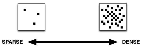
Some information environments are denser than others. By this I mean that they present a higher number of information nodes in a constrained space/time. The user’s ability to understand and navigate the environment will be greatly affected by the density of the information in the space, and managing this information density — ensuring that it’s just right for the objectives, audience, and content of the space — is a critical function of information architecture.
You can place information environments in a continuum that ranges from those that are very sparse — you could call them “minimalistic” — to those that are very dense.

A sparse information environment is not necessarily low on content: remember that when we talk about density we’re talking about the proportion of information to the space/time available to convey it. An artifact that presents an immense amount of content but takes an infinite amount of space to do so can be considered very sparse. Conversely, an artifact that presents very little information in a minuscule space can be considered dense. When it comes to information density, we’re aiming to provide something that feels comfortable and is understandable to the user. (This is one of the key challenges we face when designing for multiple device screen sizes: the information density of a particular information environment is very different when experienced in an iPhone than when it is experienced using an iMac with a 27 inch screen.)
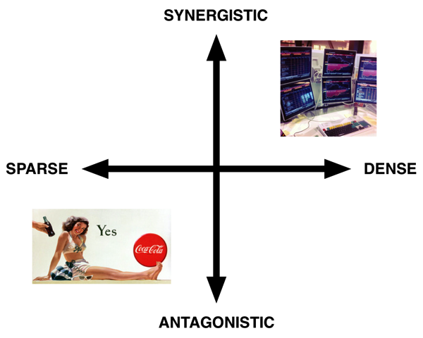
Another continuum that we can use to map these environments, and which affects this aspect of the experience, is the amount of interactivity that the environment affords. This is because the more interactive an environment is, the more information we can convey in a similarly sized viewport. I refer to highly interactive environments that encourage user exploration and participation as synergistic, because they give latitude to the consumer of the information to generate her own experience of it. Conversely, some environments allow little affordance for interaction: they are designed primarily for passive consumption and discourage user interaction. In the producer-consumer relationship, they overwhelmingly favor the producer. I call these environments antagonistic.

You can map information environments on a matrix based on these two continuums. In the low density/antagonistic quadrant, you have billboards on a highway. Billboards are information environments, but barely so: they are designed to be quickly (and memorably) consumed by users who are moving past them at high speeds. Because of this, they have to be low on information and low on interactivity. Toward the high density/synergistic quadrant you have something like the Bloomberg terminal, which presents an overwhelmingly rich amount of information that the user can navigate by using a variety of arcane, pithy commands. Either extreme is useful for edge cases, but most information architecture aims towards the upper middle of the matrix: we want our information environments to be dense enough to provide engagement and enlightenment, but not so dense that they overwhelm the user.
Advertising in mainstream media has been pulling us towards the left of the diagram for the past 120 years or so as our attention spans have been getting shorter. (Perhaps they have been getting shorter because of the influence of media.) Think of the newspaper ads in the late 1800s; they were much denser than the ones we see today. As the Internet (and, by extension, interactivity) has become more pervasive and started supplanting many of the functions of traditional mainstream media, there has been a tendency to push interactive information environments in this direction as well.

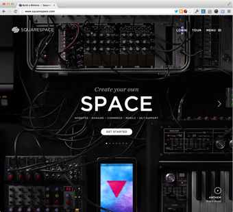
The recent redesign of the Squarespace homepage is an example of this phenomenon: while presenting a stunningly beautiful graphic design, the site is surprisingly light on actual information, and the primary structure for interaction is a right / left carousel slider. Perhaps this is an appropriate response to the design requirements (which I’m obviously not privy to), but I find it interesting that a tool that is aimed at allowing people to publish information interactively should itself be so low on both interactivity and information.
Interactive information environments are a tool to expand human understanding, one with unprecedented potential. As information architects, it is our responsibility to argue for density/synergy balance in the information environments we design. The objective is not just to make environments that engage people; we also want them to understand what they’re engaging with.
Photos: Jm3, The Coca Cola Company
