One of the advantages of living in the developing world is that I am exposed to a wide variety of UX disasters. If you find it hard to define UX, try dealing with a Panamanian government office. You will quickly see what a lack of UX thinking looks like, and this will in turn aid your appreciation and understanding of good UX.
A few weeks ago I had to go to the Panamanian immigration office to take care of some paperwork. When I got there, I found chaos. There must have been two thousand people waiting in two dozen different lines that didn’t move, all poorly labeled or not labeled at all. There was no obvious information desk where I could ask for help. I had a choice: arm myself with patience and try to trudge through this mess, or return early some other day before the office had filled up. I opted for the latter.
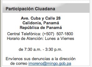
I visited the immigration office’s website to look for their operating hours. I found this:

As you can see, this widget helpfully gives 1) the address of the office, 2) their phone number, and 3) their operating hours, which they list as being 7:30 AM to 3:30 PM, Monday through Friday.
I first tried calling, but the number was busy or otherwise unresponsive. I decided to visit the office at opening time some other day. Last Tuesday I got up early and drove to the immigration office (which, I must add, is in a seedy part of town). I arrived at 7:20 AM and wasn’t surprised to find an old lady and a group of Colombian immigrants already ahead of me. Clearly these folks had the right idea.
Or not! Turns out we were all duped. 7:30 came and went without any signs of life from within the office building. Then I noticed this sign outside the main door:

8:00?! What the hell! This is not what the website sa… Oh, I see. The website can’t be trusted.
It was now ten til eight, and it was starting to get hot. The Colombians crossed the street to look for shade, joining a crowd of close to twenty people who were now waiting for the office to open. The older lady asked me if I knew at what time the office would open. “Eight AM, I guess,” was my reply, at this point uncertain even though the opening time was clearly, definitely stated. In metal. Bolted to the wall.
And I was right to be skeptical, because (you guessed it!) eight AM came and went and the doors remained shut. Still, the crowd — almost thirty people at this point — crossed the street to gather around the entrance. Those of us who’d gotten there early tried to keep our places towards the front, but there was no line and confusion started to give way to opportunism. “Were you first?” “No, I think this lady was.” “No, I got here first!” Etc.
When the doors finally opened, an older man with an extraordinary mustache appeared. “You can’t come in,” was the first thing he said. (No, not even “good morning”.) “I’m only opening the door to allow our workers in. The office doesn’t open til 9 AM.” At this point I laughed. “What about the sign on the wall?” I asked. “Oh, don’t mind that,” he said, “that’s Nestlé’s.” Yes, that Nestlé. The largest food company in the world. And, as it happens, the previous tenant of the building. Who moved to a new office in a nicer part of town. DECADES AGO.
The official with the mustache then asked us, one by one, why we were there, apparently to help direct us to the right paperwork. Great! Except he made no effort to help us in the order in which we’d gotten there (those in the front first.) Instead, he dealt with us in what seemed to be order of attractiveness, starting with a woman in expensive sunglasses and a revealing top, moving on to a cute young Colombian student in tight jeans way in the back, and so on. The older lady (the first one there) looked at me and sighed.
I will spare you the rest of the miserable experience. Instead, I’ll try to distill what made this small interaction so frustrating to see if there’s anything that can be learned from it.
These are the main points of failure I can see:
-
Inability to communicate structure/order. I’m sure there must have been some logic to the way lines were organized, but neither the building or the signage (what little there was) offered any clues as to what that logic was. As a new user, I had no way into the system and no mental model to guide me. If this office was a website, you would say it lacked a clear navigation structure.
-
No fallback navigation. If you can’t express structure, at least provide an alternate means of navigation. Many public offices have an information desk, usually staffed by some of the most knowledgeable members of the institution. If this office had such a thing, I couldn’t find it. In a website, this function is provided by the search box and FAQs.
-
Useless communication channels. The only thing worse than a useless channel is a useless channel that superficially appears to be useful. If you have no intention of answering the phone, then for heaven’s sake don’t publish your phone number!
-
Contradictory content. The organization’s website gave one opening time, the building another, and the official who “helped” us yet a third. Only the last was authoritative, but the information seemed arbitrary — especially when compared to the metal plaque bolted to the fricking wall.
-
Arbitrary authority. The official who dealt with us seemed to be following rules devised for his own benefit (apparently to win points with the ladies.) Rules should be fair, clear, and beneficial to customers. This is especially important when those rules define the organization’s interactions with customers.
Bottom line: after the first couple of interactions, I started questioning everything this organization said and did. They lost my trust early on, and every subsequent touchpoint made it worse.
From the user’s perspective, these issues seem relatively simple to solve. Why would any organization fail in such obvious ways? Here are some possible reasons:
-
Team members lack empathy for their customers
-
Team members lack respect for the value they can (should) provide
-
Team members lack an understanding of quality or benchmarks to measure it
-
There are no viable communication channels between teams
-
No one has a top-level view of what goes on with customers
-
No one is calling the shots
In my opinion, the last point is crucial. The fact that an organization can limp along with such obvious flaws is a sign of a dysfunctional culture, both at the organizational and societal levels. They are signs of a leadership vacuum.
I’ve come to understand that the opposite of UX design is not shitty design, thoughtless design, or piecemeal design. It is anarchy. Only strong leadership with a clear user-centric vision can transform the organization’s culture and improve the experience of its constituents. Design is a form of leadership, and UX designers should be well-versed in the literature of leadership not because we should aspire to C-level positions, but because it helps us do our jobs more effectively.