The architecture of information:
It used to be that when I wanted to show people an example of an information environment with a hierarchical taxonomy as its primary structure, I’d show them iTunes. However, iTunes has become a mess of different taxonomies and no longer offers a visible hierarchical navigator by default. These days, when I want to show an example of this type of environment, I point people to another Apple app: Apple Health.
Health comes installed by default in modern iPhones, so many people can access it. Its purpose is to aggregate information from various other health-related apps (such as pedometers, calorie counters, blood glucose monitors, etc.) and present it to the user in a useful way to the user. This requires the presence of two primary structures:
-
A hierarchical taxonomy of all available health-related variables in the system
-
A list of user-curated variables from that taxonomy
The user can navigate the hierarchical taxonomy under the “Health Data” tab. The main view in this tab shows a clear prioritization: it gives four top-level categories (Activity, Mindfulness, Nutrition, and Sleep) much greater visibility than other categories such as Body Measurements, Health Records, and Reproductive Health.
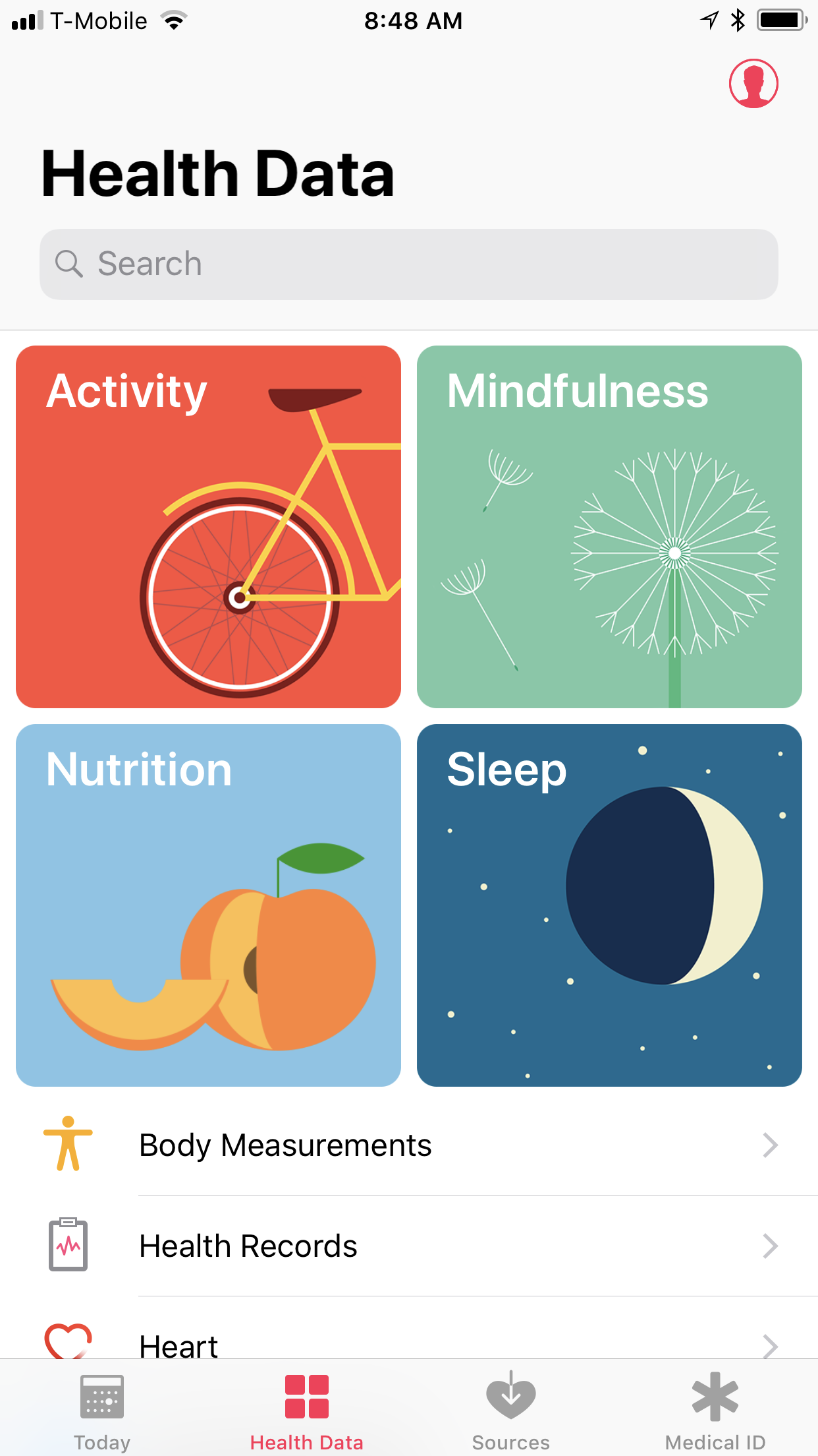
The ‘Health Data’ tab in Apple Health.
The user can tap into any of these categories to view details, including individual variables. A toggle allows the user to select whether or not she wants the variable to appear as part of her “Favorites,” making it part of the curated list that appears in the dashboard view. (Which is called “Today” in the main navigation bar.)
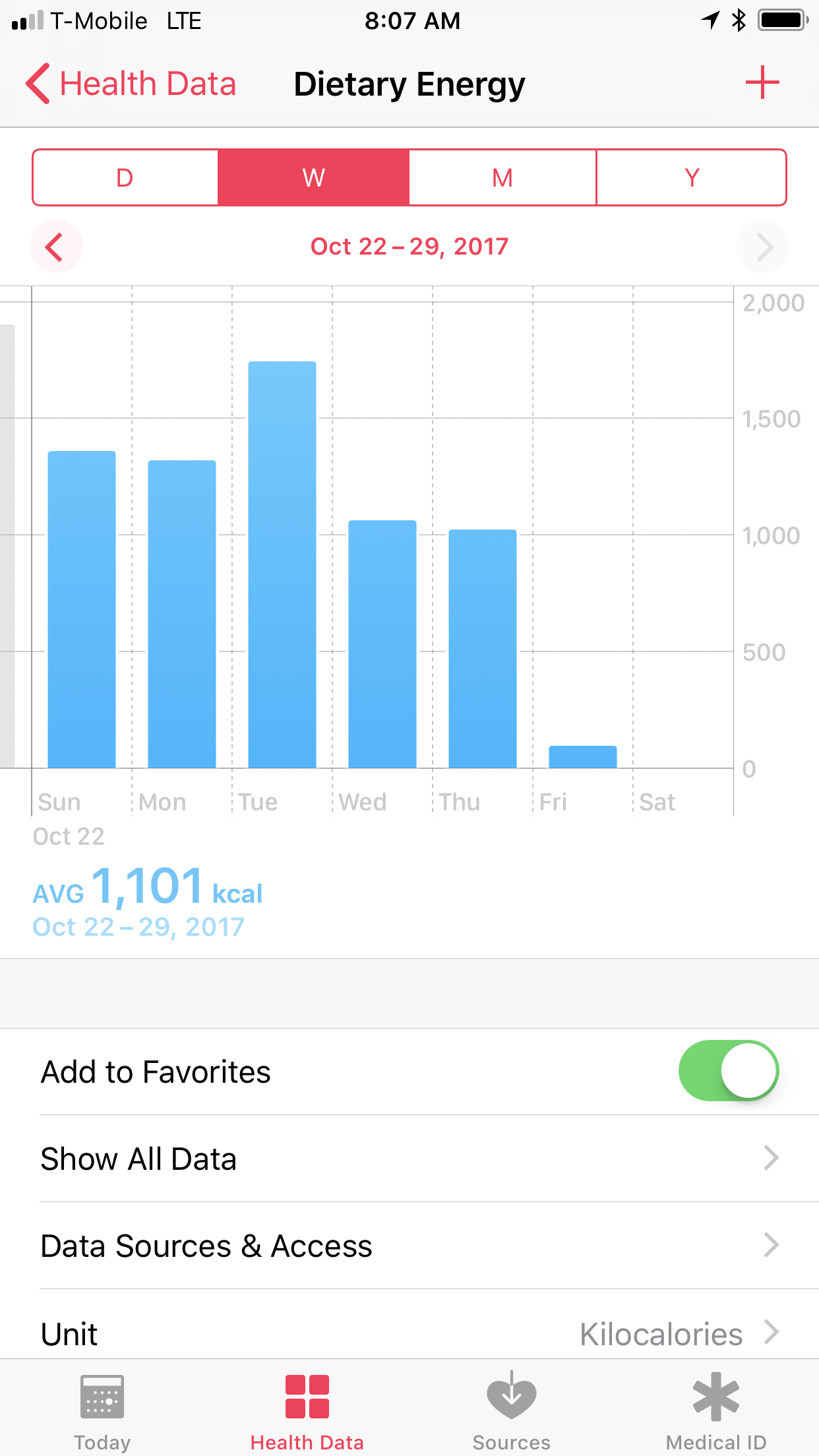
The ‘Dietary Energy’ detail screen. Note the toggle that adds the variable to my favorites.
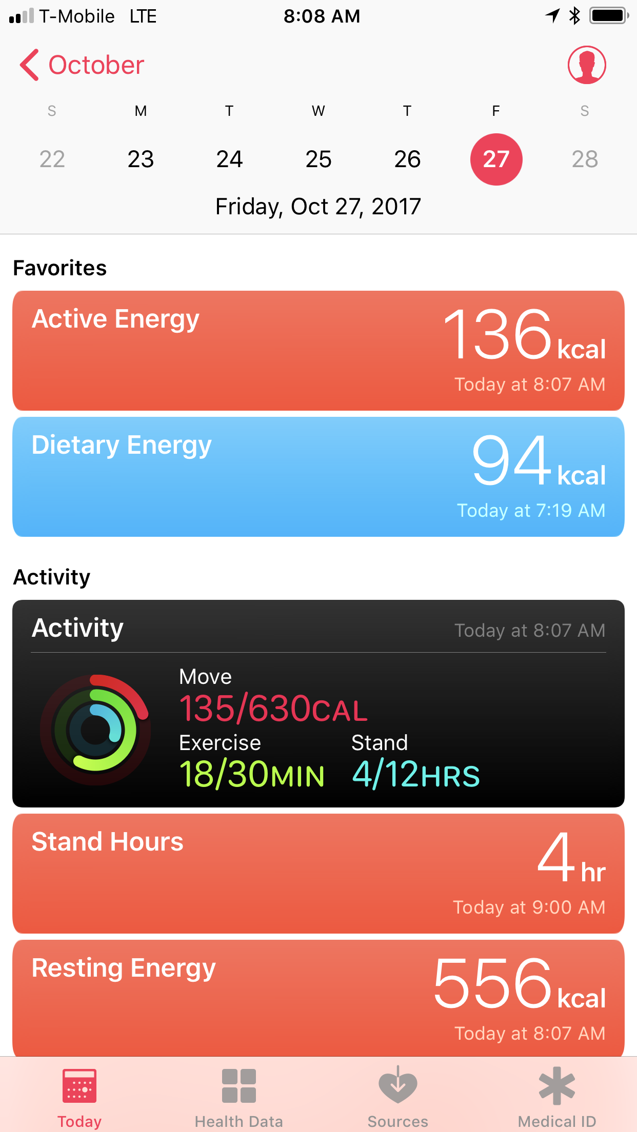
The ‘Today’ tab in Apple Health. I’ve favorited two variables: Active Energy and Dietary Energy.
The system is not entirely intuitive — it requires some exploration to figure out where some of the key variables live and what they’re called — but it is learnable. Some things you’d expect to be called by one name (such as “calories”) are not selectable as such. This makes sense when you think about it; calories are not an actual variable, but a unit of measure for a variable. So to view how many calories you’ve expended, you must select the “Active Energy” variable, and to see how many calories you’ve ingested, you must select the “Dietary Energy” variable. “Active Energy” and “Dietary Energy” are not obvious terms, but make sense once you’ve figured out how the system works.
Still, Apple Health offers a good modern example of an information environment that invites you to transverse a hierarchical taxonomy. Instead of the plain columns of lists in the iTunes days, Health offers visual elements such as icons and distinct background colors that emphasize relative importance within the environment. It’s also a good example of how to let people navigate a large information structure so they can curate a subset of it for their own needs.